Create our own Docusaurus React component and provide a "Share on Bluesky" button
Build a custom Docusaurus React component that adds a “Share on Bluesky” button to your blog posts.

This article is part of the Bluesky Docusaurus component series:
- Create our own Docusaurus React component and provide a "Share on Bluesky" button
- Show Bluesky comments on Docusaurus and, too, number of likes/reposts
Changelog

This post guides you through creating a 'Share on Bluesky' button for your Docusaurus blog. You'll learn how to use Docusaurus's swizzle feature to override the default blog post theme, create a custom React component for the button, and then integrate it into your blog posts. We'll build the component step-by-step, including the necessary CSS and SVG icon.
Nine months ago, I had enabled the feature to write comments under my articles by using Giscus (see Adding a comment area) but only people having a GitHub account were eligible to use that feature and so, almost no one did it.
So I went nearly nine months without giving readers of this blog the opportunity to interact with me, which is a bit frustrating and prevents us from exchanging ideas and enriching each other's lives.
For a few weeks now, I've been present on Bluesky and ... why not adding a Share on Bluesky button below each article?
This idea is neither revolutionary nor complicated so, let's play...
In this first article in a series of two, we'll see how we can create our Docusaurus React component. Before writing this article, I just didn't know how and now, yes, it's so easy.
Result
And, tadaaa 🎉🎉🎉, here is a "Share on Bluesky" button in action, below a blog post:
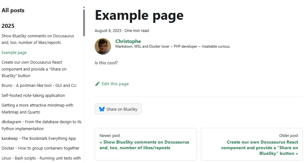
That's the whole point of this article: a small custom React component, swizzled into Docusaurus's BlogPostItem, with nothing more exotic than a <button> and an SVG icon. Let's build it.
Information
In a second article (see Show Bluesky comments on Docusaurus and, too, number of likes/reposts), we went further: retrieving the number of likes, reposts and comments posted on Bluesky and displaying them below our articles as a single, unified "engagement facepile".
This is what this very button looks like today, live on this blog, for a fresh article that hasn't collected any Bluesky interaction yet:

Because I had absolutely no idea on how to start; let's ask some AI to generate a skeleton. I've asked something like "Hello my friend, I would like to show a Bluesky share button below my article on my Docusaurus blog. Give me a skeleton; please."
Once generated by the AI, it's now time to read, understand and make some tests.
We need to override how the article is rendered by Docusaurus
So I learned I have to create a file called src/theme/BlogPostItem/index.js and just put some content to it.
The AI gives me the content but ... hey my friend, from where comes that content? After some research, I learn it's an override of the standard @docusaurus/theme-classic template.
I also learn we can extract the original file by using the so-called Swizzle action.
Information
In the Docusaurus terminology, Swizzle can be understood as override: we'll extract, here, a template so we can then override it.
The src/theme/BlogPostItem/index.js file will customize the layout and content of individual blog posts so, by updating that file, I can override then change how every single post of my blog will look.
Since I want to add a Share button; it's the perfect candidate. The AI is right.
Extract the original file
Start a console and make sure you're in the root folder of your blog.
In your console, run yarn docusaurus swizzle @docusaurus/theme-classic BlogPostItem.
When prompted, select Javascript, then Eject and finally YES.
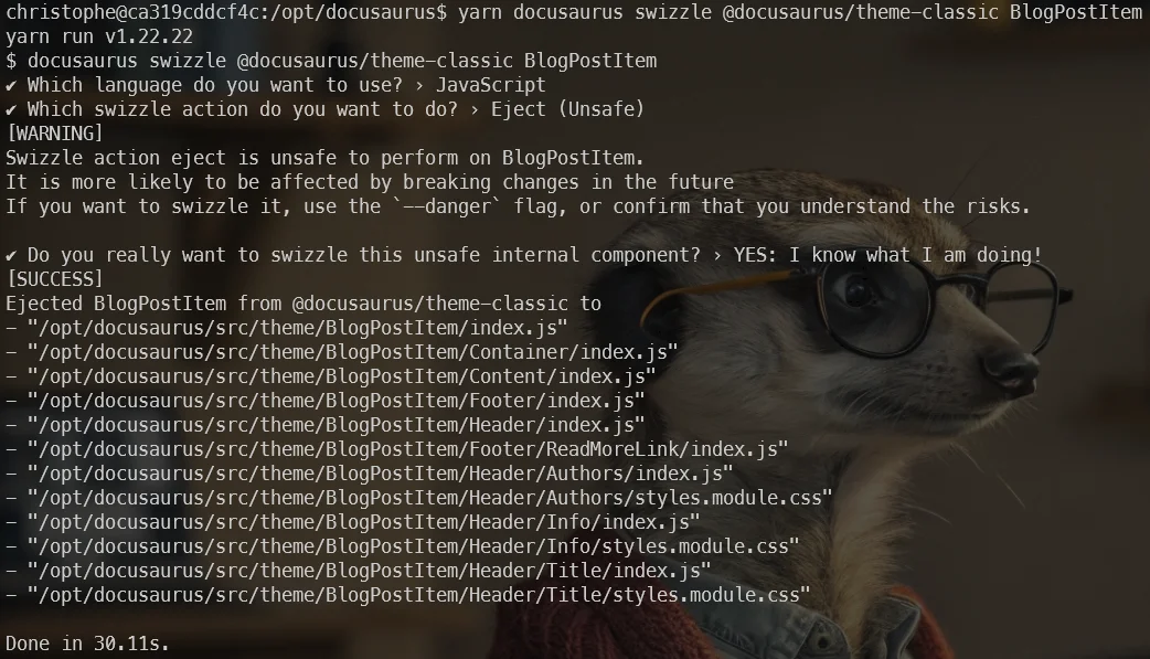
As you can see, a lot of files will be created in our Docusaurus directory's structure.
Keep things under control
As you can see on the screen, you'll extract a lot of files. Let's keep things under control: we just want to add a share button below our article; we don't want to do more than that.
Look at your Docusaurus site now; go to the src/theme/BlogPostItem folder and see that, yes, you've now a lot of files and sub folders. Just remove every sub folders; we don't want to update them i.e. we want to keep the original ones. So next time you'll install a newer version of Docusaurus, you'll stay up to date.
Just keep the index.js file created by the swizzle command. Here is the one I just got on my current Docusaurus version:
import React from "react";import clsx from "clsx";import { useBlogPost } from "@docusaurus/plugin-content-blog/client";import BlogPostItemContainer from "@theme/BlogPostItem/Container";import BlogPostItemHeader from "@theme/BlogPostItem/Header";import BlogPostItemContent from "@theme/BlogPostItem/Content";import BlogPostItemFooter from "@theme/BlogPostItem/Footer";// apply a bottom margin in list viewfunction useContainerClassName() { const { isBlogPostPage } = useBlogPost(); return !isBlogPostPage ? "margin-bottom--xl" : undefined;}export default function BlogPostItem({ children, className }) { const containerClassName = useContainerClassName(); return ( <BlogPostItemContainer className={clsx(containerClassName, className)}> <BlogPostItemHeader /> <BlogPostItemContent>{children}</BlogPostItemContent> <BlogPostItemFooter /> </BlogPostItemContainer> );}This component renders a blog post with a header, content, and footer, automatically adding bottom margin when displayed in a list (rather than on its own dedicated page). It composes several smaller specialized components together and uses a custom hook to determine the appropriate styling based on context.
Playing and adding a stupid message to every blog post
Before proceeding, let us conduct a test: is this the correct file to modify for our need?
Let's play and add a line just after our post title. Look at the example below; I've just added a new line:
import React from "react";import clsx from "clsx";import { useBlogPost } from "@docusaurus/plugin-content-blog/client";import BlogPostItemContainer from "@theme/BlogPostItem/Container";import BlogPostItemHeader from "@theme/BlogPostItem/Header";import BlogPostItemContent from "@theme/BlogPostItem/Content";import BlogPostItemFooter from "@theme/BlogPostItem/Footer";// apply a bottom margin in list viewfunction useContainerClassName() { const { isBlogPostPage } = useBlogPost(); return !isBlogPostPage ? "margin-bottom--xl" : undefined;}export default function BlogPostItem({ children, className }) { const containerClassName = useContainerClassName(); return ( <BlogPostItemContainer className={clsx(containerClassName, className)}> <BlogPostItemHeader /> // highlight-next-line {/* Just after the blog post title, we'll add a "Are you ready" text */} // highlight-next-line <strong style={{ color: "red" }}> Are you ready to update your BlogPostItem layout? </strong> <BlogPostItemContent>{children}</BlogPostItemContent> <BlogPostItemFooter /> </BlogPostItemContainer> );}This component renders a blog post item by assembling several sub-components (header, content, footer) inside a container. It uses a custom hook to determine whether extra bottom spacing should be added, which depends on whether we're viewing a single post page or a list of posts.
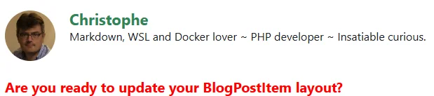
Save the file and refresh your page using your browser and tadaaa 🎉🎉🎉... Yes, we can see that text on each blog post.
On the image here above, we can see our stupid message:
Note
If it didn't work, please stop and restart your Docusaurus server. On my case (I'm using Docker), I just need to stop and restart my container.
So, as you can see, it's now quite easy. We can change the layout of our Docusaurus page just by manipulating the index.js file.
Time to create our Bluesky Docusaurus component
We'll proceed step by step and keeping in mind a few things:
Things to Remember
- We should minimize our changes on the original
src/theme/BlogPostItem/index.js; the less updates the best; - We will create a Docusaurus component in
src/components/to allow interactions with Bluesky (think about the evolution of the component) so, for this reason, we'll put everything (code, image, css) together and - We will try to keep things clean and maintainable for the developer and configurable for the user.
1/5 The layout of our Bluesky generic component
The first file we'll create will be our index.tsx file i.e. our global Bluesky component.
In this article, we'll just foresee a "Share on Bluesky" button but in the second article, we'll add some more features.
This index.tsx will be the entry point of the component.
Please create the src/components/Bluesky/index.tsx file with this content:
import BlueskyShare from "./share";import styles from "./styles.module.css";
interface Props { metadata: { frontMatter?: { blueskyRecordKey?: string; }; };}
export default function Bluesky({ metadata }: Props) { return ( <div className={styles.blueskyContainer}> <BlueskyShare metadata={metadata} /> </div> );}This is a React component that wraps a BlueskyShare component inside a styled container. It accepts metadata about a post (including an optional Bluesky record key from frontmatter) and passes that data down to the child component, which presumably handles sharing to Bluesky.
This is our React <Bluesky /> component! Simple no? Right now, it's just a div containing another component called <BlueskyShare />.
If you look at the code here above, we have to create two new files: share.tsx and styles.module.css.
2/5 Our "Share on Bluesky" button
Ok, now, we have to create a second file called src/components/Bluesky/share.tsx and to copy/paste this content in it:
import Icon from "./bluesky.svg";import styles from "./styles.module.css";import Translate, { translate } from "@docusaurus/Translate";import useDocusaurusContext from "@docusaurus/useDocusaurusContext";
// Declared locally rather than imported from useBlueskyEngagement — this file (built in the// series' first article) stands on its own before that hook exists in the tutorial's timeline.interface Props { metadata: { title?: string; permalink?: string; frontMatter?: { blueskyRecordKey?: string; }; };}
export default function BlueskyShare({ metadata }: Props) { const { siteConfig } = useDocusaurusContext(); const blueskyRecordKey = metadata?.frontMatter?.blueskyRecordKey;
if (blueskyRecordKey) return null;
if (!metadata.title || !metadata.permalink) { console.debug("<BlueskyShare> Missing required properties", { metadata }); return null; }
const shareLink = `https://bsky.app/intent/compose?text=` + `${encodeURIComponent(metadata.title)}%20${siteConfig.url}${encodeURIComponent( metadata.permalink, )}`;
return ( <a href={shareLink} target="_blank" rel="noopener noreferrer" className={styles.blueskyButton} aria-label={translate({ id: "bluesky.share.ariaLabel", message: "Share this post on Bluesky", })} > {/* alt dropped: SVGProps has no such prop — was a no-op DOM attribute even before this migration, and the link's own aria-label already names the icon. */} <Icon className={styles.blueskyLogo} /> <Translate id="bluesky.share.label">Share on Bluesky</Translate> </a> );}This React component renders a share button that lets users post the current article to Bluesky social media. It checks that the article has required metadata (title and URL) before generating a share link, and returns nothing if those details are missing or if the article already has a Bluesky record.
As you can see, we've defined a function called BlueskyShare and that function ask a parameter called metadata.
Information
Look back in the src/components/Bluesky/index.tsx we've just created before. We had this line: <BlueskyShare metadata={metadata} /> so, yes, we're well passing that parameter.
The metadata parameter is an object initialized by Docusaurus and that will contain all the front matter data from the Markdown file of the current blog post. It includes properties like title, description, date, tags, and any other custom fields you've defined in the front matter.
What does the BlueskyShare function? In fact, we'll just provide a button with a url like https://bsky.app/intent/compose?text=<title>%20<url> (where we'll inject the blog post title and url).
If you look at the code here above, we have to create another file called: bluesky.svg.
3/5 The Bluesky logo
For sure, we need the Bluesky logo somewhere.
Please create a third file called src/components/Bluesky/bluesky.svg and copy/paste this content in it:
<?xml version="1.0" encoding="UTF-8"?><svg viewBox="0 0 600 530" xmlns="http://www.w3.org/2000/svg"> <path d="m135.72 44.03c66.496 49.921 138.02 151.14 164.28 205.46 26.262-54.316 97.782-155.54 164.28-205.46 47.98-36.021 125.72-63.892 125.72 24.795 0 17.712-10.155 148.79-16.111 170.07-20.703 73.984-96.144 92.854-163.25 81.433 117.3 19.964 147.14 86.092 82.697 152.22-122.39 125.59-175.91-31.511-189.63-71.766-2.514-7.3797-3.6904-10.832-3.7077-7.8964-0.0174-2.9357-1.1937 0.51669-3.7077 7.8964-13.714 40.255-67.233 197.36-189.63 71.766-64.444-66.128-34.605-132.26 82.697-152.22-67.108 11.421-142.55-7.4491-163.25-81.433-5.9562-21.282-16.111-152.36-16.111-170.07 0-88.687 77.742-60.816 125.72-24.795z" fill="#1185fe"/></svg>This is an SVG file that draws a single blue star shape. The star is defined using a path element with a complex set of coordinates and curves, and it's filled with a bright blue color (#1185fe).
4/5 And finally our CSS
And, very important, we need a CSS. Please create a fourth file called src/components/Bluesky/styles.module.css and copy/paste this content in it:
.blueskyLogo { width: 20px; height: 20px;}
.blueskyContainer { margin: 2rem 0 0.5rem; padding: 1.1rem 1.25rem 1.4rem; border: 1px solid var(--ifm-color-emphasis-200); border-radius: 8px; background: var(--ifm-background-surface-color);}
.blueskyHeadline { display: block; font-weight: 500; color: var(--ifm-color-content); margin-bottom: 0.75rem;}
.blueskyAccountNote { display: block; margin-top: 0.6rem; font-size: smaller; color: var(--ifm-color-emphasis-600);}
.blueskyCommentsContainer { border: 1px solid var(--ifm-color-emphasis-200); margin-top: 1rem; padding: 0.4rem 0.9rem; margin-bottom: 1.25rem;}
.blueskyCommentContainer { margin-bottom: 1rem; background-color: var(--ifm-color-emphasis-100); padding: 0.8rem; border-radius: 6px; border-left: 2px solid var(--ifm-color-emphasis-300); color: var(--ifm-font-color-base);}
.blueskyCommentHeader { display: flex; align-items: center; gap: 10px;}
.blueskyCommentAuthorInfos { display: flex; flex-direction: column;}
.blueskyCommentAvatar { width: 32px; height: 32px; border-radius: 50%; margin-right: 0.5rem;}
.blueskyCommentAuthorDisplayName { margin: 0; font-weight: bold;}
.blueskyCommentAuthorHandle { margin: 0; font-size: smaller; font-weight: normal; color: var(--ifm-color-emphasis-600); display: block;}
.blueskyCommentDate { margin-left: auto; font-size: smaller; color: var(--ifm-color-emphasis-600);}
.blueskyCommentText { margin: 0.3rem 0 0;}
.blueskyCommentLikes::before { content: "❤️\a0";}
.blueskyCommentLikes::after { content: " ";}
.blueskyCommentReposts::before { content: "🔁\a0";}
.blueskyCommentReposts::after { content: " ";}
.blueskyCommentLink::before { content: "→\a0";}
.blueskyCommentLink::after { content: " ";}
.blueskyCommentLink { margin-right: 0.25rem; display: inline-flex; align-items: center; color: var(--ifm-color-emphasis-600); text-decoration: none; margin-top: 0.25rem;}
img.blueskyCommentEmbedThumb { max-height: 250px;}
.blueskyCommentImages { margin-top: 0.5rem; display: flex; flex-wrap: wrap; gap: 0.5rem;}
.blueskyCommentImage { max-width: 100%; height: auto; border-radius: 0.25rem; border: 1px solid var(--ifm-color-emphasis-300);}
.blueskyNoCommentYet { color: var(--ifm-color-emphasis-600); font-size: 1rem; line-height: 1.5; text-align: center; padding: 20px; background-color: var(--ifm-color-emphasis-100); border: 1px solid var(--ifm-color-emphasis-300); border-radius: 8px; margin: 20px 0;}
.blueskyNoCommentYetCTA { font-weight: bold; color: var(--ifm-color-primary-dark); cursor: pointer; text-decoration: underline;}
[data-theme="dark"] .blueskyNoCommentYetCTA { color: var(--ifm-color-primary-light);}
.blueskyPostLikes { display: inline-flex; align-items: center; gap: 0.4rem;}
.blueskyLikersAvatars { display: inline-flex; align-items: center; margin-left: 0.4rem;}
.blueskyLikersAvatarLink { margin-left: -1rem; line-height: 0;}
.blueskyLikersAvatarLink:first-child { margin-left: 0;}
.blueskyLikersAvatar { width: 40px; height: 40px; border-radius: 50%; border: 2px solid var(--ifm-background-color); display: block;}
.blueskyLikersAvatarMore { margin-left: 0.4rem; font-size: smaller; color: var(--ifm-color-emphasis-600);}
.blueskyEngagementRow { display: flex; align-items: center; flex-wrap: wrap;}
.blueskyButton { align-items: center; background-color: var(--ifm-color-emphasis-200); border-radius: 6px; border: 1px solid var(--ifm-color-emphasis-300); box-shadow: none; color: var(--ifm-font-color-base); display: inline-flex; font-size: 0.9rem; font-weight: 400; gap: 0.4rem; margin-bottom: 0.8rem; margin-right: 0.4rem; padding: 0.4rem 0.9rem; text-decoration: none; transition: background-color 0.2s ease, color 0.2s ease;}
.blueskyButton:hover { background-color: var(--ifm-color-primary); border-color: var(--ifm-color-primary); color: white;}This stylesheet styles a Bluesky social media embed component with various sections for displaying posts, comments, user avatars, and engagement metrics. It uses CSS variables for theming to support both light and dark modes, and includes hover effects for interactive elements like buttons and links.
5/5 Last thing, we need to implement our component in Docusaurus
Our Bluesky component is ready. We have created our four files.
You should have this:
src
Let's go back to what was said earlier: in order to adapt the page layout, Docusaurus uses the file src/theme/BlogPostItem/index.js. So it's time to inject our newly-created component in that script.
import React from "react";import clsx from "clsx";import { useBlogPost } from "@docusaurus/plugin-content-blog/client";import BlogPostItemContainer from "@theme/BlogPostItem/Container";import BlogPostItemHeader from "@theme/BlogPostItem/Header";import BlogPostItemContent from "@theme/BlogPostItem/Content";import BlogPostItemFooter from "@theme/BlogPostItem/Footer";
// highlight-next-line// import our Bluesky component// highlight-next-lineimport Bluesky from "@site/src/components/Bluesky";
// apply a bottom margin in list viewfunction useContainerClassName() { const { isBlogPostPage } = useBlogPost(); return !isBlogPostPage ? "margin-bottom--xl" : undefined;}
export default function BlogPostItem({ children, className }) { // highlight-next-line // We need to retrieve the isBlogPostPage flag // highlight-next-line const { metadata, isBlogPostPage } = useBlogPost(); const containerClassName = useContainerClassName(); return ( <BlogPostItemContainer className={clsx(containerClassName, className)}> <BlogPostItemHeader /> <BlogPostItemContent>{children}</BlogPostItemContent> <BlogPostItemFooter /> // highlight-next-line {/* Only display Bluesky components on the post page; not the blog view */} // highlight-next-line {isBlogPostPage && <Bluesky metadata={metadata} />} </BlogPostItemContainer> );}This component renders a blog post item with a header, content, and footer, and conditionally displays a Bluesky component only when viewing the full post page rather than the blog list view. It uses a custom hook to determine whether extra spacing is needed based on the current view context.
Congratulations! If you go to a page on your blog and refresh the page, you will see the Bluesky button at the bottom of the page.
Note
If it didn't work, please stop and restart your Docusaurus server. On my case (I'm using Docker), I just need to stop and restart my container.
Refresh a blog post page and you'll see the same button we already teased at the top of this article, now live on your own site.
All Files at a Glance
Here is the full set of files created in this article. Use the button below to copy them all at once, or download them as a ready-to-extract ZIP:
Need help here? Click the "Help" button above for setup instructions.
In a next article, we'll learn how to interact with Bluesky:
- Providing a button below the article to jump to the Bluesky posts so your visitors will be able to:
- Like your article (which is always nice, isn't it?),
- Share your article (even better) and
- Start or participate to a discussion
- We'll also show the number of likes and reposts on the Bluesky post and
- Retrieve all comments posted on Bluesky and display them on your blog; this will undoubtedly increase your visitors' engagement.
Final remarks - Take care about the swizzle command
You need to understand that, by swizzling (overriding) the BlogPostItem layout, you're no more aligned with the standard layout of Docusaurus.
If, in a next release, new features will be added by Docusaurus; you'll not have them! since you're no more using the default layout for your post.
Just keep that in mind and, perhaps, from time to time (after a major release f.i.), think to run the swizzle command again and restart your customization.
This is why our changes to the index.js file were kept to a minimum.
This article is part of the Bluesky Docusaurus component series:
- Create our own Docusaurus React component and provide a "Share on Bluesky" button
- Show Bluesky comments on Docusaurus and, too, number of likes/reposts
Loading comments…
