Display Docusaurus Blog Posts as Cards - A Step-by-Step Guide
Learn how to visually showcase your Docusaurus blog posts using customizable card layouts.


This article is over a year old but was reviewed on July 30, 2026 — the content is still accurate.
This article is part of the Display Docusaurus Blog Posts as Cards - A Step-by-Step Guide series:
- Displaying related posts below our Docusaurus article
- Display Docusaurus Blog Posts as Cards - A Step-by-Step Guide

This comprehensive guide demonstrates how to transform Docusaurus's default blog post lists into a visually appealing card-based layout. You'll learn how to implement a reusable multi-part <Card> component, and then create a custom <PostCard> component to display post-specific information. The tutorial walks you through creating a local Docusaurus plugin to override the default /blog/tags/:tag route, and a new page component to render the cards. It also covers utility scripts for fetching post metadata and generating slugs.
In this article, we'll learn how to create a card from a blog post.
If you're using Docusaurus for your blog, you might be looking for some ways to improve the layout of pages. Instead of displaying posts as a list, let's see how we can display them as cards.
In this guide, we'll walk through how to create this. You've been just asked to copy/paste files to your site and make a small change in your configuration file.

This will imply a big number of files but the idea is then to reuse created components / files for later use.
Using the Reusable Card component of Docux
First, we'll retrieve the Reusable Card Component of our friend, Docux. It's a set of files you have to create; let's proceed.
Information
That one can be retrieved too on the Docusaurus Community site but perhaps not up to date.
In your Docusaurus site, please create these files:
import type { CSSProperties, JSX, ReactNode } from "react";import clsx from "clsx"; // clsx helps manage conditional className names in a clean and concise manner.
interface Props { /** Custom classes for the container card */ className?: string; /** Custom styles for the container card */ style?: CSSProperties; /** Content to be included within the card */ children?: ReactNode; /** Shadow under the card. Expected values: low (lw), medium (md), tall (tl) */ shadow?: "lw" | "md" | "tl";}
const Card = ({ className, style, children, shadow }: Props): JSX.Element => { const cardShadow = shadow ? `item shadow--${shadow}` : ""; return ( <div className={clsx("card", className, cardShadow)} style={style}> {children} </div> );};
export default Card;This is a reusable Card component that wraps content in a styled container. It accepts optional custom classes, inline styles, shadow effects, and child content, then combines them all together using the clsx utility to build the final className.
.truncate p { display: -webkit-box; -webkit-line-clamp: 3; line-clamp: 3; -webkit-box-orient: vertical; overflow: hidden; text-overflow: ellipsis; margin-bottom: 0; overflow-wrap: break-word; max-height: 4.5em; /* 3 lines × 1.5em line-height */ line-height: 1.5em;}This CSS rule truncates paragraph text to exactly three lines and adds an ellipsis (…) at the end. It uses a combination of modern and older browser-specific properties to ensure the truncation works across different browsers, and sets a max-height to enforce the three-line limit.
import type { CSSProperties, JSX, ReactNode } from "react";import clsx from "clsx";import styles from "../styles.module.css";import { buildTextClasses, type CardTextOptions } from "../utils";
interface Props extends CardTextOptions { /** className for the container card */ className?: string; /** Custom styles for the container card */ style?: CSSProperties; /** Content to be included within the card */ children?: ReactNode;}
const CardBody = ({ className, style, children, textAlign, variant, italic = false, noDecoration = false, transform, truncate = false, weight,}: Props): JSX.Element => { const { text, textColor, textItalic, textDecoration, textType, textTruncate, textWeight, } = buildTextClasses( { textAlign, variant, italic, noDecoration, transform, truncate, weight }, styles.truncate, ); return ( <div className={clsx( "card__body", className, text, textType, textColor, textItalic, textDecoration, textTruncate, textWeight, )} style={style} > {children} </div> );};
export default CardBody;This component creates a card body container that displays content with customizable text styling. It accepts styling options like text alignment, weight, and decoration, then builds the appropriate CSS class names and applies them to a div that renders its children.
import type { CSSProperties, JSX, ReactNode } from "react";import clsx from "clsx";import styles from "../styles.module.css";import { buildTextClasses, type CardTextOptions } from "../utils";
interface Props extends CardTextOptions { className?: string; style?: CSSProperties; children?: ReactNode;}
const CardFooter = ({ className, style, children, textAlign, variant, italic = false, noDecoration = false, transform, truncate = false, weight,}: Props): JSX.Element => { const { text, textColor, textItalic, textDecoration, textType, textTruncate, textWeight, } = buildTextClasses( { textAlign, variant, italic, noDecoration, transform, truncate, weight }, styles.truncate, ); return ( <div className={clsx( "card__footer", className, text, textType, textColor, textItalic, textDecoration, textTruncate, textWeight, )} style={style} > {children} </div> );};
export default CardFooter;This is a React component that renders a card footer section. It accepts styling options like text alignment, weight, and color, combines them into CSS class names using a utility function, and renders a div with those classes plus any custom className or inline styles passed in.
import type { CSSProperties, JSX, ReactNode } from "react";import clsx from "clsx"; // clsx helps manage conditional className names in a clean and concise manner.import styles from "../styles.module.css";import { buildTextClasses, type CardTextOptions } from "../utils";
interface Props extends CardTextOptions { /** className for the container card */ className?: string; /** Custom styles for the container card */ style?: CSSProperties; /** Content to be included within the card */ children?: ReactNode;}
const CardHeader = ({ className, style, children, textAlign, variant, italic = false, noDecoration = false, transform, truncate = false, weight,}: Props): JSX.Element => { const { text, textColor, textItalic, textDecoration, textType, textTruncate, textWeight, } = buildTextClasses( { textAlign, variant, italic, noDecoration, transform, truncate, weight }, styles.truncate, ); return ( <div className={clsx( "card__header", className, text, textType, textColor, textItalic, textDecoration, textTruncate, textWeight, )} style={style} > {children} </div> );};
export default CardHeader;This file defines a CardHeader component that renders a styled header div. It takes configuration options for text styling (alignment, weight, decoration, etc.) and merges them into CSS class names using a helper function, then combines those with any custom classes provided by the caller.
/** * CardImage Component * * Renders an image for a card layout with optional lazy loading and * customizable size. Automatically resolves the image URL using Docusaurus's * `useBaseUrl` hook. Applies default styling via the "card__image" class * and supports additional custom styles. * * Notes: * - Using `width` and `height` helps reduce layout shift by reserving space * for the image before it loads. * - You can also override sizing via CSS or the `style` prop if more flexibility is needed. */
import type { CSSProperties, JSX } from "react";import clsx from "clsx";import useBaseUrl from "@docusaurus/useBaseUrl";
interface Props { /** Optional additional CSS classes to apply. */ className?: string; /** Inline styles for the image element. */ style?: CSSProperties; /** Relative or absolute path to the image. */ cardImageUrl: string; /** Alternative text for accessibility. */ alt: string; /** Optional tooltip text shown on hover. */ title?: string; /** If true, enables `loading="lazy"` to defer image loading until visible. */ lazy?: boolean; /** Optional width of the image in pixels. */ width?: number; /** Optional height of the image in pixels. */ height?: number;}
const CardImage = ({ className, style, cardImageUrl, alt, title, lazy = true, width, height,}: Props): JSX.Element => { const generatedCardImageUrl = useBaseUrl(cardImageUrl);
return ( <img className={clsx("card__image", className)} style={style} src={generatedCardImageUrl} alt={alt} title={title} loading={lazy ? "lazy" : undefined} width={width} height={height} /> );};
export default CardImage;This is a reusable React component that renders an image for cards. It takes a relative image path and uses Docusaurus's baseUrl hook to convert it to an absolute URL, then renders an img tag with optional lazy loading, custom styling, and accessibility features like alt text.
So right now, you've created six files on your disk.
Before going any further in this tutorial, let's first play around with the Card component and see if everything is saved correctly.
Please create a new post in your blog folder but pay attention to the extension, it should be a .mdx file (because we'll add some code that should be interpreted).
import Card from "@site/src/components/Card";import CardFooter from "@site/src/components/Card/CardFooter";import CardImage from "@site/src/components/Card/CardImage";
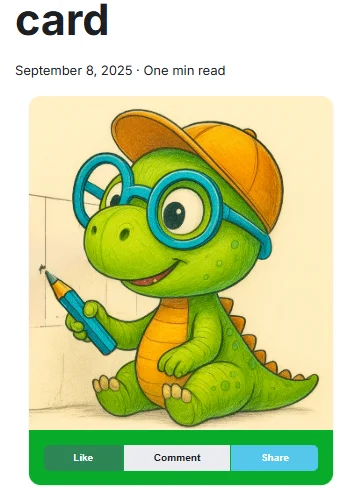
<div className="container"> <div className="row padding-bottom--xl"> <div className="col col--6"> <div className=""> <Card> <CardImage cardImageUrl="/img/docux.png" /> <CardFooter style={{ backgroundColor: "#07ac2aff", color: "#eeff00ff" }} className="text--center" > <div className="button-group button-group--block"> <button className="button button--primary button--sm">Like</button> <button className="button button--secondary button--sm">Comment</button> <button className="button button--info button--sm">Share</button> </div> </CardFooter> </Card> </div> </div> </div></div>This code renders a card component with an image and a footer containing three action buttons (Like, Comment, Share). The card is placed inside a responsive grid layout that takes up half the width of its container, with some padding below it.
If you run your blog right now, you should get this:
Note
If you want to retrieve the cute dino image, just grab it from here https://github.com/Juniors017/docux-blog/blob/main/static/img/docux.webp and store it in your /static/img folder with docux.webp as a name.
You can reuse any other image for sure.
Nice, it works. Let's continue with a practical sample
In this article, we'll override the standard page with the list of tags. As you know, natively, Docusaurus can display a page with the list of tags used across your articles if you access the /blog/tags page. So for my own blog, the page is https://www.avonture.be/blog/tags and you'll get something like this:

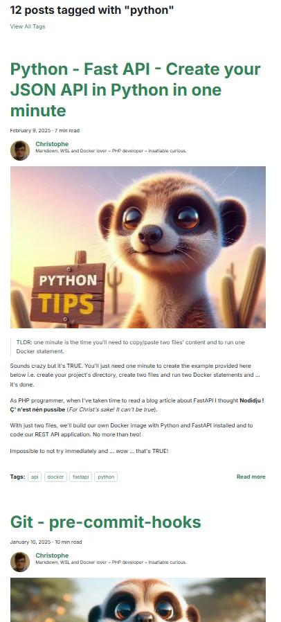
By clicking on a specific tag, Docusaurus will show a list of posts for that tag and we'll change this.
For instance, this:
Information
It can be nice but ... OK, I have to scroll a lot before seeing all articles and find the one that might interest me.
We'll change this to a list of post cards. As an example, on my blog, I'm also writing about python and here is how I'm rendering the page:

This concrete example will allow us to implement two Docusaurus concepts: the concept of plugins and that of components.
Overriding the /blog/tags/tag page by creating a plugin
Please create the file here above.
/** * Docusaurus Plugin: tag-route * * Registers the `/blog/tags/<slug>` pages rendered by `TagArticlesPage`. * * Why one route per tag instead of a single `/blog/tags/:tag` (TODO 0092): * Docusaurus's `handleBrokenLinks` resolves links against the list of *registered* * routes, and a parameterized path matches nothing there. With a single `:tag` route * every `<Link to="/blog/tags/docker">` in the corpus was reported as broken, which is * why `onBrokenLinks` had to be set to "ignore" site-wide — and a genuinely dead link * then went out silently with it. Enumerating the real tags at build time makes those * links resolvable, so link checking can be switched back on. * * Note this is *not* the blog plugin's own tag listing: that one lives at * `/blog/tags/tags/<slug>` (the doubled segment comes from blog/tags.yml's `permalink` * values being prefixed with the `/blog/tags` base), so the two never collide. */
const path = require("path");const { normalizeUrl } = require("@docusaurus/utils");const { listTagSlugs } = require("../lib/blog-taxonomy.cjs");
module.exports = function (context) { return { name: "docusaurus-plugin-tag-route", // Routes are enumerated from article frontmatter, so a new tag/series would // otherwise only get a route on the next dev-server restart. Watching the corpus // makes `yarn start` pick it up on save, like the parameterized route used to. getPathsToWatch() { return [path.join(context.siteDir, "blog", "**", "index.{md,mdx}")]; }, async contentLoaded({ actions }) { for (const slug of listTagSlugs(context.siteDir)) { actions.addRoute({ // MUST go through `baseUrl`: under a non-default locale it becomes `/fr/`, and a // hardcoded `/blog/tags/<slug>` registers a route the locale-prefixed links never // reach. That mismatch reported 2520 broken links on the `fr` build — the routes // existed as `/blog/tags/<slug>` while every link pointed at // `/fr/blog/tags/<slug>`. See TODO 0119. path: normalizeUrl([context.baseUrl, "blog/tags", slug]), component: "@site/src/components/Blog/Tags/TagArticlesPage", exact: true, }); } }, };};This Docusaurus plugin creates individual routes for each blog tag at build time, rather than using a single parameterized route. This approach allows Docusaurus's link checker to properly validate tag links, whereas a parameterized route like `/blog/tags/:tag` wouldn't match against the list of registered routes and would incorrectly flag all tag links as broken.
Take a few seconds to read this short script: as you can see that one will tell Docusaurus to no longer use its own standard /blog/tags/:tag page but ours (i.e. src/components/Blog/Tags/TagArticlesPage). Let's create that one.
Creating the TagArticlesPage
Please create the file below. It's the TagArticlesPage function that'll be called by Docusaurus when it displays a specific tag.
import type { JSX } from "react";import { createSlug } from "@site/src/components/Blog/utils/slug";import { useBlogMetadata } from "@site/src/components/Blog/utils/posts";import { useLocation, matchPath } from "@docusaurus/router";import useDocusaurusContext from "@docusaurus/useDocusaurusContext";import { useBaseUrlUtils } from "@docusaurus/useBaseUrl";import Layout from "@theme/Layout";import Link from "@docusaurus/Link";import Translate, { translate } from "@docusaurus/Translate";import styles from "./styles.module.css";import PostCard from "@site/src/components/Blog/PostCard";import Head from "@docusaurus/Head";import FollowFeed from "@site/src/components/FollowFeed";import { useTagLabel } from "@site/src/components/Blog/utils/tagsI18n";import { useSourceLocaleUrls } from "@site/src/components/Blog/utils/localeUrls";
type Tag = string | { label: string };
export default function TagArticlesPage(): JSX.Element { const location = useLocation(); // Hooks must run before any early return. const posts = useBlogMetadata(); const tagLabel = useTagLabel(); const { isDefaultLocale, sourceLabel, sourceLocale, sourceUrl } = useSourceLocaleUrls(); const { withBaseUrl } = useBaseUrlUtils();
// The pattern MUST carry `baseUrl`: under the `fr` locale the pathname is `/fr/blog/tags/<slug>` // and a hardcoded pattern silently matches nothing, rendering the "not found" branch on a // perfectly valid page (TODO 0119). const { siteConfig } = useDocusaurusContext(); const base = siteConfig.baseUrl.replace(/\/$/, ""); const match = matchPath<{ slug: string }>(location.pathname, { path: `${base}/blog/tags/:slug`, exact: true, }); const rawTag = match?.params?.slug;
if (!rawTag) { return ( <Layout> <div className="container"> <p> <Translate id="blog.tagPage.noTag">No tag specified.</Translate> </p> <Link to="/blog/tags"> <Translate id="blog.tagPage.backToTags"> Go back to all tags </Translate> </Link> </div> </Layout> ); }
// Local helper, unrelated to `useTagLabel`: it reads the raw value out of a front-matter // entry, which may be a bare string or a `{ label }` object. What comes out is the KEY. const getTagKey = (t: Tag) => (typeof t === "string" ? t : t.label);
// Find original tag name based on slug let displayTag = rawTag; for (const post of posts) { const foundTag = (post.tags || []).find( (t) => createSlug(getTagKey(t)) === rawTag ); if (foundTag) { displayTag = getTagKey(foundTag); break; } }
// `displayTag` is the front-matter KEY; this is what the reader sees. Resolving it here, once, // also closes the inconsistency noted below: the <h1> used to print the raw key ("ai") while // the feed button right under it printed the real label ("Artificial Intelligence (AI)"). const displayLabel = tagLabel(displayTag);
// Filter and sort posts by slug-matched tag (most recent first) const taggedPosts = posts .filter((post) => post.tags?.some((t) => createSlug(getTagKey(t)) === rawTag) ) .sort((a, b) => new Date(b.date).getTime() - new Date(a.date).getTime()); // Descending
if (taggedPosts.length === 0) { return ( <Layout title={translate( { id: "blog.tagPage.metaTitle", message: "Tag: {label}" }, { label: displayLabel } )} > <div className="container margin-top--lg margin-bottom--lg text--center"> <h2> <Translate id="blog.tagPage.notFound" values={{ label: displayLabel }} > {'No articles found with tag "{label}"'} </Translate> </h2> <Link to="/blog/tags"> <Translate id="blog.tagPage.browseTags">Browse all tags</Translate> </Link> </div> </Layout> ); }
const feedUrl = `/blog/tags/${rawTag}/rss.xml`;
return ( <Layout title={translate( { id: "blog.tagPage.metaTitle", message: "Tag: {label}" }, { label: displayLabel } )} > <div className="container margin-top--lg margin-bottom--lg"> <h1> <Translate id="blog.tagPage.title" values={{ label: displayLabel }}> {"Articles tagged: {label}"} </Translate> </h1> {/* This route is registered by docusaurus-plugin-tag-route, not by the blog plugin, so Docusaurus injects no feed autodiscovery of its own here — same reasoning as src/components/MarkdownAlternate. */} <Head> {/* `feedUrl` is a hand-built path to a per-locale static file, so it needs the prefix; the second <link> points at the source language, which covers the whole blog. Helmet de-duplicates <link> on `href`, so both are kept. */} <link rel="alternate" type="application/rss+xml" href={withBaseUrl(feedUrl)} title={translate( { id: "feed.linkTitle", message: "{name} — RSS feed" }, { name: displayLabel }, )} /> {!isDefaultLocale && ( <link rel="alternate" type="application/rss+xml" href={sourceUrl(feedUrl)} hrefLang={sourceLocale} title={translate( { id: "feed.linkTitleSourceBlog", message: "{name} — RSS feed ({language} — the whole blog)", }, { name: displayLabel, language: sourceLabel }, )} /> )} </Head> <FollowFeed feedUrl={feedUrl} label={displayLabel} /> <div className={styles.postRow}> {taggedPosts.map((post) => ( <PostCard key={post.permalink} post={post} /> ))} </div> </div> </Layout> );}This component renders a blog tag page that displays all articles with a specific tag. It first extracts the tag slug from the URL, looks up the original tag name from blog post metadata, filters posts that match that tag, and displays them in a grid along with RSS feed links. If no tag is specified or no posts exist for that tag, it shows an appropriate error message.
As you can see at the very top of the TagArticlesPage.tsx file, we're importing a few files. Some already exist in your Docusaurus site; some should be created.
There are three files we should create
The slug generator
/** * Converts a string into a URL-friendly slug. * * This function: * - Converts the string to lowercase * - Normalizes accented characters (e.g., accented e to plain e) * - Removes diacritics and special characters * - Replaces spaces with hyphens * - Collapses multiple hyphens into one * - Trims leading and trailing hyphens * * @param text - The input string to convert. * @returns The slugified version of the input. */export function createSlug(text: string): string { return text .replace(/([a-z0-9])([A-Z])/g, "$1-$2") // camelCase to kebab-case .toLowerCase() .normalize("NFD") // Decomposes accented characters .replace(/[\u0300-\u036f]/g, "") // Removes diacritics .replace(/[^a-z0-9\s-]/g, "") // Removes special characters .replace(/\s+/g, "-") // Replaces spaces with hyphens .replace(/-+/g, "-") // Collapses multiple hyphens .replace(/^-+|-+$/g, ""); // Trims leading/trailing hyphens}This function transforms any string into a URL-safe slug by converting it to lowercase, removing accents and special characters, replacing spaces with hyphens, and cleaning up extra hyphens. It handles common cases like camelCase input and ensures the output is clean and web-friendly.
The getBlogMetaData function
We need a function to loop all our existing blog posts (all .md or .mdx files under the blog folder) and collect information like the post title, image, slug and so on.
/** * 🧠 getBlogMetadata * * Extracts metadata from all MDX blog posts located in the `/blog` directory. * Uses Webpack's `require.context` to dynamically load and parse frontmatter * from each post, returning a structured array of metadata objects. * * 🔍 Behavior: * - Resolves permalinks based on `slug` or folder structure * - Normalizes image paths for static assets * - Filters out invalid or missing entries * * 📦 Returned metadata includes: * - `title`: Post title * - `description`: Short summary * - `image`: Resolved image path * - `draft`: Boolean flag for unpublished posts * - `unlisted`: Boolean flag for hidden posts * - `permalink`: URL path to the post * - `tags`: Array of tags * - `mainTag`: Primary tag (optional); used by the RelatedBlogPost component * - `authors`: Array of author names * - `date`: Publication date * - `series`: Series name (optional); used by the SeriesBlogPost component * * 🛠️ Usage: * ```ts * import { getBlogMetadata } from './getBlogMetadata'; * const posts = getBlogMetadata(); * ``` * * ⚠️ Note: * This function is intended for use in static site generation or client-side rendering * where Webpack's `require.context` is available. */
export interface BlogPostMetadata { title: string; description?: string; image?: string; draft: boolean; unlisted: boolean; permalink: string; tags: string[]; mainTag: string | null; authors: string[]; date?: string; series: string | null;}
const posts = require.context("../../../../blog", true, /\.mdx?$/);
export function getBlogMetadata(): BlogPostMetadata[] { return posts .keys() .map((key): BlogPostMetadata => { const post = posts(key) as { frontMatter: Record<string, unknown> };
const dir = key.replace(/\/index\.mdx?$/, "").replace(/^\.\//, "");
let permalink: string; if (typeof post.frontMatter.slug === "string") { permalink = post.frontMatter.slug.startsWith("/") ? post.frontMatter.slug : `/blog/${post.frontMatter.slug.replace(/^\//, "")}`; } else { permalink = `/blog/${dir}/`; }
let imageUrl = post.frontMatter.image as string | undefined; if (imageUrl && imageUrl.startsWith("./")) { imageUrl = `/blog/${dir}/${imageUrl.replace("./", "")}`; }
return { title: post.frontMatter.title as string, description: post.frontMatter.description as string | undefined, image: imageUrl, draft: Boolean(post.frontMatter.draft), unlisted: Boolean(post.frontMatter.unlisted), permalink, tags: (post.frontMatter.tags as string[]) || [], mainTag: (post.frontMatter.mainTag as string) || null, authors: (post.frontMatter.authors as string[]) || [], date: post.frontMatter.date as string | undefined, series: (post.frontMatter.series as string) || null, }; }) .filter(Boolean);}This function scans the blog directory for MDX files and extracts metadata from the frontmatter of each post. It normalizes the data by resolving permalinks (using either a custom slug or the folder structure), fixing relative image paths, and converting fields to the correct types, then returns a filtered array of structured blog post metadata objects.
Our PostCard component
And, finally, we need our PostCard component; the one that will display a blog post as a card.
You can see, in the top of the code, that we're importing a few parts of the Card component of Docux.
/** * ♣️ PostCard component * * A reusable Docusaurus component that displays a blog post preview card. * It shows the post image (with fallback), title (as a link), and description. * * Accessibility: * - The title is wrapped in a semantic link with an aria-label for screen readers. * - The image includes alt and title attributes. * * Styling: * - Uses Infima utility classes for layout and spacing. * - Custom styles can be applied via `styles.module.css`. * * Location: src/components/Blog/PostCard/index.tsx */
import type { JSX } from "react";import Card from "@site/src/components/Card";import CardBody from "@site/src/components/Card/CardBody";import CardImage from "@site/src/components/Card/CardImage";import Link from "@docusaurus/Link";import styles from "./styles.module.css";
interface FormattedDateProps { date?: string; layout: "big" | "small";}
/** Renders a formatted date string. */function FormattedDate({ date, layout }: FormattedDateProps): JSX.Element | null { if (!date) { return null; } return ( <p className={layout === "small" ? "" : styles.date} style={layout === "small" ? { color: "#888", fontSize: "0.95em", marginBottom: 8 } : {}} > <span> {new Date(date).toLocaleDateString("en-US", { year: "numeric", month: "long", day: "numeric", })} </span> </p> );}
interface Post { permalink: string; image?: string; title: string; description?: string; date?: string;}
interface Props { post: Post; layout?: "big" | "small"; defaultImage?: string;}
export default function PostCard({ post, layout = "big", defaultImage = "/img/default.jpg",}: Props): JSX.Element { const { permalink, image, title, description, date } = post;
if (layout === "small") { return ( <div className="col col--4" style={{ marginBottom: "2rem", display: "flex" }}> <div className="card" style={{ width: "100%", display: "flex", flexDirection: "column", height: "100%", }} > <div className="card__image"> <img src={image || defaultImage} alt={title} style={{ width: "100%", height: 180, objectFit: "cover", borderTopLeftRadius: 8, borderTopRightRadius: 8, }} /> </div> <div className="card__body" style={{ flex: 1 }}> <h3> <Link to={permalink}>{title}</Link> </h3> {description && ( <div style={{ color: "#6c63ff", fontWeight: "bold", marginBottom: 6, }} > {description} </div> )} <FormattedDate date={date} layout={layout} /> </div> <div className="card__footer" style={{ textAlign: "right" }}> <Link className="button button--primary button--sm" to={permalink}> Read more </Link> </div> </div> </div> ); }
// Default "big" layout return ( <div className="col col--3 margin-bottom--lg"> <Card shadow="md"> <CardImage cardImageUrl={image || defaultImage} alt={title} title={title} /> <CardBody className="padding-vert--md text--center" textAlign="center"> <h3> <Link href={permalink} aria-label={`Read article: ${title}`}> {title} → </Link> </h3> {description && <p className={styles.description}>{description}</p>} <FormattedDate date={date} layout={layout} /> </CardBody> </Card> </div> );}This PostCard component displays a preview of a blog post in two different layouts: 'small' (a compact card with image, title, description, and read button) or 'big' (a centered card using custom Card subcomponents). It pulls the post's permalink, image, title, description, and date from props, falling back to a default image if none is provided, and formats the date for display.
Finally, we'll create a CSS file to allow us to do some customization:
.description { font-size: 12px;}
.date { color: #888; font-size: 0.95em; margin-bottom: 8; font-style: italic;}These are two CSS style classes that format text elements—one for descriptions and one for dates. The date class makes text smaller, gray, italicized, and adds a bottom margin, while the description class just sets a small font size.
We need to load our plugin
We're almost done.
Remember, the very first file we've created was plugins/docusaurus-plugin-tag-route/index.cjs; a plugin.
Please edit your existing docusaurus.config.js file like below illustrated:
import pluginTagRoute from "./plugins/docusaurus-plugin-tag-route/index.cjs";
const config = { // [...] plugins: [ // [...] [pluginTagRoute, {}], ], // [...]};This code imports a custom Docusaurus plugin for handling tag routes and then registers it in the site configuration by adding it to the plugins array with an empty options object. Docusaurus will load and execute this plugin when the site builds.
i.e.
- You have to import the plugin at the top of your file
- Then in the
pluginssection, you have to add a new line to load your imported plugin.
We're almost finished!
Caution
Please stop and restart your Docusaurus server. On my case (I'm using Docker), I just need to stop and restart my container.
If everything is going fine after the restart (no error message), please visit your website tags page and open a tag. You should now see your posts as cards.
Congratulations!
In next articles, we'll reuse this concept of post cards. Stay tuned!
Extra
If you want your blog posts to be listed from the newest one to the oldest, please use this script.
But make sure every blog post you have has a date field in its YAML front matter.
import { createSlug } from "@site/src/components/Blog/utils/slug";import { getBlogMetadata } from "@site/src/components/Blog/utils/posts";import { useLocation } from "@docusaurus/router";import Layout from "@theme/Layout";import Link from "@docusaurus/Link";import PostCard from "@site/src/components/Blog/PostCard";
function getTagFromPathname(pathname: string): string | null { const match = pathname.match(/\/blog\/tags\/([^/]+)/); return match ? decodeURIComponent(match[1]) : null;}
export default function TagArticlesPage() { const location = useLocation(); const rawTag = getTagFromPathname(location.pathname);
if (!rawTag) { return ( <Layout> <div className="container"> <p>No tag specified.</p> <Link href="/blog/tags">Go back to all tags</Link> </div> </Layout> ); }
const posts = getBlogMetadata();
// Find original tag name based on slug const allTags = Array.from(new Set(posts.flatMap((post) => post.tags || []))); const displayTag = allTags.find((t) => createSlug(String(t)) === rawTag) || rawTag;
// highlight-start // Filter and sort posts by slug-matched tag (most recent first) const taggedPosts = posts .filter((post) => post.tags?.some((t) => createSlug(String(t)) === rawTag)) .sort((a, b) => new Date(b.date).getTime() - new Date(a.date).getTime()); // Descending // highlight-end
if (taggedPosts.length === 0) { return ( <Layout title={`Tag: ${displayTag}`}> <div className="container margin-top--lg margin-bottom--lg text--center"> <h2>No articles found with tag "{displayTag}"</h2> <Link href="/blog/tags">Browse all tags</Link> </div> </Layout> ); }
return ( <Layout title={`Tag: ${displayTag}`}> <div className="container margin-top--lg margin-bottom--lg"> <h1>Articles tagged: {displayTag}</h1> <div className="row"> {taggedPosts.map((post) => ( <PostCard key={post.title} post={post} /> ))} </div> </div> </Layout> );}This component displays all blog posts that match a specific tag, extracting the tag name from the URL path. It retrieves all blog posts, filters them by the requested tag, sorts them by date with newest first, and renders them as a list of cards. If no tag is specified in the URL or no posts match the tag, it shows an appropriate message.
This article is part of the Display Docusaurus Blog Posts as Cards - A Step-by-Step Guide series:
- Displaying related posts below our Docusaurus article
- Display Docusaurus Blog Posts as Cards - A Step-by-Step Guide
Loading comments…
Related posts


Drawing a Map of My Own Blog
October 8, 2026
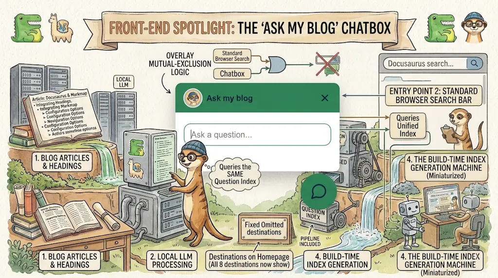

Ask My Blog: Turning 259 Articles Into 2,160 Searchable Questions
September 28, 2026

Add a "Copy as Markdown" Button to Your Docusaurus Blog
September 10, 2026
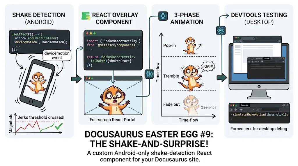
Shake Your Phone, Startle the Meerkat
August 27, 2026