Showing the changelog of your post
Showing the changelog of your post

This article is part of the Creating Docusaurus components series:
- Change how Docusaurus will create img tags
- Overrides the generation of img tags with Docusaurus
- Organize Your Docusaurus Content with a Custom Series Component
- Providing a go to the top button in Docusaurus posts
- Creating a search&replace plugin for Docusaurus
- A component for showing code snippets in a Docusaurus blog
- A Docusaurus component that alerts readers the article is over a year old
- Showing the changelog of your post
- Inject ASCII Art in any HTML pages rendered by Docusaurus
- Best Practice - Customizing the Docusaurus RSS Feed for Full Content & Images
- Running some checks on your Docusaurus images
- Tags management in Docusaurus
- Automating TL;DR Summaries with Gemini AI
- Introducing the ProjectSetup Component - A Standardized Way to Share Project Structures
- How to indicate AI-assisted content in a Docusaurus blog
- Bring Your CLI Tutorials to Life with a Typewriter Terminal
- Meerkat Mischief: Sprinkling Easter Eggs Across my Blog
- AI-Powered Code Tooltips in Docusaurus — Explain Like I'm Five
- Adding Reader Reactions to Your Docusaurus Blog
- Your Blog Is Unreadable to an AI. Here Is the Fix.
- Shake Your Phone, Startle the Meerkat
- Add a "Copy as Markdown" Button to Your Docusaurus Blog
- Ask My Blog: Turning 259 Articles Into 2,160 Searchable Questions
- The Third Door: A Floating Chat Bubble, and the Feature Nobody Could Find
- Drawing a Map of My Own Blog
- Let Readers Flag Issues — A Multi-Type Feedback Widget for Docusaurus
This article demonstrates how to implement a detailed changelog for Docusaurus blog posts, extending beyond the default last_update field. It involves creating a custom React component that parses an updates array from the post's YAML frontmatter, allowing for multiple dated notes. The solution requires creating this component and then swizzling the BlogPostItem/Content theme to automatically display the update history.
As a blog author, no doubt, it happens that you'll edit previous posts to add / clarify some part. Or just remove obsolete information.
Docusaurus supports the last_update (source) entry like illustrated below, but you can only specify one date and no description.
last_update:
  date: 1/1/2000
  author: custom author name
Let's create a very small component to enhance this.
The Result
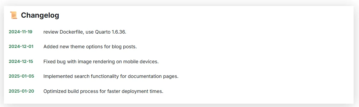
Once the component is wired in (covered below), adding an updates entry to a post's frontmatter renders this, automatically:
Why It Works
- The component reads an
updatesarray straight from the post's YAML frontmatter — no separate changelog file to maintain. - Unlike Docusaurus's native
last_update, it accepts multiple entries, each with its owndateandnote. - Once swizzled in, it displays automatically on every post that has an
updatesentry — nothing to call manually per-article.
Installation
We'll have to create a new component, and to swizzle the BlogPostPage, so the component will be executed automatically.
Create the Updated component
Please create a new folder called src/components/Blog/Updated where you'll create two files: index.tsx and styles.module.css.
import type { JSX } from "react";import clsx from "clsx";import Translate from "@docusaurus/Translate";import useDocusaurusContext from "@docusaurus/useDocusaurusContext";import { parseMarkdown } from "@site/src/components/Blog/utils/markdown";
import styles from "./styles.module.css";
interface UpdateEntry { date: string; note: string;}
interface Props { updates?: UpdateEntry[];}
export default function Updated({ updates }: Props): JSX.Element | null { const { i18n } = useDocusaurusContext();
if (!updates || updates.length === 0) return null;
const sortedUpdates = [...updates].sort( (a, b) => new Date(b.date).getTime() - new Date(a.date).getTime(), );
return ( <div className={clsx(styles.revisionHistoryContainer, "margin-top--lg")}> <h3 className={styles.revisionHistoryTitle}> <span aria-hidden="true">📜</span>{" "} <Translate id="blog.updated.changelog">Changelog</Translate> </h3> <div className={styles.timeline}> {sortedUpdates.map((update, i) => { const isLatest = i === 0; return ( <div key={`${update.date}-${i}`} className={clsx( styles.timelineItem, isLatest && styles.timelineItemLatest, )} > <div className={styles.timelineIcon}> <span aria-hidden="true">{isLatest ? "✨" : "📅"}</span> </div> <div className={styles.timelineContent}> <div className={styles.timelineDate}> <time dateTime={update.date}> {new Date(update.date).toLocaleDateString( i18n.currentLocale, { year: "numeric", month: "long", day: "numeric" }, )} </time> {isLatest && ( <span className={styles.latestBadge}> <Translate id="blog.updated.latest">Latest</Translate> </span> )} </div> <div className={styles.timelineDescription} dangerouslySetInnerHTML={{ __html: parseMarkdown(update.note), }} /> </div> </div> ); })} </div> </div> );}This component displays a changelog or update history for a blog post. It takes an array of updates with dates and notes, sorts them by date (newest first), and renders them as a timeline where the most recent update is highlighted with a sparkle emoji and a 'Latest' badge. If there are no updates, it returns nothing.
/* * Updated — the timeline structure is good and is kept as-is. What changed: * it no longer borrows --card-radius from PostCard's module (see that file), * the timeline node is the shared .mk-dot, and the title is an eyebrow rather * than a 1.1rem bold heading competing with the article's own. */
.revisionHistoryContainer { composes: mk-surface from global; padding: 1.25rem 1.375rem;}
.revisionHistoryTitle { composes: mk-eyebrow from global; display: flex; gap: 0.5rem; align-items: center; margin: 0 0 1rem;}
.timeline { position: relative;}
/* The connecting line: centred on the 26px node (13px) rather than the old * 30px one (15px). */.timeline::before { position: absolute; top: 4px; left: 13px; width: 2px; height: calc(100% - 8px); content: ""; background: var(--mk-border);}
.timelineItem { position: relative; display: flex; min-height: 26px; margin-bottom: 1.25rem;}
.timelineItem:last-child { margin-bottom: 0;}
.timelineIcon { composes: mk-dot from global; position: absolute; top: 0; left: 0; z-index: 1; color: var(--mk-on-line); background: var(--mk-n-300);}
/* The latest revision is the only filled terracotta node, with a halo in the * key tone — the halo used to be a color-mix() of the primary at 15%. */.timelineItemLatest .timelineIcon { background: var(--mk-primary); box-shadow: 0 0 0 4px var(--mk-key-bg);}
.timelineContent { flex: 1; padding-top: 0.15rem; padding-left: 40px;}
.timelineDate { display: flex; flex-wrap: wrap; gap: 0.5rem; align-items: center; margin-bottom: 0.3rem; font-size: 0.85rem; font-weight: 600; color: var(--mk-ink-soft); font-variant-numeric: tabular-nums;}
.timelineItemLatest .timelineDate { color: var(--mk-primary);}
.latestBadge { composes: mk-pill from global;}
.timelineDescription { font-size: 0.95rem; line-height: 1.6; color: var(--mk-ink);}This stylesheet styles a revision history timeline component. It creates a vertical timeline with connected dots representing different revisions, where the latest revision gets special styling with a filled dot and a glowing halo. The layout uses flexbox to position content next to timeline nodes, and CSS custom properties to theme colors consistently.
Shortly, the component will check if the YAML frontmatter of your blog post contains an updates entry. If this is the case, it will parse it. It has to be an array with two pieces of information: a date and a note.
Override the BlogPostPage template
Please first check if you don't have the src/theme/BlogPostItem/Content/index.js file yet. If you're a reader of this blog and already have customized Docusaurus, perhaps you have it already: the "this article is over a year old" component swizzles that very same file.
If not, please start a console and run yarn swizzle @docusaurus/theme-classic BlogPostItem/Content.
From now, you'll have a new file on your disk: src/theme/BlogPostItem/Content/index.js.
We'll have to inject our new Updated component, please edit the index.js file to inject the required code.
Below are the minimum lines to add at the right place in your own file.
// [...]import Updated from "@site/src/components/Blog/Updated";
export default function BlogPostContent({ children }) { // [...] const { metadata, isBlogPostPage } = useBlogPost(); // [...]
return ( <div> // [...] {isBlogPostPage && ( <> // [...] <Updated updates={metadata.frontMatter.updates} /> </> )} // [...] </div> );}This React component renders blog post content and conditionally displays an 'Updated' component when viewing a full blog post page. It retrieves metadata about the blog post using a custom hook and passes update information down to a child component that shows when the post was last modified.
More Demos
Use the component
Now, just edit any of your existing posts and add an updates entry in your YAML front matter like for instance
updates:
  - date: 2024-11-19
    note: review Dockerfile, use Quarto 1.6.36.
  - date: 2024-12-01
    note: Added new theme options for blog posts.
  - date: 2024-12-15
    note: Fixed bug with image rendering on mobile devices.
  - date: 2025-01-05
    note: Implemented search functionality for documentation pages.
  - date: 2025-01-20
    note: Optimized build process for faster deployment times.
Just save the post and refresh your web page. If you've done everything correctly, you'll see the information in your browser — the same rendering shown at the top of this article.
Feel free to update the src/components/Blog/Updated/styles.module.css to match your own styling preferences.
Conclusion
A small parsed frontmatter array and one swizzled theme file replace last_update's single date with a real, multi-entry changelog — readers see exactly what changed and when, without you maintaining a separate file.
It pairs nicely with the banner warning readers that an article is over a year old: the first says what changed, the second says when it last did.
This article is part of the Creating Docusaurus components series:
- Change how Docusaurus will create img tags
- Overrides the generation of img tags with Docusaurus
- Organize Your Docusaurus Content with a Custom Series Component
- Providing a go to the top button in Docusaurus posts
- Creating a search&replace plugin for Docusaurus
- A component for showing code snippets in a Docusaurus blog
- A Docusaurus component that alerts readers the article is over a year old
- Showing the changelog of your post
- Inject ASCII Art in any HTML pages rendered by Docusaurus
- Best Practice - Customizing the Docusaurus RSS Feed for Full Content & Images
- Running some checks on your Docusaurus images
- Tags management in Docusaurus
- Automating TL;DR Summaries with Gemini AI
- Introducing the ProjectSetup Component - A Standardized Way to Share Project Structures
- How to indicate AI-assisted content in a Docusaurus blog
- Bring Your CLI Tutorials to Life with a Typewriter Terminal
- Meerkat Mischief: Sprinkling Easter Eggs Across my Blog
- AI-Powered Code Tooltips in Docusaurus — Explain Like I'm Five
- Adding Reader Reactions to Your Docusaurus Blog
- Your Blog Is Unreadable to an AI. Here Is the Fix.
- Shake Your Phone, Startle the Meerkat
- Add a "Copy as Markdown" Button to Your Docusaurus Blog
- Ask My Blog: Turning 259 Articles Into 2,160 Searchable Questions
- The Third Door: A Floating Chat Bubble, and the Feature Nobody Could Find
- Drawing a Map of My Own Blog
- Let Readers Flag Issues — A Multi-Type Feedback Widget for Docusaurus
Loading comments…
Related posts

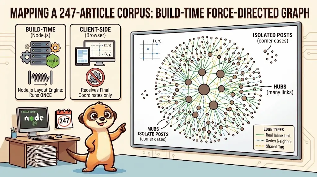
Drawing a Map of My Own Blog
October 8, 2026
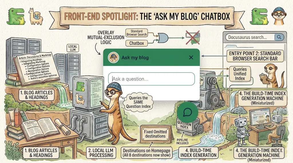
Ask My Blog: Turning 259 Articles Into 2,160 Searchable Questions
September 28, 2026
Add a "Copy as Markdown" Button to Your Docusaurus Blog
September 10, 2026