Providing a go to the top button in Docusaurus posts
Learn how to easily add a "go to the top" button, often with a fun animated icon, to your Docusaurus blog posts using a custom React component and theme override.

This article is over a year old but was reviewed on July 30, 2026 — the content is still accurate.
This article is part of the Creating Docusaurus components series:
- Change how Docusaurus will create img tags
- Overrides the generation of img tags with Docusaurus
- Organize Your Docusaurus Content with a Custom Series Component
- Providing a go to the top button in Docusaurus posts
- Creating a search&replace plugin for Docusaurus
- A component for showing code snippets in a Docusaurus blog
- A Docusaurus component that alerts readers the article is over a year old
- Showing the changelog of your post
- Inject ASCII Art in any HTML pages rendered by Docusaurus
- Best Practice - Customizing the Docusaurus RSS Feed for Full Content & Images
- Running some checks on your Docusaurus images
- Tags management in Docusaurus
- Automating TL;DR Summaries with Gemini AI
- Introducing the ProjectSetup Component - A Standardized Way to Share Project Structures
- How to indicate AI-assisted content in a Docusaurus blog
- Bring Your CLI Tutorials to Life with a Typewriter Terminal
- Meerkat Mischief: Sprinkling Easter Eggs Across my Blog
- AI-Powered Code Tooltips in Docusaurus — Explain Like I'm Five
- Adding Reader Reactions to Your Docusaurus Blog
- Your Blog Is Unreadable to an AI. Here Is the Fix.
- Shake Your Phone, Startle the Meerkat
- Add a "Copy as Markdown" Button to Your Docusaurus Blog
- Ask My Blog: Turning 259 Articles Into 2,160 Searchable Questions
- The Third Door: A Floating Chat Bubble, and the Feature Nobody Could Find
- Drawing a Map of My Own Blog
- Let Readers Flag Issues — A Multi-Type Feedback Widget for Docusaurus

This article is a quick tutorial on how to add a 'scroll to top' button to your Docusaurus blog. It walks you through implementing a custom <ScrollToTopButton> React component, including its CSS for styling. You'll learn how to override the default BlogPostItem theme component to automatically inject the button at the bottom of every blog post. The guide also provides tips on adding the button to other parts of your site, such as the blog archive or custom pages.
More on smartphones than on computers; it's pretty nice to have a Back to top of page button to avoid dislocating your thumb.
 Docux, a friend, recently developed this feature and I was really happy to add it, especially since it's terribly easy to use and adds a fun element; it's cool.
Just scroll down any page of this blog to see a little meerkat appear in the bottom right corner. Click on it and take the lift back to the top of the page.
What it looks like
Here is this very page, scrolled down. The meerkat sits in the bottom right corner, floating above your own content:
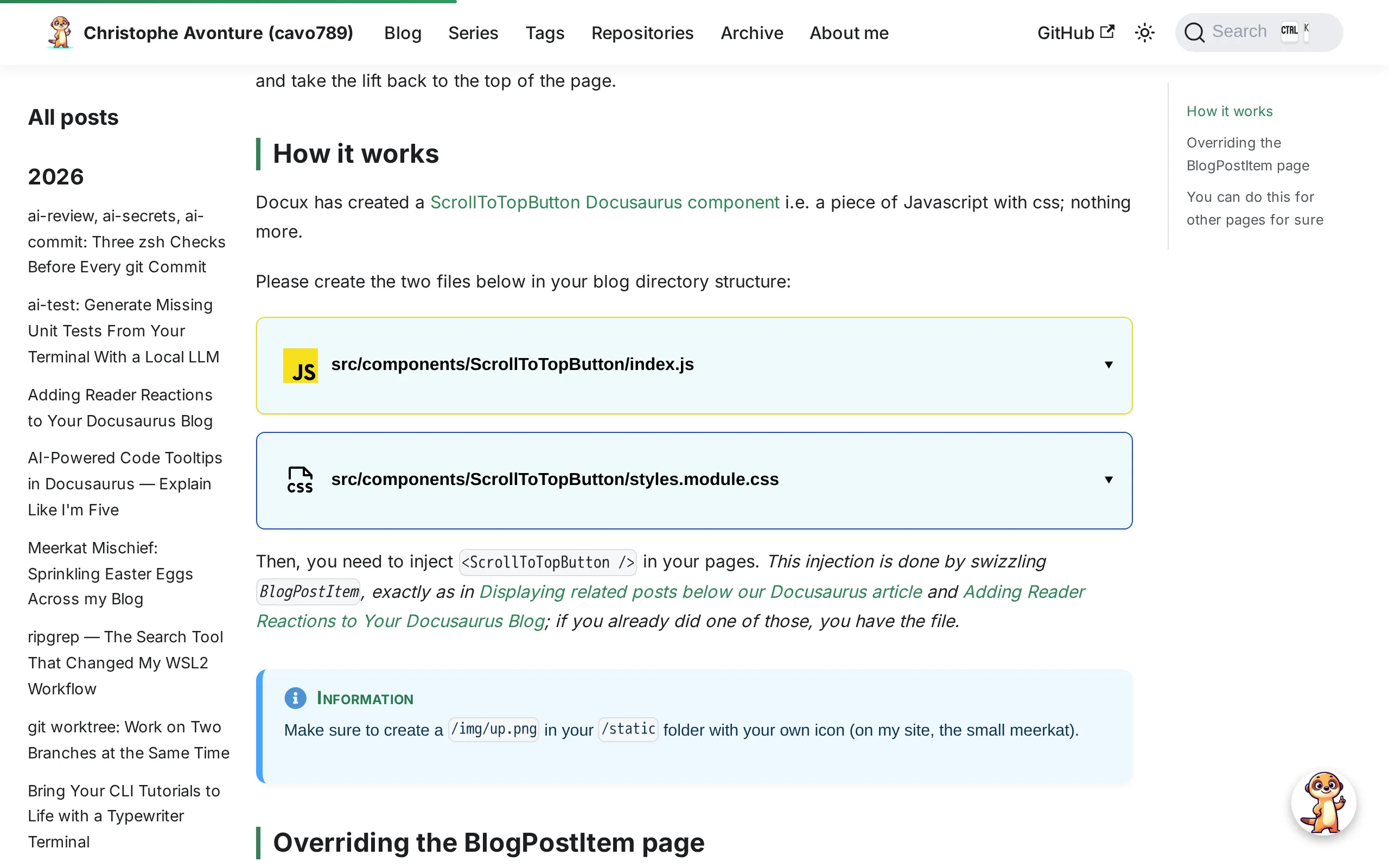
Up close, it's a round button holding whatever icon you hand it:

The button stays hidden until you've scrolled past 300 pixels, so a short page never shows it. Two files and one override, below.
How it works
Docux has created a ScrollToTopButton Docusaurus component i.e. a piece of Javascript with css; nothing more.
Please create the two files below in your blog directory structure:
import { useState, useEffect, type JSX } from "react";import clsx from "clsx";import { translate } from "@docusaurus/Translate";import styles from "./styles.module.css";import buttontop from "@site/static/img/meerkat/suricate_no_background.webp";
export default function ScrollToTopButton(): JSX.Element { const [isVisible, setIsVisible] = useState(false); const [fly, setFly] = useState(false);
useEffect(() => { const toggleVisibility = () => setIsVisible(window.scrollY > 300); window.addEventListener("scroll", toggleVisibility, { passive: true }); return () => window.removeEventListener("scroll", toggleVisibility); }, []);
const scrollToTop = () => { setFly(true); window.scrollTo({ top: 0, behavior: "smooth" });
setTimeout(() => setFly(false), 800); };
return ( <button type="button" className={clsx(styles.scrollBtn, isVisible && styles.show, fly && styles.fly)} onClick={scrollToTop} aria-label={translate({ id: "theme.common.scrollToTop", message: "Scroll to top", description: "The aria label for the scroll to top button", })} > <img src={buttontop} alt={translate({ id: "theme.common.scrollToTop", message: "Scroll to top", })} className="no-zoom" width="30" height="30" /> </button> );}This component renders a decorative button that scrolls the page back to the top when clicked. It only shows the button once you've scrolled down more than 300 pixels, and plays a brief animation when you click it. The button uses an image of a meerkat and includes proper accessibility labels for screen readers.
.scrollBtn { position: fixed; bottom: 30px; right: 30px; width: 60px; height: 60px; cursor: pointer; opacity: 0; visibility: hidden; transition: opacity 0.4s, visibility 0.4s; z-index: 1000; border: none; background: transparent; padding: 0;}
.scrollBtn img { width: 100%; height: 100%; object-fit: contain; border-radius: 50%; box-shadow: var(--mk-shadow-3); transition: transform 0.3s;}
.scrollBtn:hover img { transform: scale(1.1);}
/* Bouton visible après scroll */.scrollBtn.show { opacity: 1; visibility: visible;}
/* Animation "vol vers le haut" */.scrollBtn.fly img { animation: flyUp 0.8s ease-in forwards;}
@keyframes flyUp { 0% { transform: translateY(0) scale(1); opacity: 1; } 100% { transform: translateY(-300px) scale(0.6); opacity: 0; }}
/* The meerkat flying off the top of the page is the site's signature gesture, so it is kept — but it is pure decoration, and a reader who asked for less motion should get the plain jump. */@media (prefers-reduced-motion: reduce) { .scrollBtn.fly img { animation: none; }
.scrollBtn:hover img, .scrollBtn img { transition: none; transform: none; }}
@media (max-width: 600px) { .scrollBtn { width: 44px; height: 44px; bottom: 16px; right: 16px; }}This defines a scroll-to-top button that's hidden by default and appears when the user scrolls down. The button has a cute animation where it flies up and shrinks when clicked, but that animation is disabled for users who prefer less motion. On mobile devices, the button is made smaller and positioned closer to the corner.
Then, you need to inject <ScrollToTopButton /> in your pages. This injection is done by swizzling BlogPostItem, exactly as in Displaying related posts below our Docusaurus article and Adding Reader Reactions to Your Docusaurus Blog; if you already did one of those, you have the file.
Information
The component imports its icon on the very first lines: import buttontop from "@site/static/img/meerkat/suricate_no_background.webp". Point that import at your own square image in /static and you're done.
Overriding the BlogPostItem page
Please follow the "We need to override how the article is rendered by Docusaurus" chapter of a previous post.
You need to create the src/theme/BlogPostItem/index.js file.
If you don't want the long story; don't read that chapter and just create this file:
import React from 'react';import clsx from 'clsx';import {useBlogPost} from '@docusaurus/plugin-content-blog/client';import BlogPostItemContainer from '@theme/BlogPostItem/Container';import BlogPostItemHeader from '@theme/BlogPostItem/Header';import BlogPostItemContent from '@theme/BlogPostItem/Content';import BlogPostItemFooter from '@theme/BlogPostItem/Footer';// apply a bottom margin in list viewfunction useContainerClassName() { const {isBlogPostPage} = useBlogPost(); return !isBlogPostPage ? 'margin-bottom--xl' : undefined;}export default function BlogPostItem({children, className}) { const containerClassName = useContainerClassName(); return ( <BlogPostItemContainer className={clsx(containerClassName, className)}> <BlogPostItemHeader /> <BlogPostItemContent>{children}</BlogPostItemContent> <BlogPostItemFooter /> </BlogPostItemContainer> );}This component renders a blog post item by combining a header, content, and footer within a container. It uses a custom hook to determine whether we're viewing a single blog post page or a list of posts, and adds bottom margin spacing only when displaying posts in a list view.
Once you have it, please edit it since we need to inject the <ScrollToTopButton /> code.
Below, see the two highlighted lines you should add:
import React from 'react';import clsx from 'clsx';import {useBlogPost} from '@docusaurus/plugin-content-blog/client';import BlogPostItemContainer from '@theme/BlogPostItem/Container';import BlogPostItemHeader from '@theme/BlogPostItem/Header';import BlogPostItemContent from '@theme/BlogPostItem/Content';import BlogPostItemFooter from '@theme/BlogPostItem/Footer';// highlight-next-lineimport ScrollToTopButton from "@site/src/components/ScrollToTopButton";
// apply a bottom margin in list viewfunction useContainerClassName() { const {isBlogPostPage} = useBlogPost(); return !isBlogPostPage ? 'margin-bottom--xl' : undefined;}export default function BlogPostItem({children, className}) { const containerClassName = useContainerClassName(); return ( <BlogPostItemContainer className={clsx(containerClassName, className)}> <BlogPostItemHeader /> <BlogPostItemContent>{children}</BlogPostItemContent> <BlogPostItemFooter /> // highlight-next-line <ScrollToTopButton /> </BlogPostItemContainer> );}This component renders a blog post item by assembling several sub-components (header, content, footer) inside a container. It also adds a scroll-to-top button at the bottom and applies extra spacing when the post is displayed in a list view rather than on its own page.
We need to restart Docusaurus
Now, because we've just introduced an override, we need to restart our Docusaurus server so changes can be taken into account.
Run npm run start
If you're running Docusaurus locally, just run npm run start in your console.
If like me you're running Docusaurus thanks to Docker, just kill the container and run a new one.
You can do this for other pages for sure
On my site, I have an archive page. You want to use the <ScrollToTopButton /> button there too? Just swizzle the page by running yarn docusaurus swizzle @docusaurus/theme-classic BlogArchivePage in a console then update the index.js file as illustrated above.
If you have any other pages in your src/pages/ folder (like about.mdx, index.mdx, ...), no need to swizzle first, just directly add the two lines in these files too.
Conclusion
No more dislocated thumbs: one small component, one swizzled BlogPostItem, and every long article on your site gets a way back to the top. The fun part is that the icon is yours; mine waves at readers who scroll too far.
If you're building up your set of Docusaurus components, the next one worth adding is related posts below each article, which reuses the exact same override file.
This article is part of the Creating Docusaurus components series:
- Change how Docusaurus will create img tags
- Overrides the generation of img tags with Docusaurus
- Organize Your Docusaurus Content with a Custom Series Component
- Providing a go to the top button in Docusaurus posts
- Creating a search&replace plugin for Docusaurus
- A component for showing code snippets in a Docusaurus blog
- A Docusaurus component that alerts readers the article is over a year old
- Showing the changelog of your post
- Inject ASCII Art in any HTML pages rendered by Docusaurus
- Best Practice - Customizing the Docusaurus RSS Feed for Full Content & Images
- Running some checks on your Docusaurus images
- Tags management in Docusaurus
- Automating TL;DR Summaries with Gemini AI
- Introducing the ProjectSetup Component - A Standardized Way to Share Project Structures
- How to indicate AI-assisted content in a Docusaurus blog
- Bring Your CLI Tutorials to Life with a Typewriter Terminal
- Meerkat Mischief: Sprinkling Easter Eggs Across my Blog
- AI-Powered Code Tooltips in Docusaurus — Explain Like I'm Five
- Adding Reader Reactions to Your Docusaurus Blog
- Your Blog Is Unreadable to an AI. Here Is the Fix.
- Shake Your Phone, Startle the Meerkat
- Add a "Copy as Markdown" Button to Your Docusaurus Blog
- Ask My Blog: Turning 259 Articles Into 2,160 Searchable Questions
- The Third Door: A Floating Chat Bubble, and the Feature Nobody Could Find
- Drawing a Map of My Own Blog
- Let Readers Flag Issues — A Multi-Type Feedback Widget for Docusaurus
Loading comments…
Related posts
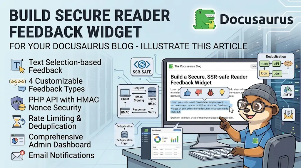
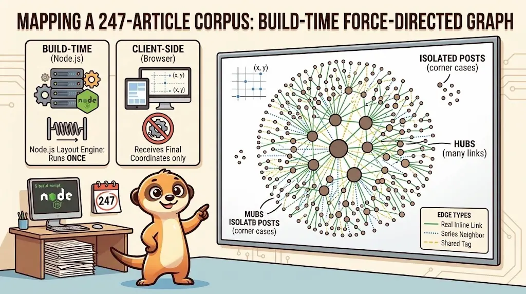
Drawing a Map of My Own Blog
October 8, 2026
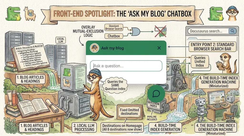
Ask My Blog: Turning 259 Articles Into 2,160 Searchable Questions
September 28, 2026
Add a "Copy as Markdown" Button to Your Docusaurus Blog
September 10, 2026
Shake Your Phone, Startle the Meerkat
August 27, 2026