A component for showing code snippets in a Docusaurus blog
Learn how to build a custom React component to embed dynamic code snippets in your Docusaurus blog for a more interactive reader experience.

This article is part of the Creating Docusaurus components series:
- Change how Docusaurus will create img tags
- Overrides the generation of img tags with Docusaurus
- Organize Your Docusaurus Content with a Custom Series Component
- Providing a go to the top button in Docusaurus posts
- Creating a search&replace plugin for Docusaurus
- A component for showing code snippets in a Docusaurus blog
- A Docusaurus component that alerts readers the article is over a year old
- Showing the changelog of your post
- Inject ASCII Art in any HTML pages rendered by Docusaurus
- Best Practice - Customizing the Docusaurus RSS Feed for Full Content & Images
- Running some checks on your Docusaurus images
- Tags management in Docusaurus
- Automating TL;DR Summaries with Gemini AI
- Introducing the ProjectSetup Component - A Standardized Way to Share Project Structures
- How to indicate AI-assisted content in a Docusaurus blog
- Bring Your CLI Tutorials to Life with a Typewriter Terminal
- Meerkat Mischief: Sprinkling Easter Eggs Across my Blog
- AI-Powered Code Tooltips in Docusaurus — Explain Like I'm Five
- Adding Reader Reactions to Your Docusaurus Blog
- Your Blog Is Unreadable to an AI. Here Is the Fix.
- Shake Your Phone, Startle the Meerkat
- Add a "Copy as Markdown" Button to Your Docusaurus Blog
- Ask My Blog: Turning 259 Articles Into 2,160 Searchable Questions
- The Third Door: A Floating Chat Bubble, and the Feature Nobody Could Find
- Drawing a Map of My Own Blog
- Let Readers Flag Issues — A Multi-Type Feedback Widget for Docusaurus
Changelog

This article guides you through creating a powerful <Snippet> component for Docusaurus to display code blocks. This custom component improves on native HTML by adding features like file-type-specific icons and custom styling. The tutorial shows how to build the React component, integrate it with an icon library, and then takes it a step further by creating a remark plugin. This plugin allows you to dynamically load code from source files directly into your articles, ensuring your snippets are always up-to-date without manual copy-pasting. You'll learn how to handle both relative and absolute file paths and register the plugin in your site's configuration.
If you're a regular reader of this blog, you know I'm sharing a lot of code snippets.
This component became the foundation of two others: ProjectSetup, which assembles several snippets into a downloadable project tree, and the ELI5 tooltips, which annotate the tricky lines of a snippet.
The HTML native way of doing this is by using the <summary> element (see official documentation).
Can we do something, perhaps not better but more esthetic?
The summary element
In pure HTML, we can use the <summary> DOM element like this:
<details>
  <summary>blog/index.md</summary>

  Hello world! Proud to be here!!!
</details>
Information
It works but ... can we do better. I think to f.i. add an icon based on the language type, also do color's distinction between language and much, much better, don't copy/paste the code anymore in the article but just read it from the disk.
In this article we'll learn how to create a Snippets component and get this look&feel:
<Snippet filename="blog/index.md"> Hello world! Proud to be here!!! </Snippet>
and here is the rendering:
Hello world! Proud to be here!!!
Creation of our Snippets component
Please create the src/components/Snippet/index.tsx file with this content:
import React, { useState, useRef, useEffect, useCallback, useMemo, useId, type CSSProperties, type JSX, type ReactNode,} from "react";import { createPortal } from "react-dom";import Prism from "prismjs";import { useTokenize } from "prism-react-renderer";// Eli5CodeBlock (below) needs its own Prism grammars registered on this exact// `prismjs` singleton — everything beyond markup/html/xml/css/clike/javascript// (Prism's default bundle) only exists here as a side effect of requiring its// component file. `prism-react-renderer` (peer-depends on "prismjs": "*", so// it shares this same module instance) registers `additionalLanguages` the// same way whenever a native `<CodeBlock>` renders — meaning `Prism.languages// .bash` etc. was previously only defined here if some *other* CodeBlock had// already rendered first in this process/session. Registering every grammar// `Eli5CodeBlock` can receive (see remark-snippet-loader's `extensionToLang`// map) unconditionally, here, makes that no longer order-dependent.// markup/html/xml/css/javascript need no entry — already in Prism's default// bundle (verified empirically).import "prismjs/components/prism-jsx";import "prismjs/components/prism-typescript";import "prismjs/components/prism-python";import "prismjs/components/prism-markup-templating"; // prism-php's own dependencyimport "prismjs/components/prism-php";import "prismjs/components/prism-bash";import "prismjs/components/prism-json";import "prismjs/components/prism-yaml";import "prismjs/components/prism-markdown";import "prismjs/components/prism-docker";import "prismjs/components/prism-ini";import "prismjs/components/prism-sql";
import CodeBlock from "@theme/CodeBlock";import IconCopy from "@theme/Icon/Copy";import IconSuccess from "@theme/Icon/Success";import LogoIcon from "@site/src/components/Blog/LogoIcon";import clsx from "clsx";import { useVarResolver } from "@site/src/components/Vars/store";import { substitutePlainText, substituteChildren,} from "@site/src/components/Vars/substitute";import VarToken from "@site/src/components/Vars/VarToken";import styles from "./styles.module.css";import Translate, { translate } from "@docusaurus/Translate";
// Extract language from <code className="language-xyz"> inside childrenconst getLanguageFromChildren = (children: ReactNode): string | null => { const findLang = (node: ReactNode): string | null => { if (React.isValidElement(node)) { const props = node.props as { className?: unknown; children?: ReactNode; }; if (typeof props.className === "string") { const match = props.className.match(/language-(\w+)/); if (match) return match[1].toLowerCase(); } if (props.children) { const nested = props.children; if (Array.isArray(nested)) { for (const child of nested) { const lang = findLang(child); if (lang) return lang; } } else { return findLang(nested); } } } return null; }; return findLang(children);};
// Maps code language to styling variantconst mapLangToVariant: Record<string, string> = { apacheconf: "apacheconf", asm: "asm", bas: "vb", bash: "bash", bashrc: "bash", bat: "batch", batch: "batch", cjs: "js", cmd: "batch", css: "css", csv: "csv", diff: "diff", docker: "docker", gherkin: "gherkin", html: "html", ignore: "ignore", ini: "ini", java: "java", javascript: "js", js: "js", jsx: "js", json: "json", log: "log", makefile: "makefile", markdown: "md", markdownlint_ignore: "json", md: "md", mdx: "md", mjs: "js", none: "none", pascal: "pascal", php: "php", plaintext: "txt", powershell: "powershell", ps1: "powershell", py: "python", python: "python", qmd: "md", sh: "bash", sql: "sql", svg: "svg", toml: "toml", ts: "ts", tsx: "ts", txt: "txt", typescript: "ts", vb: "vb", vba: "vb", vbnet: "vbnet", vbs: "vb", xml: "xml", yaml: "yaml", yml: "yaml", zsh: "bash",};
// Map variant keys to their icon components and CSS classes// For retrieving the value for the iconify key, just go to "https://icon-sets.iconify.design/?query=python"// and, in the top right search area, type the name of the language.// When found, click on the desired icon and retrieve the "icon name" as displayed in the bottom part.interface VariantIcon { iconClassName: string; iconify: string; ariaLabel: string;}
const variantIcons: Record<string, VariantIcon> = { apacheconf: { iconClassName: styles.apacheconf_icon, iconify: "logos:apache", ariaLabel: "ApacheConf Logo", }, asm: { iconClassName: styles.asm_icon, iconify: "vscode-icons:file-type-assembly", ariaLabel: "Asm Logo", }, bash: { iconClassName: styles.bash_icon, iconify: "devicon:bash", ariaLabel: "Bash Logo", }, batch: { iconClassName: styles.batch_icon, iconify: "file-icons:ms-dos", ariaLabel: "Batch Logo", }, css: { iconClassName: styles.css_icon, iconify: "ph:file-css", ariaLabel: "CSS Logo", }, csv: { iconClassName: styles.csv_icon, iconify: "ph:file-csv", ariaLabel: "CSV Logo", }, diff: { iconClassName: styles.diff_icon, iconify: "ph:git-diff", ariaLabel: "Diff Logo", }, docker: { iconClassName: styles.docker_icon, iconify: "uil:docker", ariaLabel: "Docker Logo", }, docusaurus: { iconClassName: styles.docker_docusaurus, iconify: "logos:docusaurus", ariaLabel: "Docusaurus Logo", }, gherkin: { iconClassName: styles.gherkin_icon, iconify: "skill-icons:gherkin-light", ariaLabel: "Gherkin Logo", }, html: { iconClassName: styles.html_icon, iconify: "ph:file-html", ariaLabel: "HTML Logo", }, ignore: { iconClassName: styles.ignore_icon, iconify: "codicon:sync-ignored", ariaLabel: "Ignore Logo", }, ini: { iconClassName: styles.ini_icon, iconify: "ph:file-ini", ariaLabel: "INI Logo", }, java: { iconClassName: styles.java_icon, iconify: "vscode-icons:file-type-java", ariaLabel: "Java Logo", }, js: { iconClassName: styles.js_icon, iconify: "logos:javascript", ariaLabel: "JS Logo", }, json: { iconClassName: styles.json_icon, iconify: "ix:json-document", ariaLabel: "JSON Logo", }, log: { iconClassName: styles.log_icon, iconify: "ix:log", ariaLabel: "Log Logo", }, makefile: { iconClassName: styles.makefile_icon, iconify: "vscode-icons:file-type-makefile", ariaLabel: "GNU Makefile Logo", }, md: { iconClassName: styles.md_icon, iconify: "ph:markdown-logo", ariaLabel: "Markdown Logo", }, none: { iconClassName: styles.none_icon, iconify: "ph:empty", ariaLabel: "None Logo", }, pascal: { iconClassName: styles.pascal_icon, iconify: "file-icons:pascal", ariaLabel: "Pascal Logo", }, php: { iconClassName: styles.php_icon, iconify: "bi:filetype-php", ariaLabel: "PHP Logo", }, powershell: { iconClassName: styles.powershell_icon, iconify: "file-icons:powershell", ariaLabel: "Powershell Logo", }, python: { iconClassName: styles.python_icon, iconify: "devicon:python", ariaLabel: "Python Logo", }, sql: { iconClassName: styles.sql_icon, iconify: "ph:file-sql", ariaLabel: "SQL Logo", }, svg: { iconClassName: styles.svg_icon, iconify: "ph:file-svg", ariaLabel: "SVG Logo", }, toml: { iconClassName: styles.toml_icon, iconify: "tabler:toml", ariaLabel: "Toml Logo", }, ts: { iconClassName: styles.ts_icon, iconify: "logos:typescript-icon", ariaLabel: "TypeScript Logo", }, txt: { iconClassName: styles.txt, iconify: "ph:file-txt", ariaLabel: "Txt Logo", }, vb: { iconClassName: styles.vb_icon, iconify: "fluent:document-vb-16-regular", ariaLabel: "VB Logo", }, vbnet: { iconClassName: styles.vbnet_icon, iconify: "fluent:document-vb-16-regular", ariaLabel: "VbNet Logo", }, xml: { iconClassName: styles.xml_icon, iconify: "hugeicons:xml-01", ariaLabel: "XML Logo", }, yaml: { iconClassName: styles.yaml_icon, iconify: "devicon-plain:yaml", ariaLabel: "YAML Logo", },};
// ELI5 line-by-line renderer — used when eli5json prop is present.// Calls Prism.highlight() directly to get syntax-colored HTML per line,// then overlays interactive ? badges for annotated lines.// The tooltip is rendered via a React Portal into document.body so it// escapes every overflow:hidden / stacking-context ancestor.// C0 control characters other than tab/newline/carriage return, plus DEL. A few example files// carry them for real — `make.bat` colours its output with ESC sequences — and a raw control// character in the page is invalid HTML (the SSG minifier flags it on every build, in every// locale). They are shown as their Unicode "control picture" (ESC -> ␛) instead: visible, honest// about what the file contains, and valid markup.const isControlChar = (code: number): boolean => (code <= 0x1f && code !== 0x09 && code !== 0x0a && code !== 0x0d) || code === 0x7f;
function hasControlChars(text: string): boolean { for (let i = 0; i < text.length; i += 1) { if (isControlChar(text.charCodeAt(i))) return true; } return false;}
function showControlChars(text: string): string { if (!hasControlChars(text)) return text; let out = ""; for (let i = 0; i < text.length; i += 1) { const code = text.charCodeAt(i); // U+2400..U+241F picture each C0 control; U+2421 pictures DEL. out += isControlChar(code) ? String.fromCharCode(code === 0x7f ? 0x2421 : 0x2400 + code) : text[i]; } return out;}
interface Eli5CodeBlockProps { code: string; lang: string; eli5: Record<string, string>;}
// Eli5CodeBlock renders its own <pre>, bypassing Docusaurus's native// <CodeBlock> (see below) and losing its built-in copy button in the// process — reimplemented locally rather than pulling in// `@docusaurus/theme-common/internal`'s CodeBlockContext, which TODO 0112// already names as a suspect in an open React hydration bug.function useCopyToClipboard() { const [copied, setCopied] = useState(false); const timeoutRef = useRef<number | undefined>(undefined);
const copy = useCallback((text: string) => { navigator.clipboard.writeText(text).then(() => { window.clearTimeout(timeoutRef.current); setCopied(true); timeoutRef.current = window.setTimeout(() => setCopied(false), 1000); }); }, []);
useEffect(() => () => window.clearTimeout(timeoutRef.current), []);
return { copied, copy };}
function Eli5CodeBlock({ code, lang, eli5 }: Eli5CodeBlockProps): JSX.Element { const [activeLine, setActiveLine] = useState<string | null>(null); const [tooltipStyle, setTooltipStyle] = useState<CSSProperties | null>(null); const { copied, copy } = useCopyToClipboard(); // false until mounted client-side — gates the tooltip's document.body Portal, // which doesn't exist during SSR. const [mounted, setMounted] = useState(false); const badgeRefs = useRef<Record<string, HTMLButtonElement | null>>({});
useEffect(() => { // eslint-disable-next-line react-hooks/set-state-in-effect -- intentional mount flag, see comment on `mounted` above setMounted(true); }, []);
// `Prism.highlight()` + `.split("\n")` (the previous approach) corrupts any // token that spans multiple lines — a `/** … */` JSDoc comment most // commonly — because the highlighted HTML gets cut across an unclosed // `<span>`. Browsers silently repair that malformed HTML while parsing the // page, but repair it *differently* than what React's virtual tree expects // once it hydrates, which is a genuine structural mismatch (React error // #418) on any snippet whose language has multi-line comments/strings — // confirmed via a server-vs-hydrated-DOM diff on `docusaurus-cards.mdx` // (see TODO 0112). `useTokenize` avoids the string-splitting step entirely: // it walks Prism's real token tree and only ever hands back whole tokens, // already split at line boundaries. const grammar = useMemo( () => Prism.languages[lang] || Prism.languages.plaintext || Prism.languages.clike, [lang], ); const tokenizedLines = useTokenize({ prism: Prism, code, grammar, language: lang }); // A trailing `\n` in `code` makes normalizeTokens() append one synthetic // last "line" holding a single `{ content: "\n", empty: true }` token — // drop it so line numbers keep matching `eli5`'s 1-based keys, exactly like // the previous `rawLines.pop()` did for a trailing blank line. const lines = useMemo(() => { const last = tokenizedLines[tokenizedLines.length - 1]; if (last?.length === 1 && last[0].empty) { return tokenizedLines.slice(0, -1); } return tokenizedLines; }, [tokenizedLines]);
// Compute position: tooltip appears above the badge, right-aligned. const positionTooltip = useCallback((lineNum: string) => { const el = badgeRefs.current[lineNum]; if (!el) return; const rect = el.getBoundingClientRect(); setTooltipStyle({ top: rect.top, // translateY(-100%-gap) shifts it above right: window.innerWidth - rect.right, // right-align with the badge }); }, []);
const handleBadgeClick = useCallback( (lineNum: string) => setActiveLine((prev) => (prev === lineNum ? null : lineNum)), [], );
// Keep the tooltip glued to its badge: position is computed once on // hover/focus, but `position: fixed` doesn't move with scrolling — without // this, scrolling the page (or the horizontally-scrollable code block) // while a tooltip is open leaves it stranded at its old screen position. useEffect(() => { if (!activeLine) return undefined; const reposition = () => positionTooltip(activeLine); window.addEventListener("scroll", reposition, { capture: true, passive: true }); window.addEventListener("resize", reposition, { passive: true }); return () => { window.removeEventListener("scroll", reposition, { capture: true }); window.removeEventListener("resize", reposition); }; }, [activeLine, positionTooltip]);
const activeExplanation = activeLine ? eli5[activeLine] : null;
return ( <> <pre className={clsx(`language-${lang}`, styles.eli5_pre)}> <button type="button" className={styles.eli5_copy_button} onClick={() => copy(code)} aria-label={ copied ? translate({ id: "common.copied", message: "Copied" }) : translate({ id: "common.copyCode", message: "Copy code to clipboard" }) } title={translate({ id: "common.copy", message: "Copy" })} > {copied ? ( <IconSuccess className={styles.eli5_copy_icon} /> ) : ( <IconCopy className={styles.eli5_copy_icon} /> )} </button> <code className={`language-${lang}`}> {lines.map((lineTokens, i) => { const lineNum = String(i + 1); const explanation = eli5[lineNum]; const isActive = activeLine === lineNum;
return ( <div key={i} className={styles.eli5_line}> <span className={styles.eli5_code}> {lineTokens.map((token, tokenIdx) => ( <span key={tokenIdx} className={clsx("token", ...token.types)}> {/* Display only: the copy button still copies `code`, real bytes and all. */} {showControlChars(token.content)} </span> ))} </span> {explanation ? ( <span className={styles.eli5_badge_wrapper}> <button type="button" ref={(el) => { badgeRefs.current[lineNum] = el; }} className={clsx( styles.eli5_badge, isActive && styles.eli5_badge_active, )} aria-label={translate( { id: "snippet.explainLine", message: "Explain line {line}" }, { line: lineNum }, )} aria-expanded={isActive} onClick={() => handleBadgeClick(lineNum)} onMouseEnter={() => { positionTooltip(lineNum); setActiveLine(lineNum); }} onMouseLeave={() => setActiveLine(null)} onFocus={() => { positionTooltip(lineNum); setActiveLine(lineNum); }} onBlur={() => setActiveLine(null)} > ? </button> </span> ) : ( <span className={styles.eli5_badge_placeholder} /> )} </div> ); })} </code> </pre> {mounted && activeExplanation && tooltipStyle && createPortal( <span role="tooltip" className={styles.eli5_tooltip} style={tooltipStyle}> {activeExplanation} </span>, document.body, )} </> );}
// ELI5 verbose summary — a Show/Hide disclosure rendered below the code block,// giving a narrative explanation of the whole snippet (as opposed to// Eli5CodeBlock's per-line tooltips). Kept as its own component, deliberately// outside Eli5CodeBlock's render tree — see TODO 0112 (open React hydration// bug on Eli5CodeBlock/<CodeBlock>): this feature must not add surface area// there. Also kept as a sibling of the collapsible `snippet_content` div// (not nested inside it): nesting would let this block's own open/close// change the *inner* scrollHeight without the outer collapsible's height// (computed once per its own toggle) ever re-measuring, clipping the summary// whenever a reader opens it after the snippet was already expanded.interface Eli5SummaryBlockProps { summary: string;}
function Eli5SummaryBlock({ summary }: Eli5SummaryBlockProps): JSX.Element { const [open, setOpen] = useState(false); const contentRef = useRef<HTMLDivElement | null>(null); const [height, setHeight] = useState("0px"); const contentId = `eli5-summary-${useId()}`;
useEffect(() => { if (contentRef.current) { setHeight(open ? `${contentRef.current.scrollHeight}px` : "0px"); } }, [open, summary]);
return ( <div className={styles.eli5_summary_block}> <button type="button" className={styles.eli5_summary_toggle} onClick={() => setOpen((prev) => !prev)} aria-expanded={open} aria-controls={contentId} > <span> {open ? translate({ id: "snippet.hideExplanation", message: "Hide explanation" }) : translate({ id: "snippet.explain", message: "Explain this snippet" })} </span> <span className={styles.eli5_summary_toggle_right}> <span className={styles.eli5_summary_badge}> <Translate id="snippet.poweredByAi">Powered by AI</Translate> </span> <span className={`${styles.chevron} ${open ? styles.rotate : ""}`}> ▾ </span> </span> </button> <div ref={contentRef} id={contentId} className={styles.eli5_summary_content} style={{ maxHeight: height }} > <p className={styles.eli5_summary_text}>{summary}</p> </div> </div> );}
interface Props { filename?: string; title?: ReactNode; code?: string; children?: ReactNode; /** * Force the open/closed state. Leave undefined and the component decides: * open, unless the snippet is longer than COLLAPSE_OVER_LINES. * * Pass `false` explicitly on file-index sections (ProjectSetup articles, * "All Files at a Glance"): there the page is a LIST of files the reader * scans and opens one of, not a narrative the code belongs to. */ defaultOpen?: boolean; variant?: string; lang?: string; eli5json?: string; eli5summary?: string;}
/** * Above this many lines a snippet opens PARTIALLY: the first lines are shown * under a fade, with a "show the remaining N lines" control. Below it, the * snippet simply opens. * * 30 is roughly one screenful of code at 0.85rem/1.6 on a laptop — the point * where "I can take this in at a glance" stops being true. */const COLLAPSE_OVER_LINES = 30;
/** Height of the peek window, in lines. Deliberately less than * COLLAPSE_OVER_LINES so a truncated block always LOOKS truncated. */const PEEK_LINES = 18;
export default function Snippet({ filename, title, code, children, defaultOpen, variant, lang: pluginLang, eli5json, eli5summary,}: Props): JSX.Element { const contentRef = useRef<HTMLDivElement | null>(null);
// Parse eli5json string (injected by remark-snippet-loader) into an object const eli5 = useMemo((): Record<string, string> | null => { if (!eli5json || typeof eli5json !== "string") return null; try { return JSON.parse(eli5json); } catch { return null; } }, [eli5json]);
const eli5Summary = typeof eli5summary === "string" && eli5summary.trim() ? eli5summary.trim() : null;
const lineCount = useMemo( () => (typeof code === "string" ? code.replace(/\n$/, "").split("\n").length : 0), [code], );
const isLong = lineCount > COLLAPSE_OVER_LINES;
/* * The default is OPEN. A reader who clicked "Install Docker under WSL2" came * for the compose file; making them click again to see it is asking them to * work for the thing they searched for. * * Three concrete costs of the old closed-by-default, beyond the extra click: * - find-in-page broke. The collapsed content sits in a max-height: 0 / * overflow: hidden box, which Ctrl+F cannot reach: a reader searching the * page for a variable name got "no results" while the word was right * there. * - printing produced empty boxes. * - the ELI5 "Explain this snippet" control is gated on `open`, so the * line-by-line explanations nobody had expanded were never discovered. * * Long files do not get the old all-or-nothing treatment either: they open * truncated (see PEEK_LINES), so the reader sees WHAT it is immediately and * the page is not eaten by 300 lines. */ const [open, setOpen] = useState(defaultOpen ?? true); const [expandedLong, setExpandedLong] = useState(false);
const handleToggle = useCallback(() => setOpen((prev) => !prev), []); const handleExpandLong = useCallback(() => setExpandedLong(true), []); const contentId = `snippet-content-${useId()}`;
const lang = useMemo(() => { // 1. Check for the `lang` prop provided by your plugin if (pluginLang) return pluginLang;
// 2. Fallback to the existing logic for `children` const languageFromChildren = getLanguageFromChildren(children); if (languageFromChildren) return languageFromChildren;
// 3. Fallback to the filename extension if no other language is found if (typeof filename === "string") { const ext = filename.split(".").pop(); return mapLangToVariant[ext ?? ""] || "plaintext"; }
return "plaintext"; }, [pluginLang, children, filename]);
// Resolve `default` markers (TODO 0088) before rendering. `code` // (from `source=`/`code=`, including files loaded at build time) is plain // text feeding Prism, so substitution there is a string swap — no visible // "this is yours" underline, which the `children` path below gets for // free; an acceptable v1 trade-off, see Vars/readme.md. const resolve = useVarResolver(); const resolvedCode = useMemo( () => (code ? substitutePlainText(code, resolve) : code), [code, resolve], ); const resolvedChildren = useMemo( () => substituteChildren(children, resolve, (name, value, key) => ( <VarToken key={key}>{value}</VarToken> )), [children, resolve], );
// Use line-by-line ELI5 renderer when annotations are available and code is a string. // Otherwise fall back to Docusaurus CodeBlock (or raw children). // // Code holding control characters also takes the ELI5 renderer, with no annotations: it is the // only one that can show them escaped while its copy button keeps the original bytes. The // native <CodeBlock> would either print them raw or copy the escaped version. const codeBlock = useMemo(() => { const hasEli5 = Boolean(eli5 && Object.keys(eli5).length > 0); if (resolvedCode && (hasEli5 || hasControlChars(resolvedCode))) { return <Eli5CodeBlock code={resolvedCode} lang={lang} eli5={eli5 ?? {}} />; } if (resolvedCode) { return <CodeBlock className={`language-${lang}`}>{resolvedCode}</CodeBlock>; } return resolvedChildren; }, [resolvedCode, eli5, lang, resolvedChildren]);
const baseName = useMemo( () => typeof filename === "string" ? (filename.split("/").pop() ?? "").toLowerCase() : null, [filename], );
const isDockerFile = useMemo(() => { if (!baseName) return false; return ( baseName === "dockerfile" || baseName === "docker" || baseName.endsWith(".docker") || baseName.endsWith(".dockerfile") || baseName.endsWith(".dockerignore") || baseName.endsWith("compose.yaml") || baseName.endsWith("compose.yml") || baseName.endsWith("docker-compose.yaml") ); }, [baseName]);
const isDocusaurus = useMemo(() => baseName === "docusaurus.config.js", [baseName]);
const variantKey = useMemo( () => variant || (isDockerFile ? "docker" : isDocusaurus ? "docusaurus" : mapLangToVariant[lang]) || "none", [variant, isDockerFile, isDocusaurus, lang], );
const variantClass = styles[`variant_${variantKey}`] || ""; const IconInfo = variantIcons[variantKey] || variantIcons.none; const { iconify, ariaLabel } = IconInfo;
const displayTitle = title || filename || (lang ? lang.toUpperCase() : translate({ id: "snippet.defaultTitle", message: "Snippet" }));
// Peek mode: long, open, and the reader has not asked for the rest yet. const peeking = open && isLong && !expandedLong;
return ( <div className={clsx(styles.snippet_block, variantClass)}> <button type="button" className={styles.snippet_summary} onClick={handleToggle} aria-expanded={open} aria-controls={contentId} > <span className={styles.filename_wrapper}> <LogoIcon name={iconify} className={styles.snippet_logo} aria-label={ariaLabel} size="32" /> {displayTitle} </span> <span className={clsx(styles.chevron, open && styles.rotate)}>▾</span> </button>
{/* Conditional render, not a max-height animation on a permanently mounted div. With the old approach the collapsed code stayed in the DOM inside an overflow: hidden box — invisible to Ctrl+F but still found by a screen reader, which is the worst of both. Unmounting is honest: closed means closed. */} {open && ( <div ref={contentRef} id={contentId} className={clsx(styles.snippet_content, peeking && styles.snippet_peek)} style={peeking ? { ["--peek-lines" as string]: String(PEEK_LINES) } : undefined} > <div className={styles.snippet_inner}>{codeBlock}</div> {peeking && ( <button type="button" className={styles.snippet_expand} onClick={handleExpandLong} > <Translate id="snippet.showRemaining" values={{ count: lineCount - PEEK_LINES }} description="Control revealing the rest of a truncated snippet" > {"Show the remaining {count} lines"} </Translate> </button> )} </div> )}
{open && eli5Summary && <Eli5SummaryBlock summary={eli5Summary} />} </div> );}This is a React component that displays code snippets with optional explanations and interactive features. It handles syntax highlighting using Prism, supports line-by-line annotations with tooltips, shows verbose summaries powered by AI, and truncates long code blocks to avoid overwhelming the reader while keeping the full content available to search and screen readers.
Also create the stylesheet (CSS icon and blue border here):
/* * Snippet. * * The language brand colours were NOT regenerated: the 33 values below are * exactly the ones already in this file. What changed is how far each one * reaches. Each variant now declares a single --lang-color, consumed by three * things at once: * * 1. the 3px rule under the toolbar, * 2. the language logo — but only the MONOCHROME ones. Iconify sets * ph:*, bi:*, ix:*, file-icons:* etc. render in currentColor, which is * why they used to come out black; logos:*, devicon:* and * vscode-icons:* ship their own brand colours and ignore it. Both end * up correct. Practical consequence: if a logo ever renders grey, it * is a monochrome icon whose .variant_ class is missing. * 3. the focus ring of the disclosure button. * * So the logo stays, in its real brand colour, and is the only saturated thing * in an otherwise sand-coloured toolbar. Languages present in * mapLangToVariant but with no .variant_ class fall back to the neutral sand * defined on [class^="variant_"] — nothing to add per language. */
/* * IMPORTANT — companion change in index.tsx: * * - <div className={clsx(styles.snippet_block, variantClass, "alert alert--info")}> * + <div className={clsx(styles.snippet_block, variantClass)}> * * The root element was carrying Infima's "alert alert--info" utility classes, * which paint the whole card in Docusaurus blue. Same issue as TLDR and * QuickJump. It was invisible on snippets WITH ELI5 annotations, because * .eli5_pre paints its own background over it; it showed on every other * snippet, where the native <CodeBlock> is transparent and let the blue * through. * * The .snippet_block rule below is defensive against that class coming back * (Infima sets background/color/border on .alert with plain specificity). */
.snippet_block { composes: mk-surface from global; margin: 1.5rem 0; padding: 0; overflow: hidden; background: var(--mk-surface); color: var(--mk-ink);}
/* * ── One surface per rendering path ──────────────────────────────────────── * * A Snippet renders through one of THREE paths, and they had three different * looks: * 1. Eli5CodeBlock — its own <pre>, warm dark * 2. native <CodeBlock> — Prism's light theme * 3. raw children — rendered MDX prose, no <pre> at all, no padding * * Paths 1 and 2 are code: one dark surface, owned by the <pre>. Path 3 is * prose (a .md snippet renders as text, not as source) and had no padding at * all. All three now share ONE dark surface, owned by .snippet_inner: keeping * the prose path light was tried and rejected — a .md snippet sitting white * between two dark ones read as a different component. */.snippet_inner { padding: 0.875rem 1.125rem; font-family: var(--ifm-font-family-monospace); font-size: 0.85rem; line-height: 1.6; color: var(--mk-code-fg); background: var(--mk-code-bg);}
.snippet_inner > :last-child { margin-bottom: 0;}
/* :has() — when the snippet holds a real code block, the <pre> brings its own * padding, so the wrapper gives that up. The surface stays here either way. */.snippet_inner:has(pre) { padding: 0;}
/* Every engine's output goes transparent; the dark ground above shows through, * so all three paths land on exactly one colour. */.snippet_inner :global(.theme-code-block),.snippet_inner :global(div[class*="codeBlockContainer"]),.snippet_inner :global(div[class*="codeBlockContent"]),.snippet_inner :global(pre[class*="codeBlock"]),.snippet_inner :global(.prism-code),.snippet_inner pre,.snippet_inner pre code { margin: 0; background: transparent !important; border-radius: 0; box-shadow: none;}
/* Prism's light theme also sets a dark text colour — unreadable now. */.snippet_inner :global(.prism-code),.snippet_inner pre code { color: var(--mk-code-fg);}
/* Docusaurus's own copy / word-wrap buttons, now on a dark ground. */.snippet_inner :global(div[class*="buttonGroup"]) button { color: var(--mk-n-500); background: rgb(255, 255, 255, 0.06); border-color: rgb(255, 255, 255, 0.15);}
.snippet_inner :global(div[class*="buttonGroup"]) button:hover { color: var(--mk-code-fg); background: rgb(255, 255, 255, 0.12);}
/* The file header is now the shared toolbar — byte-identical to the one * ProjectSetup uses, so the two components read as one family. */.snippet_summary { composes: mk-toolbar from global; width: 100%; cursor: pointer; border: none; border-bottom: 1px solid var(--mk-border); --chevron-rotation: 0deg;}
.snippet_summary:hover { background: var(--mk-n-100);}
.snippet_summary[aria-expanded="true"] { --chevron-rotation: 180deg;}
.snippet_summary:focus-visible { outline: 2px solid var(--lang-color, var(--mk-primary)); outline-offset: -2px;}
/* The filename: an eyebrow, like every other component label. It used to be * 1rem bold — the weight of a small heading. * * .filename_wrapper is the class index.tsx actually uses today; .snippet_filename * is the name used in the migration notes. Both are defined so the stylesheet * works whether or not the markup is renamed. */.snippet_filename,.filename_wrapper { composes: mk-eyebrow from global; display: flex; gap: 0.6rem; align-items: center; min-width: 0; overflow: hidden; text-align: left; text-overflow: ellipsis; white-space: nowrap;}
.chevron { margin-left: auto; color: var(--mk-n-500); transition: transform 0.3s ease; transform: rotate(var(--chevron-rotation));}
.chevron.rotate { transform: rotate(180deg);}
.snippet_content { overflow: hidden; transition: max-height 0.35s ease;}
/* * Peek mode: a long snippet opens truncated rather than closed. * * The height is expressed in LINES, not pixels: --peek-lines is set inline by * index.tsx and multiplied by the code block's own line-height here, so the * window always cuts between two lines instead of through the middle of one. */.snippet_peek { position: relative; overflow: hidden; max-height: calc(var(--peek-lines, 18) * 1.6 * 0.85rem + 1.75rem);}
/* The fade tells the reader the block continues. It sits above the content but below the button, and must not intercept text selection. */.snippet_peek::after { content: ""; position: absolute; right: 0; bottom: 0; left: 0; height: 5.5rem; pointer-events: none; background: linear-gradient(to bottom, transparent, var(--mk-code-bg) 85%);}
.snippet_expand { position: absolute; right: 0; bottom: 0; left: 0; z-index: 1; padding: 0.55rem 1rem; font-family: var(--ifm-font-family-base); font-size: 0.78rem; font-weight: 700; letter-spacing: 0.06em; text-transform: uppercase; color: var(--mk-code-fg); cursor: pointer; background: none; border: none;}
.snippet_expand:hover { color: var(--mk-term-prompt);}
.snippet_expand:focus-visible { outline: 2px solid var(--mk-term-prompt); outline-offset: -2px;}
/* A reader who asked for less motion gets the whole file rather than a height that would otherwise animate open. */@media (prefers-reduced-motion: reduce) { .snippet_content { transition: none; }}
/* * PRINT — the reason default-open matters most. A printed article must carry * its code: no truncation window, no fade, no control. */@media print { .snippet_peek { max-height: none; }
.snippet_peek::after, .snippet_expand, .chevron { display: none; }}
.snippet_toolbar { display: flex; justify-content: flex-end; padding: 0.5rem 1rem 0;}
/* === The language logo ================================================== */
/* * 20px, always left, always in its brand colour. The previous rule sized every * [class$="_icon"] at 18px with a 0.5rem right margin; spacing now comes from * the toolbar's gap, which survives markup edits. */.snippet_logo,[class$="_icon"] { width: 20px; height: 20px; flex-shrink: 0; color: var(--lang-color, var(--mk-n-500));}
/* * Light brand colours (JavaScript #f0d91e, Docusaurus #3ecc5f, Batch #8bad2e) * float on the sand toolbar. A 12%-black hairline anchors them without * repainting the mark — the only concession the logos make to the theme. */.variant_js .snippet_logo,.variant_docusaurus .snippet_logo,.variant_batch .snippet_logo { filter: drop-shadow(0 0 0.5px rgb(0, 0, 0, 0.45));}
/* === Variant base + per-language brand colours =========================== */
/* * Border colours map to each language/tool's own brand identity (Docker blue, * PHP purple, GitHub's linguist palette…) — external identities, not site UI, * so they intentionally don't follow the light/dark theme. Legitimate * color-no-hex exception, see AGENTS.md and * .todos/039-hardcoded-hex-colors-no-token-system.md. * * Values unchanged from the previous version of this file. The old rule also * set `color: #fff` on every variant, which was dead weight: no text in these * blocks sits on the brand colour. *//* stylelint-disable color-no-hex */[class^="variant_"] { --lang-color: var(--mk-n-500); border-top: 3px solid var(--lang-color);}
.variant_apacheconf { --lang-color: #d22128;}.variant_asm { --lang-color: #6e4c13;}.variant_bash { --lang-color: #3eaaaf;}.variant_batch { --lang-color: #8bad2e;}.variant_csv { --lang-color: #2d7f5e;}.variant_css { --lang-color: #1e4fb4;}.variant_diff { --lang-color: #e36209;}.variant_docker { --lang-color: #0aa2ce;}.variant_docusaurus { --lang-color: #3ecc5f;}.variant_gherkin { --lang-color: #5a9a00;}.variant_html { --lang-color: #e44d26;}.variant_ignore { --lang-color: #6a737d;}.variant_ini { --lang-color: #008080;}.variant_java { --lang-color: #e11e2b;}.variant_js { --lang-color: #f0d91e;}.variant_json { --lang-color: #ad8b00;}.variant_log { --lang-color: #808080;}.variant_makefile { --lang-color: #6e4f1e;}.variant_md { --lang-color: #083fa1;}.variant_none { --lang-color: #aaaaaa;}.variant_pascal { --lang-color: #4278b8;}.variant_php { --lang-color: #7a87b9;}.variant_powershell { --lang-color: #0078d7;}.variant_python { --lang-color: #2c628d;}.variant_sql { --lang-color: #e38c00;}.variant_svg { --lang-color: #f04e23;}.variant_toml { --lang-color: #f36d25;}.variant_ts { --lang-color: #3178c6;}.variant_txt { --lang-color: #6a737d;}.variant_vb { --lang-color: #571a66;}.variant_vbnet { --lang-color: #68217a;}.variant_xml { --lang-color: #bf3b1b;}.variant_yaml { --lang-color: #a31416;}/* stylelint-enable color-no-hex */
/* ═══════════════════════════════════════════════════════════════════════════ ELI5 — line-by-line renderer Still deliberately dark-optimised regardless of site theme (it sits on a Prism background), but now on the palette's own warm black and with the badge/tooltip using tokens instead of six rgba() literals. ═══════════════════════════════════════════════════════════════════════════ */
.eli5_pre { position: relative; margin: 0; padding: 0.75rem 0; overflow-x: auto; font-family: var(--ifm-font-family-monospace); font-size: var(--ifm-code-font-size, 0.875rem); line-height: 1.5; color: var(--mk-code-fg); background: var(--mk-code-bg); border-radius: 0 0 var(--mk-radius-md) var(--mk-radius-md);}
.eli5_line { display: flex; align-items: flex-start; min-height: 1.5em; padding: 0 1rem;}
.eli5_line:hover { background: rgb(255, 255, 255, 0.04);}
.eli5_code { flex: 1; overflow: hidden; white-space: pre;}
.eli5_badge_placeholder { display: inline-block; width: 1.2rem; flex-shrink: 0; margin-left: 0.5rem;}
.eli5_badge_wrapper { position: relative; display: inline-flex; flex-shrink: 0; align-items: center; margin-left: 0.5rem;}
/* The "?" badge was indigo-tinted — the one cool accent left in the site. * It now uses the savanna green that the Terminal prompt uses. */.eli5_badge { display: inline-flex; align-items: center; justify-content: center; width: 1.2rem; height: 1.2rem; padding: 0; font-size: 0.6rem; font-weight: 700; line-height: 1; color: var(--mk-term-prompt); cursor: pointer; background: rgb(147, 183, 100, 0.14); border: 1px solid rgb(147, 183, 100, 0.45); border-radius: 50%; flex-shrink: 0; transition: background 0.15s ease, color 0.15s ease, border-color 0.15s ease;}
.eli5_badge:hover,.eli5_badge:focus-visible,.eli5_badge_active { color: var(--mk-code-bg); background: var(--mk-term-prompt); border-color: var(--mk-term-prompt); outline: none;}
.eli5_copy_button { position: absolute; top: 0.6rem; right: 1rem; display: flex; align-items: center; justify-content: center; width: 1.9rem; height: 1.9rem; padding: 0.35rem; color: var(--mk-n-500); cursor: pointer; background: rgb(255, 255, 255, 0.06); border: 1px solid rgb(255, 255, 255, 0.15); border-radius: var(--mk-radius-sm); opacity: 0; transition: opacity 0.15s ease-in-out, background 0.15s ease-in-out, color 0.15s ease-in-out;}
.eli5_copy_button:hover,.eli5_copy_button:focus-visible { color: var(--mk-code-fg); background: rgb(255, 255, 255, 0.12); opacity: 1; outline: none;}
/* :where() zeroes specificity so this never outranks the button's own hover * state above — see the original note, the reasoning is unchanged. *//* stylelint-disable-next-line no-descending-specificity */:where(.eli5_pre:hover) .eli5_copy_button { opacity: 0.55;}
.eli5_copy_icon { width: 1.1rem; height: 1.1rem;}
.eli5_tooltip { position: fixed; z-index: 9999; width: 270px; max-width: min(270px, 90vw); padding: 0.5rem 0.75rem; font-family: var(--ifm-font-family-base); font-size: 0.8rem; line-height: 1.55; color: var(--mk-ink); white-space: normal; pointer-events: none; background: var(--mk-surface); border: 1px solid var(--mk-border); border-radius: var(--mk-radius-md); box-shadow: var(--mk-shadow-3); transform: translateY(calc(-100% - 8px));}
.eli5_tooltip::before { position: absolute; bottom: -5px; right: 4px; width: 8px; height: 8px; content: ""; background: var(--mk-surface); border-right: 1px solid var(--mk-border); border-bottom: 1px solid var(--mk-border); transform: rotate(45deg);}
.eli5_summary_block { border-top: 1px solid var(--mk-border);}
.eli5_summary_toggle { display: flex; align-items: center; justify-content: space-between; width: 100%; padding: 0.4rem 1rem; font-size: 0.8rem; font-weight: 500; color: var(--mk-ink-soft); cursor: pointer; background: none; border: none;}
.eli5_summary_toggle_right { display: inline-flex; gap: 0.5rem; align-items: center;}
.eli5_summary_badge { composes: mk-eyebrow from global; font-size: 0.65rem; font-weight: 500;}
.eli5_summary_toggle:hover { background: var(--ifm-hover-overlay);}
.eli5_summary_toggle:focus-visible { outline: 2px solid var(--mk-primary); outline-offset: -2px;}
.eli5_summary_content { overflow: hidden; transition: max-height 0.3s ease;}
.eli5_summary_text { margin: 0; padding: 0 1rem 0.75rem; font-size: 0.85rem; line-height: 1.6; color: var(--mk-ink);}This CSS stylesheet styles code snippet components with language-specific branding. It creates a consistent dark code display area, a collapsible toolbar with language logos and brand colors, and optional line-by-line annotations (ELI5 mode). The key innovation is that each language now declares a single --lang-color variable that drives the toolbar underline, logo color, and focus ring, rather than repeating the color across multiple rules.
The last thing we should do is to teach Docusaurus about our custom component.
Please also edit the src/theme/MDXComponents.js file (and if not present, please create it)
import MDXComponents from "@theme-original/MDXComponents";import Snippets from "@site/src/components/Snippets";
export default { // Reusing the default mapping ...MDXComponents, Snippets,};This file exports a custom configuration object for MDX (a format that lets you mix Markdown with React components). It takes all the default MDX components, adds a custom Snippets component to the mix, and exports the combined set so other parts of the app can use both the standard and custom components.
LogoIcon of Docux
You'll also need the LogoIcon created by  Docux.
This component makes it easy to retrieve an SVG icon for a language (let's say Python) and display it. Behind the scenes, LogoIcon is using Iconify.
In very short:
- Please run
yarn add @iconify/reactto install the iconify library - Please create this file
src/components/Blog/LogoIcon/index.tsx
import type { JSX } from "react";import { Icon, addCollection } from "@iconify/react";import { iconCollections } from "./iconBundle.generated";
// Register the bundled icon data once, at module load time, so it is already available// (synchronously, on both server and client) before the first <Icon> ever renders. This// avoids the React hydration mismatch (#418) caused by @iconify/react's default behaviour// of fetching icon data from its API asynchronously: SSR would render an empty placeholder// while the client, once the fetch resolved, rendered the actual SVG.Object.values(iconCollections).forEach((collection) => addCollection(collection));
interface Props { name: string; size?: number | string; className?: string; "aria-label"?: string;}
export default function LogoIcon({ name, size = 48, className, "aria-label": ariaLabel,}: Props): JSX.Element { return ( <Icon icon={name} ssr width={size} height={size} className={className} aria-label={ariaLabel} /> );}This module sets up icon data for the Iconify library at startup, then exports a React component that renders icons. By pre-loading the icon collections before any component renders, we avoid a common problem where the server and browser would show different content during page load.
Using the Snippets component
Now, if you want to add a snippet in your blog, just do something like this:
<Snippet filename="who_are_you.py">
  name = input("What's your name? ") if name: print(f"Hello, {name}!") else:
  print("Hello, stranger!") print("Nice to meet you.")
</Snippet>
And it'll be rendered like this:
name = input("What's your name? ")
if name: print(f"Hello, {name}!")else: print("Hello, stranger!")
print("Nice to meet you.")This program asks the user for their name, then greets them by name if they provided one, or calls them 'stranger' if they didn't. Either way, it finishes with a friendly closing line.
Don't copy/paste content anymore
Let's do much, much better: don't copy/paste the code to the article but read it from the disk.
Let's imagine this:
<Snippet filename="src/components/Snippet/index.tsx" source="src/components/Snippet/index.tsx" />
filenameis thus the title to show in the article, so the reader knows the file should be named like thatsourceis the relative path (from your Docusaurus root folder) when the file can be retrieved. In this scenario, we don't have to put the source code in the file but Docusaurus will do the job for us:- When previewing the site (dev mode), a plugin will read the content immediately from the disk and will inject its content. So, if the sourced file is updated, your article will always be up-to-date
- When building the static version (prod mode), the Docusaurus build engine will also read the content of the file from the disk and inject it in your article.
Caution
You have two types of paths: from your root folder or relative to the blog post.
If you use the source="./files/example.js" syntax (the path is starting with a dot), the file will be relative to your blog post.
The second possible syntax is without the dot like source="src/components/Snippet/index.tsx" and, in this case, the filename will be relative to your Docusaurus root folder i.e. the folder where the docusaurus.config.js file is saved.
To make this work, we need a plugin
In Docusaurus vocabulary, we need a plugin to do this i.e. read the file's content from the disk and "inject" it in the article.
So the plugin will parse the blog post, search for any <Snippet> call and check if there is a src= attribute. If so, the plugin will open the file and read its content. The plugin will also extract the file's extension (like .js). With these two pieces of information (content and extension), the plugin will inject the content into the <Snippet> tag, just as if you, the blog post author, had made a copy/paste.
The ultimate advantage here: your blog post will always be up-to-date; if you change the file on the disk, your post will automatically get the last version.
Please create the plugins/remark-snippet-loader/index.cjs with the content below:
const fs = require("fs");const path = require("path");const { visit } = require("unist-util-visit");
const extensionToLang = { js: "javascript", jsx: "jsx", ts: "typescript", tsx: "typescript", py: "python", php: "php", sh: "bash", bash: "bash", // Prism has no "zsh" grammar: without these, a .zsh/.zshrc/.bashrc snippet // gets language-zsh / language-.zshrc and renders with zero highlighting. zsh: "bash", ".zshrc": "bash", ".bashrc": "bash", css: "css", html: "html", json: "json", yml: "yaml", yaml: "yaml", md: "markdown", dockerfile: "docker", ini: "ini", sql: "sql", xml: "xml", // Add more as needed};
// Resolves a `source="…"` attribute the same way for every consumer: a// `./`/`../`-prefixed path is relative to the file that carries the// attribute, anything else is relative to the project root. Exported so the// Markdown-export plugin (plugins/markdown-export-plugin/degrade.cjs) can// inline the very same files without re-deriving this rule.function resolveSourcePath(sourcePath, currentFileDir, projectRoot = process.cwd()) { if (sourcePath.startsWith("./") || sourcePath.startsWith("../")) { return path.resolve(currentFileDir, sourcePath); } return path.resolve(projectRoot, sourcePath);}
// i18n/<locale>/docusaurus-plugin-content-<kind>/… — the locale of the file being compiled.// It has to come from the file's own path and not from the `source` attribute, because// remark-i18n-assets runs FIRST and has already rewritten that attribute to point back at the// English article's folder. The vfile path is the only thing left that still says "fr".const I18N_LOCALE_RE = /(^|[/\\])i18n[/\\]([^/\\]+)[/\\]docusaurus-plugin-content-(?:blog|pages)(?:[/\\]|$)/;
/** The locale a file is compiled for, or null for the English sources. */function localeOf(filePath) { const match = String(filePath ?? "").match(I18N_LOCALE_RE); return match ? match[2] : null;}
/** * The ELI5 sidecar to read for this locale, preferring the localized one. * * Falling back to the English sidecar is deliberate (TODO 0121): a reader of a technical blog * reads English, and showing nothing would cost them information for the sake of visual * uniformity. The fallback only fires on a gap — a failed generation, or a snippet added to the * article after it was translated. */function eli5PathFor(absolutePath, locale) { if (locale) { const localized = `${absolutePath}.eli5.${locale}.json`; if (fs.existsSync(localized)) return localized; } const english = `${absolutePath}.eli5.json`; return fs.existsSync(english) ? english : null;}
function snippetLoader() { return (tree, vfile) => { // The absolute path of the currently processed .mdx/blog/doc file const blogPostPath = vfile.path; // Which locale this compilation is for — drives ELI5 sidecar selection below. const locale = localeOf(blogPostPath); // The directory of the .mdx/blog/doc file const currentFileDir = path.dirname(blogPostPath); // The Docusaurus project root (where docusaurus.config.js is located) const projectRoot = process.cwd();
visit(tree, "mdxJsxFlowElement", (node) => { if (node.name !== "Snippet" && node.name !== "Terminal") return;
const sourceAttr = node.attributes.find((attr) => attr.name === "source"); if (!sourceAttr || typeof sourceAttr.value !== "string") return;
const sourcePath = sourceAttr.value; const absolutePath = resolveSourcePath(sourcePath, currentFileDir, projectRoot);
// Terminal: inject the file content as a text child of the node. // This reproduces exactly what <Terminal>...inline content...</Terminal> does, // avoiding any issues with JSX attribute serialisation of multi-line strings. if (node.name === "Terminal") { // Intentionally not caught: a missing/unreadable source must fail the // build loudly, not degrade to a placeholder string that gets published. // See .todos/0106-migration-composants-js-vers-typescript.md — this is // exactly what silently broke 4 articles during the TS migration. let rawContent; try { rawContent = fs.readFileSync(absolutePath, "utf-8"); } catch (err) { throw new Error( `<Terminal source="${sourcePath}"> in ${blogPostPath} could not read ${absolutePath}: ${err.message}`, { cause: err }, ); } // Replace self-closing node with one that has a single child holding the // file content. It must be an *expression* child, not a text child: MDX // applies JSX whitespace rules to text children, which trims the leading // spaces of every line and destroys the indentation of the terminal // output. An expression carrying a plain string literal is emitted // verbatim, so indentation survives. node.children = [ { type: "mdxFlowExpression", value: JSON.stringify(rawContent), data: { estree: { type: "Program", sourceType: "module", comments: [], body: [ { type: "ExpressionStatement", expression: { type: "Literal", value: rawContent }, }, ], }, }, }, ]; return; }
// Snippet: language detection, code injection, eli5. const filenameAttr = node.attributes.find((attr) => attr.name === "filename");
// Reading the source itself is not caught: a missing/unreadable file must // fail the build loudly, not degrade to a "// Error loading..." comment // that gets published as if it were real code. See // .todos/0106-migration-composants-js-vers-typescript.md — this is // exactly what silently broke 4 articles during the TS migration. let code; try { code = fs.readFileSync(absolutePath, "utf-8"); } catch (err) { throw new Error( `<Snippet source="${sourcePath}"> in ${blogPostPath} could not read ${absolutePath}: ${err.message}`, { cause: err }, ); }
const pathForLang = filenameAttr && typeof filenameAttr.value === "string" ? filenameAttr.value : sourcePath;
// Determine extension for language detection const ext = path.extname(pathForLang).slice(1).toLowerCase() || path.basename(pathForLang).toLowerCase();
let lang = extensionToLang[ext]; if (!lang) { // Try to detect language based on the base file name (useful for Dockerfile, compose.yaml) const baseName = path.basename(pathForLang).toLowerCase(); if (baseName === "dockerfile") { lang = "docker"; } else if (baseName.includes("compose.yaml") || baseName.includes(".yml")) { lang = "yaml"; } else { lang = ext; // Use the extension or base name as fallback } }
node.attributes.push({ type: "mdxJsxAttribute", name: "code", value: code, });
node.attributes.push({ type: "mdxJsxAttribute", name: "lang", value: lang, });
// Auto-inject ELI5 explanations if a <source>.eli5.json file exists alongside the // source. This one stays a soft-fail: a missing/broken ELI5 cache is a content // nicety, not the code sample itself — losing it shouldn't fail the build. const eli5Path = eli5PathFor(absolutePath, locale); if (eli5Path) { try { const eli5Raw = fs.readFileSync(eli5Path, "utf-8"); const eli5Data = JSON.parse(eli5Raw); if (eli5Data.explanations && typeof eli5Data.explanations === "object") { node.attributes.push({ type: "mdxJsxAttribute", name: "eli5json", value: JSON.stringify(eli5Data.explanations), }); } if (typeof eli5Data.summary === "string" && eli5Data.summary.trim()) { node.attributes.push({ type: "mdxJsxAttribute", name: "eli5summary", value: eli5Data.summary.trim(), }); } } catch (e) { console.warn( `Snippet plugin: could not parse ELI5 file ${eli5Path}:`, e.message, ); } } }); };}
// Attached (not a named export) so the default-import used by// docusaurus.config.js (`beforeDefaultRemarkPlugins: [remarkSnippetLoader, …]`)// keeps seeing a plain callable plugin factory.snippetLoader.resolveSourcePath = resolveSourcePath;
module.exports = snippetLoader;This is a Docusaurus plugin that processes Markdown files to automatically load code snippets and terminal content from external files. When it encounters special Snippet or Terminal components in your documentation, it reads the referenced source file, detects the programming language, and injects the code content along with any optional explanations stored in companion JSON files.
Also, please edit your docusaurus.config.js file like this:
// highlight-next-lineimport remarkSnippetLoader from "./plugins/remark-snippet-loader/index.cjs";
const config = { // [ ... ] presets: [ [ "classic", { // [ ... ] blog: { beforeDefaultRemarkPlugins: [ // [ ... ] // highlight-next-line remarkSnippetLoader, ], }, // [ ... ] }, ], ],};
export default config;This file imports a custom remark plugin called remarkSnippetLoader and then exports a configuration object that registers this plugin with a documentation/blog preset. The plugin will run before any default remark processing happens, allowing it to transform markdown content first.
This done, please restart your Docusaurus server and on the next start, if some changes have to be made, you can see them in your console:
Demo, hardcoded content
In this section, I've copy/pasted the source inside the <Snippet> tag. Useful when I don't have the file on my disk.
<VirtualHost *:80> ServerName www.example.com DocumentRoot /www/domain</VirtualHost>This is an Apache web server configuration block that sets up a virtual host listening on port 80 (standard HTTP). It tells Apache that when someone visits www.example.com, serve files from the /www/domain directory on the server.
section .data msg db 'Hello, world!', 0Ahsection .text global _start_start: mov edx, 13This is a minimal x86-64 assembly program that sets up the data section with a hello world message and starts execution at the _start label. It moves the value 13 into the edx register, which is typically the size of the message for a system call.
#!/bin/bashecho "Hello, world!"This is a simple bash script that prints the text 'Hello, world!' to the console. It's the most basic example of a shell script, demonstrating the shebang line that tells the system to run this file with bash and a single echo command.
@echo offecho Hello, world!This is a simple batch script that prints a greeting message to the console. The first line turns off command echoing so only the output is shown, not the commands themselves, and the second line displays the text 'Hello, world!'.
body {
  background-color: #f0f0f0;
}
This CSS rule sets the background color of the entire page to a light gray. It's a simple stylesheet that applies a neutral background to all content on the page.
name,age
Alice,30
Bob,25
This is a simple CSV (comma-separated values) file that stores information about people, with a header row defining the columns as 'name' and 'age', followed by two data rows for Alice and Bob.
- old line+ new lineThis is a diff showing that one line of code was removed (marked with a minus) and replaced with a different line (marked with a plus). It's the standard format for showing what changed between two versions of a file.
FROM node:18WORKDIR /appCOPY . .RUN npm installCMD ["node", "index.js"]This Dockerfile creates a Docker image for a Node.js application. It starts with Node.js version 18, copies your application files into the container, installs dependencies, and sets the default command to run your app's main entry point.
Feature: User login Scenario: Valid login Given the user is on the login page When the user enters valid credentials Then they are redirected to the dashboardThis is a Gherkin feature file that describes a user login test scenario in plain English. It outlines one test case where a user successfully logs in with correct credentials and ends up on the dashboard—this is the kind of specification that both developers and non-technical stakeholders can read and understand.
<!DOCTYPE html><html> <body> <p>Hello, world!</p> </body></html>This is a minimal HTML document that displays the text 'Hello, world!' in a paragraph on a web page. It uses the standard HTML5 structure with a DOCTYPE declaration, html tag, and body containing content.
node_modules/dist/.envThis is a .gitignore file that tells Git which files and folders to ignore when tracking changes to the project. It prevents dependency files, build output, and sensitive configuration from being committed to version control.
[server]port=8080host=localhostThis is a configuration file that defines settings for a server. It specifies that the server should listen on port 8080 and bind to the localhost address, which means it will only accept connections from the same machine it's running on.
public class HelloWorld { public static void main(String[] args) { System.out.println("Hello, world!"); }}This is a basic Java program that prints the text "Hello, world!" to the console. The main method is the entry point that runs when you execute the program.
console.log("Hello, world!");
This script outputs the string 'Hello, world!' to the console, which is typically the first program beginners write when learning a new programming language.
{
  "name": "example",
  "version": "1.0.0"
}
This is a simple JSON object that defines metadata for a package or project, specifying its name as 'example' and version as '1.0.0'. It's typically what you'd see in a package.json or similar configuration file.
[INFO] Server started at 10:00
[ERROR] Connection failed
This is a log file showing two events from a server session: the server successfully started at 10:00 AM, followed by a connection failure error. These are typical operational log entries that track what happened and when.
build:\tgcc main.c -o appThis is a Makefile that defines a build target. When you run 'make build', it compiles a C source file called main.c using the gcc compiler and produces an executable program named app.
# Hello World

This is a markdown example.
program HelloWorld;begin writeln('Hello, world!');end.This is a simple Pascal program that prints the text 'Hello, world!' to the console. It's the classic first program people write when learning a new language, demonstrating the basic structure of a Pascal program with a program declaration, a begin-end block, and a single output statement.
<?php
echo "Hello, world!";
?>
This is a simple PHP script that outputs the text 'Hello, world!' to the browser or console. It demonstrates the most basic use of PHP's echo statement to display content.
Write-Output "Hello, world!"
This script simply prints the message 'Hello, world!' to the console output. It's the classic first program people write when learning a new language.
print("Hello, world!")
This program prints the phrase 'Hello, world!' to the console. It's the classic first program people write when learning a new programming language.
SELECT * FROM users WHERE active = 1;This query retrieves all columns from the users table, but only for rows where the active column has a value of 1, which typically means those user accounts are currently active or enabled.
<svg width="100" height="100" xmlns="http://www.w3.org/2000/svg"> <circle cx="50" cy="50" r="40" fill="red" /></svg>This is a simple SVG image that draws a red circle in the center of a 100×100 pixel canvas. The circle has a radius of 40 pixels and is positioned at the exact center point.
[package]name = "example"version = "0.1.0"This is a TOML configuration file defining basic metadata for a Rust package. It specifies the package name as 'example' and sets its initial version to 0.1.0, which is the standard way to describe a new project in Rust's Cargo system.
Sub Main()
        Console.WriteLine("Hello, world!")
    End Sub
End Module
This is a minimal VB.NET program that prints "Hello, world!" to the console when run. It's the classic first program people write to verify their development environment is working correctly.
<message>
  <text>Hello, world!</text>
</message>
This is a simple XML document containing a message element with a text element inside it. It demonstrates the basic hierarchical structure of XML where elements can be nested inside other elements.
name: Example
version: 1.0.0
This is a YAML configuration file that defines basic metadata for a project or application, specifying its name as 'Example' and assigning it version number 1.0.0.
Demo, get content from the disk
Unlike the previous chapter, here, the syntax <Snippet filename="src/components/Blog/PostCard/index.tsx" source="src/components/Blog/PostCard/index.tsx" /> has been used. So, the source code is injected dynamically during the previewing/rendering of the blog. If the source file is updated, the article will be updated too. Both are synchronized.
import type { JSX } from "react";import Card from "@site/src/components/Card";import CardBody from "@site/src/components/Card/CardBody";import CardImage from "@site/src/components/Card/CardImage";import Link from "@docusaurus/Link";import Translate, { translate } from "@docusaurus/Translate";import useDocusaurusContext from "@docusaurus/useDocusaurusContext";import useBaseUrl from "@docusaurus/useBaseUrl";import { formatPostDate } from "@site/src/components/Blog/utils/date";import { createSlug } from "@site/src/components/Blog/utils/slug";import { useTagLabel } from "@site/src/components/Blog/utils/tagsI18n";import styles from "./styles.module.css";
interface Post { permalink: string; image?: string; title: string; // `null` is accepted alongside `undefined`: LatestPosts / RelatedPosts pass // `{ ...post, description: null }` to render a card without its description, // and getBlogMetadata() types `mainTag` as `string | null`. description?: string | null; date?: string; counter?: string; mainTag?: string | null; readingTime?: number;}
interface Props { post: Post; layout?: "big" | "small"; defaultImage?: string; lazyImage?: boolean;}
export default function PostCard({ post, layout = "big", defaultImage = "/img/default.jpg", lazyImage = true,}: Props): JSX.Element { const { permalink, image, title, description, date, counter, mainTag, readingTime } = post; const { i18n } = useDocusaurusContext(); const formattedDate = formatPostDate(date, i18n.currentLocale); const tagLabel = useTagLabel();
// `image` is a front-matter path (`/img/v2/atuin.webp`) — a string this repo wrote, not one // Docusaurus handed us, so it does NOT carry the locale's baseUrl. Under `fr` the static file // is served from `/fr/img/...`; requesting `/img/...` gets the dev server's SPA fallback, // which answers `200 text/html` and paints a broken banner rather than 404-ing visibly. // Only the "small" layout needs this: the "big" one goes through `<CardImage>`, which calls // `useBaseUrl` itself. const smallLayoutImageUrl = useBaseUrl(image || defaultImage);
if (layout === "small") { return ( <div className={`col col--4 ${styles.cardSmallWrapper}`}> <div className={`card ${styles.cardSmall}`}> <div className="card__image"> <img src={smallLayoutImageUrl} alt={title} loading="lazy" className={styles.cardSmallImage} /> </div> <div className={`card__body ${styles.cardSmallBody}`}> <h3> <Link to={permalink}>{title}</Link> </h3> {counter && <div className={styles.cardSmallCounter}>{counter}</div>} {formattedDate && <p className={styles.date}><span>{formattedDate}</span></p>} </div> <div className={`card__footer ${styles.cardSmallFooter}`}> <Link className="button button--primary button--sm" to={permalink}> <Translate id="blog.postCard.readMore">Read more</Translate> </Link> </div> </div> </div> ); }
// Default "big" layout return ( <div className="col col--3 margin-bottom--lg"> <Card className={styles.cardEnhanced} shadow="md"> <CardImage cardImageUrl={image || defaultImage} alt={title} title={title} lazy={lazyImage} className={styles.cardImageEnhanced} /> <CardBody className={styles.cardBodyEnhanced}> {mainTag && ( <Link to={`/blog/tags/${createSlug(mainTag)}`} className={styles.cardTagBadge} > {tagLabel(mainTag)} </Link> )} <h3 className={styles.cardTitle}> <Link to={permalink} aria-label={translate( { id: "blog.postCard.readAriaLabel", message: "Read article: {title}" }, { title }, )} className={styles.cardTitleLink} > {title} → </Link> </h3> {description && <p className={styles.description}>{description}</p>} {counter && <p className={styles.counter}>{counter}</p>} {(formattedDate || readingTime) && ( <p className={styles.date}> {formattedDate && <span>{formattedDate}</span>} {readingTime && ( <span className={styles.readingTime}> {" "} ·{" "} <Translate id="blog.postCard.readingTime" values={{ minutes: Math.ceil(readingTime) }} > {"{minutes} min read"} </Translate> </span> )} </p> )} </CardBody> </Card> </div> );}This component renders a blog post card in one of two layouts—a small compact version or a larger default version. It takes a post object with details like title, description, and date, then displays them with proper formatting, localization, and image handling. The component handles different image paths depending on the layout and provides clickable links to the full post.
# 📄 PostCard Component

A reusable React component for Docusaurus that renders a blog post preview card with image, title and description.

## 📦 Location

Place the component in your Docusaurus project:

```bash
src/components/Blog/PostCard/index.tsx
src/components/Blog/PostCard/styles.module.css
```

## ✨ Features

- Displays:
  - Featured image (with fallback)
  - Optional tag badge (real link, not a nested fake link) when `post.mainTag` is set
  - Title (linked to the post)
  - Short description
- Accessible markup with semantic link and alt text
- Customizable fallback image via `defaultImage` prop
- Optional eager-loading of the image via `lazyImage` (useful for above-the-fold cards)
- Uses Infima utility classes and optional CSS module styling

## 🚀 Usage

```jsx
import PostCard from '@site/src/components/Blog/PostCard';

<PostCard post={post} defaultImage="/img/default.webp" />
```

## 🧾 Props

| Prop | Type | Required | Default | Description |
| --- | --- | --- | --- | --- |
| `post` | object | ✅ | — | Blog post metadata (see structure below) |
| `layout` | `"big"` \| `"small"` | ❌ | `"big"` | Card variant to render |
| `defaultImage` | string | ❌ | `/img/default.jpg` | Fallback image path if `post.image` is missing |
| `lazyImage` | boolean | ❌ | `true` | Set to `false` for above-the-fold cards to avoid hurting LCP |

### post object structure

```js
{
  permalink: "/blog/my-post",
  image: "/img/my-post.webp",
  title: "My Blog Post",
  description: "A short summary of the post.",
  mainTag: "docker" // optional, renders a tag badge on the "big" layout
}
```

## 🧠 Accessibility Notes

- The title is wrapped in a `<Link>` with an aria-label for screen reader clarity.
- The tag badge is a real `<Link>` (not a nested fake link), and sits as a sibling of the
  title link rather than inside it — no interactive element is ever nested inside another.
- The image includes alt and title attributes for better context.

## 🎨 Styling

Custom styles can be added via `styles.module.css`.

Example: `.description` class for paragraph styling.

## 🧩 Related Components

- `Card`
- `CardBody`
- `CardImage`

## 📄 License

MIT — free to use, modify, and contribute.

## 💬 AI generated

This code has been generated by Christophe Avonture using AI.
This is documentation for a reusable React component called PostCard that displays blog post previews in a Docusaurus site. It explains where to place the files, what features it has (like images, tags, and titles), how to use it, what props it accepts, and accessibility considerations to ensure it works well for all users.
/* * PostCard. * * Note the removal of the :root block at the top of the old file: it declared * --card-radius / --card-transition / --card-hover-transform from inside a CSS * module, and Blog/Updated consumed --card-radius through a fallback. Two * unrelated components were coupled through a variable whose definition * depended on PostCard being on the page. Those now live in theme.css. * * The tag badge was a filled terracotta pill — the loudest thing in a grid of * twenty cards. It becomes the shared .mk-pill: cream ground, terracotta text. */
.cardEnhanced { composes: mk-surface from global; composes: mk-liftable from global; display: flex; flex-direction: column; height: 100%; min-width: 0; overflow: hidden;}
.cardBodyEnhanced { display: flex; flex: 1; flex-direction: column; gap: 0.5rem; padding: 1rem;}
.cardImageEnhanced { display: block; width: 100%; aspect-ratio: 2 / 1; object-fit: contain; background: var(--mk-n-100); transition: transform 0.2s ease;}
.cardEnhanced:hover .cardImageEnhanced { transform: scale(1.03);}
.cardTitle { display: -webkit-box; margin: 0; overflow: hidden; font-family: var(--mk-font-display); font-size: 1.02rem; font-weight: 700; line-height: 1.35; -webkit-line-clamp: 2; -webkit-box-orient: vertical;}
.cardTitleLink { color: var(--mk-ink); text-decoration: none; transition: color 0.15s ease;}
.cardTitleLink:hover { color: var(--mk-primary); text-decoration: none;}
.cardTagBadge { composes: mk-pill from global; align-self: flex-start;}
/* * The date was italic and the reading time italic too — two italics in a * four-word line. Both are now plain, quiet, and tabular so the dates line up * from card to card in a grid. */.date { margin-bottom: 0; font-size: 0.82rem; color: var(--mk-ink-soft); font-variant-numeric: tabular-nums;}
.readingTime { font-variant-numeric: tabular-nums;}
.description { display: -webkit-box; margin: 0; overflow: hidden; font-size: 0.88rem; line-height: 1.55; color: var(--mk-ink-soft); -webkit-line-clamp: 2; -webkit-box-orient: vertical;}
.counter { composes: mk-pill from global; margin-top: 0.5rem;}
/* ── Small layout ─────────────────────────────────────── */
.cardSmallWrapper { display: flex; margin-bottom: 2rem;}
.cardSmall { display: flex; flex-direction: column; width: 100%; height: 100%;}
.cardSmallImage { width: 100%; aspect-ratio: 2 / 1; object-fit: contain; background: var(--mk-n-100); border-radius: var(--mk-radius-lg) var(--mk-radius-lg) 0 0;}
.cardSmallBody { flex: 1;}
.cardSmallCounter { composes: mk-eyebrow from global; margin-bottom: 0.375rem; color: var(--mk-primary);}
.cardSmallFooter { text-align: right;}This CSS file styles a PostCard component with two layout variants: an enhanced card layout and a smaller card layout. It defines how the card containers, images, titles, dates, and metadata display, with careful attention to typography and hover effects. The file also notes that shared design tokens were moved to a theme file to reduce coupling between components.
And, last demo, retrieve the content of file relative to this blog post (so the source filename starts here with a dot to tell it's relative to the .md file):
def greet_user(name): print(f"Hello, {name}! Welcome to the Python world.")
def main(): name = input("What's your name? ") if name.strip(): greet_user(name) else: print("You didn't enter a name. Try again!")
if __name__ == "__main__": main()This script defines a greeting function and a main function that asks the user for their name, validates that they actually entered something (not just whitespace), and then either greets them or asks them to try again. The script only runs when executed directly, not when imported as a module elsewhere.
Go further with ProjectSetup
The Snippet component is a great way to display code snippets in your Docusaurus blog, but what if you want to share an entire project structure with your readers? That's where the ProjectSetup component comes in.
Continue reading to learn about the ProjectSetup component, which allows you to display a project's file structure in a clean, interactive, and standardized way. It not only shows the files and their content but also provides tools to scaffold the project with a single command or download it as a ZIP file.
This article is part of the Creating Docusaurus components series:
- Change how Docusaurus will create img tags
- Overrides the generation of img tags with Docusaurus
- Organize Your Docusaurus Content with a Custom Series Component
- Providing a go to the top button in Docusaurus posts
- Creating a search&replace plugin for Docusaurus
- A component for showing code snippets in a Docusaurus blog
- A Docusaurus component that alerts readers the article is over a year old
- Showing the changelog of your post
- Inject ASCII Art in any HTML pages rendered by Docusaurus
- Best Practice - Customizing the Docusaurus RSS Feed for Full Content & Images
- Running some checks on your Docusaurus images
- Tags management in Docusaurus
- Automating TL;DR Summaries with Gemini AI
- Introducing the ProjectSetup Component - A Standardized Way to Share Project Structures
- How to indicate AI-assisted content in a Docusaurus blog
- Bring Your CLI Tutorials to Life with a Typewriter Terminal
- Meerkat Mischief: Sprinkling Easter Eggs Across my Blog
- AI-Powered Code Tooltips in Docusaurus — Explain Like I'm Five
- Adding Reader Reactions to Your Docusaurus Blog
- Your Blog Is Unreadable to an AI. Here Is the Fix.
- Shake Your Phone, Startle the Meerkat
- Add a "Copy as Markdown" Button to Your Docusaurus Blog
- Ask My Blog: Turning 259 Articles Into 2,160 Searchable Questions
- The Third Door: A Floating Chat Bubble, and the Feature Nobody Could Find
- Drawing a Map of My Own Blog
- Let Readers Flag Issues — A Multi-Type Feedback Widget for Docusaurus
Loading comments…
Related posts

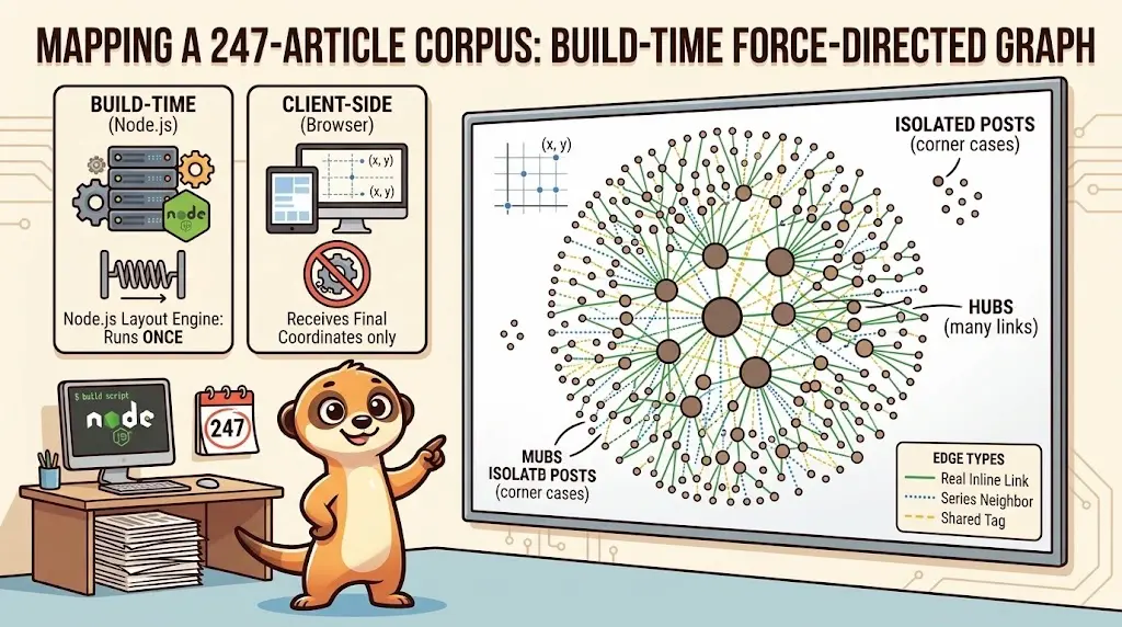
Drawing a Map of My Own Blog
October 8, 2026
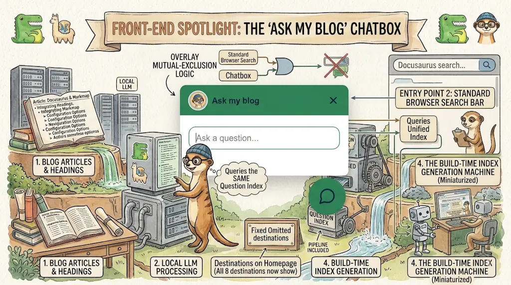
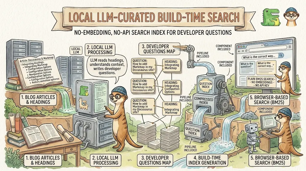
Ask My Blog: Turning 259 Articles Into 2,160 Searchable Questions
September 28, 2026
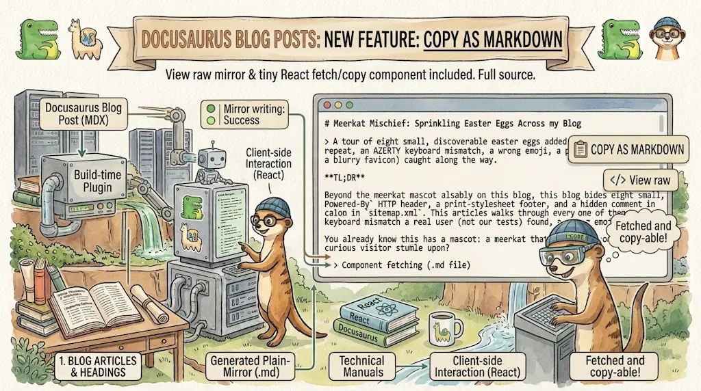
Add a "Copy as Markdown" Button to Your Docusaurus Blog
September 10, 2026
Shake Your Phone, Startle the Meerkat
August 27, 2026