Afficher les articles de blog Docusaurus sous forme de cartes - Guide pas à pas
Apprenez à mettre en valeur vos articles de blog Docusaurus grâce à des mises en page en cartes personnalisables.


Traduction automatique
Cet article a plus d'un an, mais il a été relu le 30 juillet 2026 — son contenu est toujours exact.

Ce guide complet montre comment transformer les listes d'articles par défaut de Docusaurus en une mise en page en cartes plus agréable à l'œil. Vous allez implémenter un composant <Card> réutilisable en plusieurs parties, puis créer un composant <PostCard> pour afficher les informations propres à chaque article. Le tutoriel vous guide dans la création d'un plugin Docusaurus local pour surcharger la route /blog/tags/:tag par défaut, et d'un nouveau composant de page pour afficher les cartes. Il couvre aussi des scripts utilitaires pour récupérer les métadonnées des articles et générer les slugs.
Dans cet article, nous allons apprendre à créer une carte à partir d'un article de blog.
Si vous utilisez Docusaurus pour votre blog, vous cherchez peut-être des moyens d'améliorer la mise en page. Plutôt que d'afficher les articles sous forme de liste, voyons comment les afficher sous forme de cartes.
Dans ce guide, nous allons voir comment faire. Il vous suffira de copier/coller des fichiers dans votre site et de faire une petite modification dans votre fichier de configuration.

Cela va impliquer un grand nombre de fichiers, mais l'idée est ensuite de réutiliser les composants / fichiers créés plus tard.
Utiliser le composant Card réutilisable de Docux
D'abord, nous allons récupérer le composant Card réutilisable de notre ami  Docux. C'est un ensemble de fichiers que vous devez créer ; c'est parti.
Information
On peut aussi le récupérer sur le site de la Docusaurus Community, mais peut-être pas dans sa dernière version.
Dans votre site Docusaurus, créez ces fichiers :
import type { CSSProperties, JSX, ReactNode } from "react";import clsx from "clsx"; // clsx helps manage conditional className names in a clean and concise manner.
interface Props { /** Custom classes for the container card */ className?: string; /** Custom styles for the container card */ style?: CSSProperties; /** Content to be included within the card */ children?: ReactNode; /** Shadow under the card. Expected values: low (lw), medium (md), tall (tl) */ shadow?: "lw" | "md" | "tl";}
const Card = ({ className, style, children, shadow }: Props): JSX.Element => { const cardShadow = shadow ? `item shadow--${shadow}` : ""; return ( <div className={clsx("card", className, cardShadow)} style={style}> {children} </div> );};
export default Card;This is a reusable Card component that wraps content in a styled container. It accepts optional custom classes, inline styles, shadow effects, and child content, then combines them all together using the clsx utility to build the final className.
.truncate p { display: -webkit-box; -webkit-line-clamp: 3; line-clamp: 3; -webkit-box-orient: vertical; overflow: hidden; text-overflow: ellipsis; margin-bottom: 0; overflow-wrap: break-word; max-height: 4.5em; /* 3 lines × 1.5em line-height */ line-height: 1.5em;}This CSS rule truncates paragraph text to exactly three lines and adds an ellipsis (…) at the end. It uses a combination of modern and older browser-specific properties to ensure the truncation works across different browsers, and sets a max-height to enforce the three-line limit.
import type { CSSProperties, JSX, ReactNode } from "react";import clsx from "clsx";import styles from "../styles.module.css";import { buildTextClasses, type CardTextOptions } from "../utils";
interface Props extends CardTextOptions { /** className for the container card */ className?: string; /** Custom styles for the container card */ style?: CSSProperties; /** Content to be included within the card */ children?: ReactNode;}
const CardBody = ({ className, style, children, textAlign, variant, italic = false, noDecoration = false, transform, truncate = false, weight,}: Props): JSX.Element => { const { text, textColor, textItalic, textDecoration, textType, textTruncate, textWeight, } = buildTextClasses( { textAlign, variant, italic, noDecoration, transform, truncate, weight }, styles.truncate, ); return ( <div className={clsx( "card__body", className, text, textType, textColor, textItalic, textDecoration, textTruncate, textWeight, )} style={style} > {children} </div> );};
export default CardBody;This component creates a card body container that displays content with customizable text styling. It accepts styling options like text alignment, weight, and decoration, then builds the appropriate CSS class names and applies them to a div that renders its children.
import type { CSSProperties, JSX, ReactNode } from "react";import clsx from "clsx";import styles from "../styles.module.css";import { buildTextClasses, type CardTextOptions } from "../utils";
interface Props extends CardTextOptions { className?: string; style?: CSSProperties; children?: ReactNode;}
const CardFooter = ({ className, style, children, textAlign, variant, italic = false, noDecoration = false, transform, truncate = false, weight,}: Props): JSX.Element => { const { text, textColor, textItalic, textDecoration, textType, textTruncate, textWeight, } = buildTextClasses( { textAlign, variant, italic, noDecoration, transform, truncate, weight }, styles.truncate, ); return ( <div className={clsx( "card__footer", className, text, textType, textColor, textItalic, textDecoration, textTruncate, textWeight, )} style={style} > {children} </div> );};
export default CardFooter;This is a React component that renders a card footer section. It accepts styling options like text alignment, weight, and color, combines them into CSS class names using a utility function, and renders a div with those classes plus any custom className or inline styles passed in.
import type { CSSProperties, JSX, ReactNode } from "react";import clsx from "clsx"; // clsx helps manage conditional className names in a clean and concise manner.import styles from "../styles.module.css";import { buildTextClasses, type CardTextOptions } from "../utils";
interface Props extends CardTextOptions { /** className for the container card */ className?: string; /** Custom styles for the container card */ style?: CSSProperties; /** Content to be included within the card */ children?: ReactNode;}
const CardHeader = ({ className, style, children, textAlign, variant, italic = false, noDecoration = false, transform, truncate = false, weight,}: Props): JSX.Element => { const { text, textColor, textItalic, textDecoration, textType, textTruncate, textWeight, } = buildTextClasses( { textAlign, variant, italic, noDecoration, transform, truncate, weight }, styles.truncate, ); return ( <div className={clsx( "card__header", className, text, textType, textColor, textItalic, textDecoration, textTruncate, textWeight, )} style={style} > {children} </div> );};
export default CardHeader;This file defines a CardHeader component that renders a styled header div. It takes configuration options for text styling (alignment, weight, decoration, etc.) and merges them into CSS class names using a helper function, then combines those with any custom classes provided by the caller.
/** * CardImage Component * * Renders an image for a card layout with optional lazy loading and * customizable size. Automatically resolves the image URL using Docusaurus's * `useBaseUrl` hook. Applies default styling via the "card__image" class * and supports additional custom styles. * * Notes: * - Using `width` and `height` helps reduce layout shift by reserving space * for the image before it loads. * - You can also override sizing via CSS or the `style` prop if more flexibility is needed. */
import type { CSSProperties, JSX } from "react";import clsx from "clsx";import useBaseUrl from "@docusaurus/useBaseUrl";
interface Props { /** Optional additional CSS classes to apply. */ className?: string; /** Inline styles for the image element. */ style?: CSSProperties; /** Relative or absolute path to the image. */ cardImageUrl: string; /** Alternative text for accessibility. */ alt: string; /** Optional tooltip text shown on hover. */ title?: string; /** If true, enables `loading="lazy"` to defer image loading until visible. */ lazy?: boolean; /** Optional width of the image in pixels. */ width?: number; /** Optional height of the image in pixels. */ height?: number;}
const CardImage = ({ className, style, cardImageUrl, alt, title, lazy = true, width, height,}: Props): JSX.Element => { const generatedCardImageUrl = useBaseUrl(cardImageUrl);
return ( <img className={clsx("card__image", className)} style={style} src={generatedCardImageUrl} alt={alt} title={title} loading={lazy ? "lazy" : undefined} width={width} height={height} /> );};
export default CardImage;This is a reusable React component that renders an image for cards. It takes a relative image path and uses Docusaurus's baseUrl hook to convert it to an absolute URL, then renders an img tag with optional lazy loading, custom styling, and accessibility features like alt text.
Vous avez donc maintenant créé six fichiers sur votre disque.
Avant d'aller plus loin dans ce tutoriel, jouons un peu avec le composant Card et vérifions que tout a été enregistré correctement.
Créez un nouvel article dans votre dossier blog, mais attention à l'extension : ce doit être un fichier .mdx (parce que nous allons ajouter du code qui doit être interprété).
import Card from "@site/src/components/Card";import CardFooter from "@site/src/components/Card/CardFooter";import CardImage from "@site/src/components/Card/CardImage";
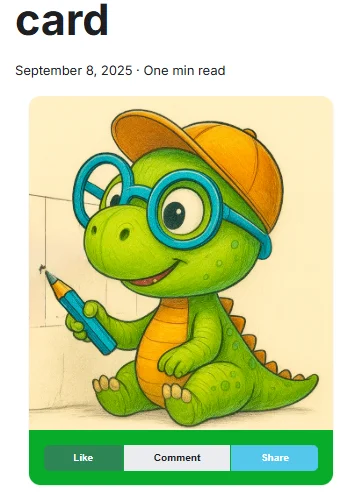
<div className="container"> <div className="row padding-bottom--xl"> <div className="col col--6"> <div className=""> <Card> <CardImage cardImageUrl="/img/docux.png" /> <CardFooter style={{ backgroundColor: "#07ac2aff", color: "#eeff00ff" }} className="text--center" > <div className="button-group button-group--block"> <button className="button button--primary button--sm">Like</button> <button className="button button--secondary button--sm">Comment</button> <button className="button button--info button--sm">Share</button> </div> </CardFooter> </Card> </div> </div> </div></div>Ce snippet construit une interface utilisateur avec une carte (Card) contenant une image et un pied de page avec trois boutons d'interaction (Like, Comment, Share). La carte est disposée dans une grille de mise en page responsive avec un fond vert et du texte jaune au pied de page.
Si vous lancez votre blog maintenant, vous devriez obtenir ceci :
Remarque
Si vous voulez récupérer la mignonne image de dinosaure, prenez-la ici https://github.com/Juniors017/docux-blog/blob/main/static/img/docux.webp et enregistrez-la dans votre dossier /static/img sous le nom docux.webp.
Vous pouvez bien sûr réutiliser n'importe quelle autre image.
Parfait, ça fonctionne. Continuons avec un exemple concret
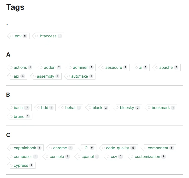
Dans cet article, nous allons surcharger la page standard qui affiche la liste des tags. Comme vous le savez, Docusaurus sait nativement afficher une page avec la liste des tags utilisés dans vos articles si vous accédez à la page /blog/tags. Pour mon propre blog, la page est https://www.avonture.be/blog/tags et vous obtenez quelque chose comme ceci :
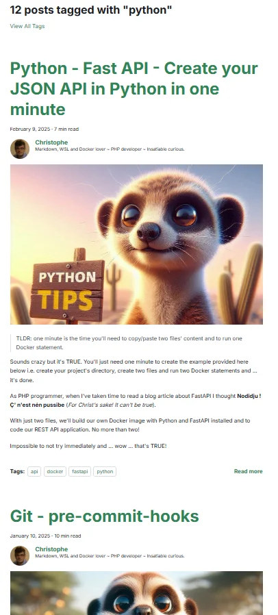
En cliquant sur un tag précis, Docusaurus affiche une liste d'articles pour ce tag, et c'est ce que nous allons changer.
Par exemple, ceci :
Information
C'est sympa mais... OK, je dois beaucoup scroller avant de voir tous les articles et de trouver celui qui pourrait m'intéresser.
Nous allons remplacer ça par une liste de cartes d'articles. Par exemple, sur mon blog, j'écris aussi à propos de python et voici comment j'affiche la page :
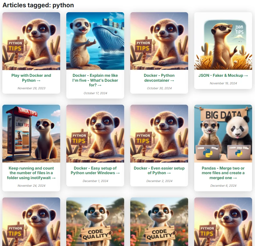
Cet exemple concret va nous permettre de mettre en œuvre deux concepts de Docusaurus : le concept de plugins et celui de composants.
Surcharger la page /blog/tags/tag en créant un plugin
Créez le fichier ci-dessous.
/** * Docusaurus Plugin: tag-route * * Registers the `/blog/tags/<slug>` pages rendered by `TagArticlesPage`. * * Why one route per tag instead of a single `/blog/tags/:tag` (TODO 0092): * Docusaurus's `handleBrokenLinks` resolves links against the list of *registered* * routes, and a parameterized path matches nothing there. With a single `:tag` route * every `<Link to="/blog/tags/docker">` in the corpus was reported as broken, which is * why `onBrokenLinks` had to be set to "ignore" site-wide — and a genuinely dead link * then went out silently with it. Enumerating the real tags at build time makes those * links resolvable, so link checking can be switched back on. * * Note this is *not* the blog plugin's own tag listing: that one lives at * `/blog/tags/tags/<slug>` (the doubled segment comes from blog/tags.yml's `permalink` * values being prefixed with the `/blog/tags` base), so the two never collide. */
const path = require("path");const { normalizeUrl } = require("@docusaurus/utils");const { listTagSlugs } = require("../lib/blog-taxonomy.cjs");
module.exports = function (context) { return { name: "docusaurus-plugin-tag-route", // Routes are enumerated from article frontmatter, so a new tag/series would // otherwise only get a route on the next dev-server restart. Watching the corpus // makes `yarn start` pick it up on save, like the parameterized route used to. getPathsToWatch() { return [path.join(context.siteDir, "blog", "**", "index.{md,mdx}")]; }, async contentLoaded({ actions }) { for (const slug of listTagSlugs(context.siteDir)) { actions.addRoute({ // MUST go through `baseUrl`: under a non-default locale it becomes `/fr/`, and a // hardcoded `/blog/tags/<slug>` registers a route the locale-prefixed links never // reach. That mismatch reported 2520 broken links on the `fr` build — the routes // existed as `/blog/tags/<slug>` while every link pointed at // `/fr/blog/tags/<slug>`. See TODO 0119. path: normalizeUrl([context.baseUrl, "blog/tags", slug]), component: "@site/src/components/Blog/Tags/TagArticlesPage", exact: true, }); } }, };};This Docusaurus plugin creates individual routes for each blog tag at build time, rather than using a single parameterized route. This approach allows Docusaurus's link checker to properly validate tag links, whereas a parameterized route like `/blog/tags/:tag` wouldn't match against the list of registered routes and would incorrectly flag all tag links as broken.
Prenez quelques secondes pour lire ce court script : comme vous le voyez, il dit à Docusaurus de ne plus utiliser sa propre page standard /blog/tags/:tag mais la nôtre (c'est-à-dire src/components/Blog/Tags/TagArticlesPage). Créons-la.
Créer le TagArticlesPage
Créez le fichier ci-dessous. C'est la fonction TagArticlesPage qui sera appelée par Docusaurus lorsqu'il affiche un tag précis.
import type { JSX } from "react";import { createSlug } from "@site/src/components/Blog/utils/slug";import { useBlogMetadata } from "@site/src/components/Blog/utils/posts";import { useLocation, matchPath } from "@docusaurus/router";import useDocusaurusContext from "@docusaurus/useDocusaurusContext";import { useBaseUrlUtils } from "@docusaurus/useBaseUrl";import Layout from "@theme/Layout";import Link from "@docusaurus/Link";import Translate, { translate } from "@docusaurus/Translate";import styles from "./styles.module.css";import PostCard from "@site/src/components/Blog/PostCard";import Head from "@docusaurus/Head";import FollowFeed from "@site/src/components/FollowFeed";import { useTagLabel } from "@site/src/components/Blog/utils/tagsI18n";import { useSourceLocaleUrls } from "@site/src/components/Blog/utils/localeUrls";
type Tag = string | { label: string };
export default function TagArticlesPage(): JSX.Element { const location = useLocation(); // Hooks must run before any early return. const posts = useBlogMetadata(); const tagLabel = useTagLabel(); const { isDefaultLocale, sourceLabel, sourceLocale, sourceUrl } = useSourceLocaleUrls(); const { withBaseUrl } = useBaseUrlUtils();
// The pattern MUST carry `baseUrl`: under the `fr` locale the pathname is `/fr/blog/tags/<slug>` // and a hardcoded pattern silently matches nothing, rendering the "not found" branch on a // perfectly valid page (TODO 0119). const { siteConfig } = useDocusaurusContext(); const base = siteConfig.baseUrl.replace(/\/$/, ""); const match = matchPath<{ slug: string }>(location.pathname, { path: `${base}/blog/tags/:slug`, exact: true, }); const rawTag = match?.params?.slug;
if (!rawTag) { return ( <Layout> <div className="container"> <p> <Translate id="blog.tagPage.noTag">No tag specified.</Translate> </p> <Link to="/blog/tags"> <Translate id="blog.tagPage.backToTags"> Go back to all tags </Translate> </Link> </div> </Layout> ); }
// Local helper, unrelated to `useTagLabel`: it reads the raw value out of a front-matter // entry, which may be a bare string or a `{ label }` object. What comes out is the KEY. const getTagKey = (t: Tag) => (typeof t === "string" ? t : t.label);
// Find original tag name based on slug let displayTag = rawTag; for (const post of posts) { const foundTag = (post.tags || []).find( (t) => createSlug(getTagKey(t)) === rawTag ); if (foundTag) { displayTag = getTagKey(foundTag); break; } }
// `displayTag` is the front-matter KEY; this is what the reader sees. Resolving it here, once, // also closes the inconsistency noted below: the <h1> used to print the raw key ("ai") while // the feed button right under it printed the real label ("Artificial Intelligence (AI)"). const displayLabel = tagLabel(displayTag);
// Filter and sort posts by slug-matched tag (most recent first) const taggedPosts = posts .filter((post) => post.tags?.some((t) => createSlug(getTagKey(t)) === rawTag) ) .sort((a, b) => new Date(b.date).getTime() - new Date(a.date).getTime()); // Descending
if (taggedPosts.length === 0) { return ( <Layout title={translate( { id: "blog.tagPage.metaTitle", message: "Tag: {label}" }, { label: displayLabel } )} > <div className="container margin-top--lg margin-bottom--lg text--center"> <h2> <Translate id="blog.tagPage.notFound" values={{ label: displayLabel }} > {'No articles found with tag "{label}"'} </Translate> </h2> <Link to="/blog/tags"> <Translate id="blog.tagPage.browseTags">Browse all tags</Translate> </Link> </div> </Layout> ); }
const feedUrl = `/blog/tags/${rawTag}/rss.xml`;
return ( <Layout title={translate( { id: "blog.tagPage.metaTitle", message: "Tag: {label}" }, { label: displayLabel } )} > <div className="container margin-top--lg margin-bottom--lg"> <h1> <Translate id="blog.tagPage.title" values={{ label: displayLabel }}> {"Articles tagged: {label}"} </Translate> </h1> {/* This route is registered by docusaurus-plugin-tag-route, not by the blog plugin, so Docusaurus injects no feed autodiscovery of its own here — same reasoning as src/components/MarkdownAlternate. */} <Head> {/* `feedUrl` is a hand-built path to a per-locale static file, so it needs the prefix; the second <link> points at the source language, which covers the whole blog. Helmet de-duplicates <link> on `href`, so both are kept. */} <link rel="alternate" type="application/rss+xml" href={withBaseUrl(feedUrl)} title={translate( { id: "feed.linkTitle", message: "{name} — RSS feed" }, { name: displayLabel }, )} /> {!isDefaultLocale && ( <link rel="alternate" type="application/rss+xml" href={sourceUrl(feedUrl)} hrefLang={sourceLocale} title={translate( { id: "feed.linkTitleSourceBlog", message: "{name} — RSS feed ({language} — the whole blog)", }, { name: displayLabel, language: sourceLabel }, )} /> )} </Head> <FollowFeed feedUrl={feedUrl} label={displayLabel} /> <div className={styles.postRow}> {taggedPosts.map((post) => ( <PostCard key={post.permalink} post={post} /> ))} </div> </div> </Layout> );}This component renders a blog tag page that displays all articles with a specific tag. It first extracts the tag slug from the URL, looks up the original tag name from blog post metadata, filters posts that match that tag, and displays them in a grid along with RSS feed links. If no tag is specified or no posts exist for that tag, it shows an appropriate error message.
Comme vous le voyez tout en haut du fichier TagArticlesPage.tsx, nous importons quelques fichiers. Certains existent déjà dans votre site Docusaurus ; d'autres doivent être créés.
Il y a trois fichiers à créer.
Le générateur de slug
/** * Converts a string into a URL-friendly slug. * * This function: * - Converts the string to lowercase * - Normalizes accented characters (e.g., accented e to plain e) * - Removes diacritics and special characters * - Replaces spaces with hyphens * - Collapses multiple hyphens into one * - Trims leading and trailing hyphens * * @param text - The input string to convert. * @returns The slugified version of the input. */export function createSlug(text: string): string { return text .replace(/([a-z0-9])([A-Z])/g, "$1-$2") // camelCase to kebab-case .toLowerCase() .normalize("NFD") // Decomposes accented characters .replace(/[\u0300-\u036f]/g, "") // Removes diacritics .replace(/[^a-z0-9\s-]/g, "") // Removes special characters .replace(/\s+/g, "-") // Replaces spaces with hyphens .replace(/-+/g, "-") // Collapses multiple hyphens .replace(/^-+|-+$/g, ""); // Trims leading/trailing hyphens}This function transforms any string into a URL-safe slug by converting it to lowercase, removing accents and special characters, replacing spaces with hyphens, and cleaning up extra hyphens. It handles common cases like camelCase input and ensures the output is clean and web-friendly.
La fonction getBlogMetaData
Il nous faut une fonction pour parcourir tous nos articles de blog existants (tous les fichiers .md ou .mdx dans le dossier blog) et récupérer des informations comme le titre de l'article, l'image, le slug, etc.
/** * 🧠 getBlogMetadata * * Extracts metadata from all MDX blog posts located in the `/blog` directory. * Uses Webpack's `require.context` to dynamically load and parse frontmatter * from each post, returning a structured array of metadata objects. * * 🔍 Behavior: * - Resolves permalinks based on `slug` or folder structure * - Normalizes image paths for static assets * - Filters out invalid or missing entries * * 📦 Returned metadata includes: * - `title`: Post title * - `description`: Short summary * - `image`: Resolved image path * - `draft`: Boolean flag for unpublished posts * - `unlisted`: Boolean flag for hidden posts * - `permalink`: URL path to the post * - `tags`: Array of tags * - `mainTag`: Primary tag (optional); used by the RelatedBlogPost component * - `authors`: Array of author names * - `date`: Publication date * - `series`: Series name (optional); used by the SeriesBlogPost component * * 🛠️ Usage: * ```ts * import { getBlogMetadata } from './getBlogMetadata'; * const posts = getBlogMetadata(); * ``` * * ⚠️ Note: * This function is intended for use in static site generation or client-side rendering * where Webpack's `require.context` is available. */
export interface BlogPostMetadata { title: string; description?: string; image?: string; draft: boolean; unlisted: boolean; permalink: string; tags: string[]; mainTag: string | null; authors: string[]; date?: string; series: string | null;}
const posts = require.context("../../../../blog", true, /\.mdx?$/);
export function getBlogMetadata(): BlogPostMetadata[] { return posts .keys() .map((key): BlogPostMetadata => { const post = posts(key) as { frontMatter: Record<string, unknown> };
const dir = key.replace(/\/index\.mdx?$/, "").replace(/^\.\//, "");
let permalink: string; if (typeof post.frontMatter.slug === "string") { permalink = post.frontMatter.slug.startsWith("/") ? post.frontMatter.slug : `/blog/${post.frontMatter.slug.replace(/^\//, "")}`; } else { permalink = `/blog/${dir}/`; }
let imageUrl = post.frontMatter.image as string | undefined; if (imageUrl && imageUrl.startsWith("./")) { imageUrl = `/blog/${dir}/${imageUrl.replace("./", "")}`; }
return { title: post.frontMatter.title as string, description: post.frontMatter.description as string | undefined, image: imageUrl, draft: Boolean(post.frontMatter.draft), unlisted: Boolean(post.frontMatter.unlisted), permalink, tags: (post.frontMatter.tags as string[]) || [], mainTag: (post.frontMatter.mainTag as string) || null, authors: (post.frontMatter.authors as string[]) || [], date: post.frontMatter.date as string | undefined, series: (post.frontMatter.series as string) || null, }; }) .filter(Boolean);}Cette fonction extrait et structure les métadonnées de tous les articles de blog au format MDX stockés dans le répertoire `/blog`. Elle utilise `require.context` de Webpack pour charger dynamiquement chaque fichier, parse le frontmatter (en-tête YAML), résout les permaliens et les chemins d'images, puis retourne un tableau d'objets de métadonnées normalisées.
Notre composant PostCard
Et, enfin, il nous faut notre composant PostCard ; celui qui affichera un article de blog sous forme de carte.
Vous voyez, en haut du code, que nous importons quelques parties du composant Card de Docux.
/** * ♣️ PostCard component * * A reusable Docusaurus component that displays a blog post preview card. * It shows the post image (with fallback), title (as a link), and description. * * Accessibility: * - The title is wrapped in a semantic link with an aria-label for screen readers. * - The image includes alt and title attributes. * * Styling: * - Uses Infima utility classes for layout and spacing. * - Custom styles can be applied via `styles.module.css`. * * Location: src/components/Blog/PostCard/index.tsx */
import type { JSX } from "react";import Card from "@site/src/components/Card";import CardBody from "@site/src/components/Card/CardBody";import CardImage from "@site/src/components/Card/CardImage";import Link from "@docusaurus/Link";import styles from "./styles.module.css";
interface FormattedDateProps { date?: string; layout: "big" | "small";}
/** Renders a formatted date string. */function FormattedDate({ date, layout }: FormattedDateProps): JSX.Element | null { if (!date) { return null; } return ( <p className={layout === "small" ? "" : styles.date} style={layout === "small" ? { color: "#888", fontSize: "0.95em", marginBottom: 8 } : {}} > <span> {new Date(date).toLocaleDateString("en-US", { year: "numeric", month: "long", day: "numeric", })} </span> </p> );}
interface Post { permalink: string; image?: string; title: string; description?: string; date?: string;}
interface Props { post: Post; layout?: "big" | "small"; defaultImage?: string;}
export default function PostCard({ post, layout = "big", defaultImage = "/img/default.jpg",}: Props): JSX.Element { const { permalink, image, title, description, date } = post;
if (layout === "small") { return ( <div className="col col--4" style={{ marginBottom: "2rem", display: "flex" }}> <div className="card" style={{ width: "100%", display: "flex", flexDirection: "column", height: "100%", }} > <div className="card__image"> <img src={image || defaultImage} alt={title} style={{ width: "100%", height: 180, objectFit: "cover", borderTopLeftRadius: 8, borderTopRightRadius: 8, }} /> </div> <div className="card__body" style={{ flex: 1 }}> <h3> <Link to={permalink}>{title}</Link> </h3> {description && ( <div style={{ color: "#6c63ff", fontWeight: "bold", marginBottom: 6, }} > {description} </div> )} <FormattedDate date={date} layout={layout} /> </div> <div className="card__footer" style={{ textAlign: "right" }}> <Link className="button button--primary button--sm" to={permalink}> Read more </Link> </div> </div> </div> ); }
// Default "big" layout return ( <div className="col col--3 margin-bottom--lg"> <Card shadow="md"> <CardImage cardImageUrl={image || defaultImage} alt={title} title={title} /> <CardBody className="padding-vert--md text--center" textAlign="center"> <h3> <Link href={permalink} aria-label={`Read article: ${title}`}> {title} → </Link> </h3> {description && <p className={styles.description}>{description}</p>} <FormattedDate date={date} layout={layout} /> </CardBody> </Card> </div> );}Ce composant PostCard affiche une préview de article de blog dans l'un de deux layouts possibles. Il utilise des props optionnels pour personnaliser l'image, le titre, la description et la date, en fournissant des valeurs par défaut lorsque nécessaire. Le rendu change complètement selon le prop layout pour adapter le rendu à des contextes différents.
Pour terminer, nous allons créer un fichier CSS pour pouvoir personnaliser un peu l'ensemble :
.description { font-size: 12px;}
.date { color: #888; font-size: 0.95em; margin-bottom: 8; font-style: italic;}Ce fichier CSS définit les styles pour deux éléments : une description avec une police petite et une date avec une couleur grise, une taille légèrement réduite, un espacement en bas et un style italique.
Il faut charger notre plugin
Nous y sommes presque.
Rappelez-vous : le tout premier fichier que nous avons créé était plugins/docusaurus-plugin-tag-route/index.cjs ; un plugin.
Modifiez votre fichier docusaurus.config.js existant comme illustré ci-dessous :
import pluginTagRoute from "./plugins/docusaurus-plugin-tag-route/index.cjs";
const config = { // [...] plugins: [ // [...] [pluginTagRoute, {}], ], // [...]};Ce fichier configure un projet Docusaurus en important un plugin personnalisé et l'enregistrant dans le tableau plugins avec une configuration vide. Le plugin pluginTagRoute est chargé depuis un fichier CommonJS local et ajouté à la liste des plugins actifs.
C'est-à-dire :
- Vous devez importer le plugin en haut de votre fichier
- Puis, dans la section
plugins, vous devez ajouter une nouvelle ligne pour charger le plugin importé.
Nous avons presque fini !
Attention
Arrêtez et relancez votre serveur Docusaurus. Dans mon cas (j'utilise Docker), il me suffit d'arrêter et de relancer mon container.
Si tout se passe bien après le redémarrage (aucun message d'erreur), rendez-vous sur la page des tags de votre site et ouvrez un tag. Vous devriez maintenant voir vos articles sous forme de cartes.
Félicitations !
Dans les prochains articles, nous réutiliserons ce concept de cartes d'articles. Restez à l'écoute !
Bonus
Si vous voulez que vos articles de blog soient listés du plus récent au plus ancien, utilisez ce script.
Mais assurez-vous que chacun de vos articles possède bien un champ date dans son front matter YAML.
import { createSlug } from "@site/src/components/Blog/utils/slug";import { getBlogMetadata } from "@site/src/components/Blog/utils/posts";import { useLocation } from "@docusaurus/router";import Layout from "@theme/Layout";import Link from "@docusaurus/Link";import PostCard from "@site/src/components/Blog/PostCard";
function getTagFromPathname(pathname: string): string | null { const match = pathname.match(/\/blog\/tags\/([^/]+)/); return match ? decodeURIComponent(match[1]) : null;}
export default function TagArticlesPage() { const location = useLocation(); const rawTag = getTagFromPathname(location.pathname);
if (!rawTag) { return ( <Layout> <div className="container"> <p>No tag specified.</p> <Link href="/blog/tags">Go back to all tags</Link> </div> </Layout> ); }
const posts = getBlogMetadata();
// Find original tag name based on slug const allTags = Array.from(new Set(posts.flatMap((post) => post.tags || []))); const displayTag = allTags.find((t) => createSlug(String(t)) === rawTag) || rawTag;
// highlight-start // Filter and sort posts by slug-matched tag (most recent first) const taggedPosts = posts .filter((post) => post.tags?.some((t) => createSlug(String(t)) === rawTag)) .sort((a, b) => new Date(b.date).getTime() - new Date(a.date).getTime()); // Descending // highlight-end
if (taggedPosts.length === 0) { return ( <Layout title={`Tag: ${displayTag}`}> <div className="container margin-top--lg margin-bottom--lg text--center"> <h2>No articles found with tag "{displayTag}"</h2> <Link href="/blog/tags">Browse all tags</Link> </div> </Layout> ); }
return ( <Layout title={`Tag: ${displayTag}`}> <div className="container margin-top--lg margin-bottom--lg"> <h1>Articles tagged: {displayTag}</h1> <div className="row"> {taggedPosts.map((post) => ( <PostCard key={post.title} post={post} /> ))} </div> </div> </Layout> );}Ce composant affiche les articles du blog filtrés par un tag spécifique extrait de l'URL. Il récupère le tag depuis le chemin, retrouve son nom d'affichage original, filtre les articles correspondants en les triant du plus récent au plus ancien, et affiche soit une liste d'articles soit un message si aucun n'est trouvé.
Chargement des commentaires…
Articles liés


Dessiner une carte de mon propre blog
8 octobre 2026


Ajouter un bouton « Copy as Markdown » à votre blog Docusaurus
10 septembre 2026
Secouez votre téléphone, surprenez le suricate
27 août 2026