Organisez votre contenu Docusaurus avec un composant Series personnalisé
Découvrez comment regrouper des articles de blog Docusaurus liés en une expérience de lecture fluide grâce à un composant Series personnalisé.

Traduction automatique
Cet article fait partie de la série Créer des composants Docusaurus :
- Modifier la façon dont Docusaurus génère les balises img
- Surcharger la génération des balises img avec Docusaurus
- Organisez votre contenu Docusaurus avec un composant Series personnalisé
- Ajouter un bouton « retour en haut » dans les articles Docusaurus
- Créer un plugin de recherche/remplacement pour Docusaurus
- Un composant pour afficher des snippets de code dans un blog Docusaurus
- Un composant Docusaurus qui prévient le lecteur que l'article a plus d'un an
- Afficher le changelog de votre article
- Injecter de l'ASCII art dans toutes les pages HTML générées par Docusaurus
- Best Practice - Personnaliser le flux RSS de Docusaurus pour un contenu complet et des images
- Quelques vérifications sur les images de votre site Docusaurus
- Gestion des tags dans Docusaurus
- Automatiser les résumés TL;DR avec Gemini AI
- Le composant ProjectSetup - Une façon standardisée de partager des structures de projet
- Comment signaler un contenu assisté par IA dans un blog Docusaurus
- Donnez vie à vos tutoriels CLI avec un terminal machine à écrire
- Espiègleries de suricate : semer des easter eggs partout sur mon blog
- Tooltips de code assistés par l'IA dans Docusaurus — Explique-moi comme à un enfant de cinq ans
- Ajouter des réactions de lecteurs à votre blog Docusaurus
- Votre blog est illisible pour une IA. Voici la solution.
- Secouez votre téléphone, surprenez le suricate
- Ajouter un bouton « Copy as Markdown » à votre blog Docusaurus
- Ask My Blog : transformer 259 articles en 2 160 questions cherchables
- La troisième porte : une bulle de chat flottante, et la fonctionnalité que personne ne trouvait
- Dessiner une carte de mon propre blog
- Laissez vos lecteurs signaler les problèmes — un widget de feedback multi-types pour Docusaurus
Journal des modifications
/src/data/series.js file
Ce guide détaillé vous montre comment implémenter une fonctionnalité complète de « série d'articles » dans Docusaurus. Vous apprendrez à créer un composant <SeriesPosts> qui affiche une bannière de série sur chaque article, ainsi qu'une page /series dédiée qui liste toutes vos séries sous forme de cartes. Le tutoriel couvre la création de plusieurs composants React, des helpers utilitaires pour récupérer les données des articles, la surcharge de composants du thème Docusaurus via le swizzling, et la construction d'un plugin local personnalisé pour gérer les routes dynamiques des séries. Enfin, il montre comment ajouter des descriptions et des images personnalisées à vos séries via un fichier de données centralisé.
Si vous utilisez Docusaurus depuis longtemps, vous avez peut-être remarqué qu'il n'est pas possible de relier des articles entre eux sous forme de série.
Ce serait pratique d'écrire un premier article, un deuxième, un troisième, etc., et de pouvoir dire à Docusaurus que ces articles font partie de la même série.
Cela aura aussi un impact positif sur votre SEO (en créant un meilleur maillage interne) et gardera vos lecteurs plus longtemps. Pour des articles liés entre eux mais qui ne forment pas une série ordonnée, Afficher les articles liés sous nos articles Docusaurus joue le même rôle sur base des tags partagés.
Ce n'est pas possible nativement, alors créons un composant pour ça.
Attention, spoiler
Cliquez simplement sur le lien Séries pour voir à quel point le composant SeriesPosts est sympa. Vous allez apprendre à le faire ici.
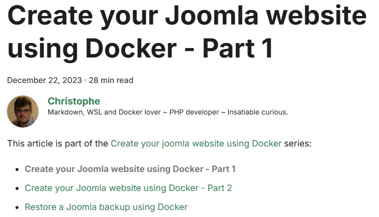
Voici le composant en action, une fois branché — une bannière annonçant la série, directement sur l'article :
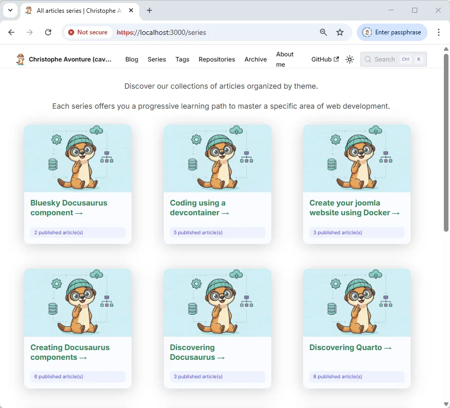
La partie 2 va plus loin et ajoute une page /series complète qui liste chaque série sous forme de cartes :
Construisons les deux, en commençant par la bannière.
Information
Vous avez déjà vu cet article ? Regardez en haut. Vous verrez une bannière qui dit : « Cet article fait partie de la série Creating Docusaurus components ». C'est exactement ce que nous allons apprendre à faire tout de suite.
Ce long article comporte deux sections principales : l'une sur la création du composant, l'autre sur la navigation dans le blog.
Il combine les deux techniques utilisées partout dans cette série : le swizzling d'un composant de thème (comme dans la notice signalant un article de plus d'un an) et l'écriture d'un plugin local (comme dans le plugin de recherche & remplacement).
Partie 1 - Création du composant SeriesPosts
Dans ce premier chapitre, nous allons créer notre composant SeriesPosts afin qu'à l'ouverture d'un article, vous voyiez un message « Cet article fait partie de... » et la liste des autres articles de cette série.
Cela implique plusieurs choses :
- Nous aurons besoin de quelques helpers.
- Nous aurons besoin d'un nouveau composant.
- Les articles de blog devront avoir une entrée
seriesdans leur YAML front matter, et - Nous devrons surcharger la façon standard d'afficher un article de blog.
1.1. Nous avons besoin de quelques helpers
Si vous ne l'avez pas encore, créez le fichier src/components/Blog/utils/posts.ts. Il contiendra une fonction helper que nous pourrons réutiliser pour plusieurs composants.
Ce helper va scanner chaque fichier Markdown avec une extension .md ou .mdx dans le sous-dossier blog.
Pour chaque fichier, le script va regarder le YAML front matter et utiliser certaines de ses propriétés. Par exemple :
- Si l'article a
draft: trueouunlisted: true, il sera ignoré. - Si l'article a un
slug, il sera utilisé ; sinon, le slug sera généré par le code. - Si l'article a une image associée, elle sera utilisée ; sinon, une image par défaut sera utilisée.
- Ensuite, le helper retournera la liste des articles et leurs propriétés.
Certaines propriétés sont personnalisées, comme mainTag (voir mon article Afficher les articles liés sous nos articles Docusaurus) et, pour notre besoin actuel, la propriété series.
Donc, copiez-collez simplement le contenu du fichier ci-dessous et créez le fichier src/components/Blog/utils/posts.ts dans la structure de votre projet.
/** * getBlogMetadata * * Extracts metadata from all MDX blog posts located in the `/blog` directory. * Uses Webpack's `require.context` to dynamically load and parse frontmatter * from each post, returning a structured array of metadata objects. * * Behavior: * - Resolves permalinks based on `slug` or folder structure * - Normalizes image paths for static assets * - Filters out invalid or missing entries * * Returned metadata includes: * - `title`: Post title * - `description`: Short summary * - `image`: Resolved image path * - `draft`: Boolean flag for unpublished posts * - `unlisted`: Boolean flag for hidden posts * - `permalink`: URL path to the post * - `tags`: Array of tags * - `mainTag`: Primary tag (optional); used by the RelatedBlogPost component * - `authors`: Array of author names * - `date`: Publication date * - `series`: Series name (optional); used by the SeriesBlogPost component * * Usage: * ```ts * import { getBlogMetadata } from './posts'; * const posts = getBlogMetadata(); * const withDrafts = getBlogMetadata({ includeDrafts: true }); * ``` * * By default, posts flagged `draft` or `unlisted` are excluded so consumers don't have to * remember to filter them out themselves. Pass `includeDrafts`/`includeUnlisted` to opt back in * (e.g. author-facing counters that need to show "in progress" articles). * * Note: * This function is intended for use in static site generation or client-side rendering * where Webpack's `require.context` is available. */
/** * A tag as it reaches these helpers: a plain slug string from front matter, or — * defensively, since related.ts and TagArticlesPage both handle it — a * Docusaurus-normalised tag object. */export type BlogTag = string | { label: string };
export interface BlogPostMetadata { authors: string[]; blueskyRecordKey: string | null; /** * ISO date string from front matter, e.g. "2026-08-28". Every article under blog/ carries * one (blog authoring convention, and the blog plugin itself refuses a post without a * date), so this is not optional. * * Runtime note: plugins/frontmatter-loader actually hands back a real `Date` instance for * a typical unquoted YAML date (see that plugin's own header comment) — not a string. * Declaring `string` here anyway matches the pre-existing contract every niveau 1-4 `.tsx` * consumer already compiles against (`Post.date?: string`, …); every one of them passes * this straight into `new Date(...)`, which accepts a `Date` argument just as well as a * string, so nothing behavioral changes. Widening this to the more literally accurate type * would ripple into every already-migrated consumer — out of scope here. */ date: string; description: string | undefined; draft: boolean; image: string | undefined; mainTag: string | null; permalink: string; series: string | null; tags: BlogTag[]; title: string; unlisted: boolean;}
interface RawFrontMatter { title?: string; slug?: string; image?: string; authors?: string[]; blueskyRecordKey?: string; date?: BlogPostMetadata["date"]; description?: string; draft?: boolean; mainTag?: string; series?: string; tags?: BlogTag[]; unlisted?: boolean;}
// The `!!…!` prefix is load-bearing, do not simplify it away: it bypasses the// rules configured by @docusaurus/plugin-content-blog and reads the files with// plugins/frontmatter-loader instead. Without it, Webpack MDX-compiles every// file under `blog/`, and any article flagged `draft: true` crashes the// production build with "Blog post not found for filePath=…" — because the blog// plugin drops drafts from its post list while this context still pulls them in.// See plugins/frontmatter-loader/index.cjs for the full story.import { useTranslationState, slugFromPermalink } from "./translations";
const posts = require.context( "!!../../../../plugins/frontmatter-loader/index.cjs!../../../../blog", true, /\.mdx?$/,);
// Second corpus: the French translations. Needed because the context above reads `blog/` — the// English source — whatever locale is being rendered, so every card, list and related-post// block showed an English title on a French page even for articles that ARE translated.//// The locale is spelled out rather than computed: `require.context` is a webpack construct and// its path must be statically analysable. Adding a locale means adding a context here.const translatedPosts = require.context( "!!../../../../plugins/frontmatter-loader/index.cjs!../../../../i18n/fr/docusaurus-plugin-content-blog", true, /\.mdx?$/,);
/** slug -> the translated `title`/`description`, for the one non-default locale we ship. */function buildTranslatedFrontMatter(): Map<string, { title: string; description: string }> { const bySlug = new Map<string, { title: string; description: string }>();
for (const key of translatedPosts.keys()) { const post = translatedPosts(key) as { frontMatter: RawFrontMatter }; if (!post.frontMatter?.title) continue;
const dir = key.replace(/\/index\.mdx?$/, "").replace(/^\.\//, ""); const slug = post.frontMatter.slug ? post.frontMatter.slug.replace(/^\/+|\/+$/g, "").replace(/^blog\//, "") : dir.split("/").pop() ?? "";
if (slug) { bySlug.set(slug, { title: post.frontMatter.title, description: post.frontMatter.description ?? "", }); } }
return bySlug;}
const TRANSLATED_FRONT_MATTER = buildTranslatedFrontMatter();
export function getBlogMetadata({ includeDrafts = false, includeUnlisted = false,}: { includeDrafts?: boolean; includeUnlisted?: boolean } = {}): BlogPostMetadata[] { return posts .keys() .map((key): BlogPostMetadata | null => { const post = posts(key) as { frontMatter: RawFrontMatter };
// A Markdown file under `blog/` without a title is not an article // (a fragment, a note, a readme…); the blog plugin ignores it, so do we. if (!post.frontMatter?.title) { return null; }
const dir = key.replace(/\/index\.mdx?$/, "").replace(/^\.\//, "");
let permalink: string; if (post.frontMatter.slug) { permalink = post.frontMatter.slug.startsWith("/") ? post.frontMatter.slug : `/blog/${post.frontMatter.slug.replace(/^\//, "")}`; } else { permalink = `/blog/${dir}/`; }
let imageUrl = post.frontMatter.image; if (imageUrl && imageUrl.startsWith("./")) { imageUrl = `/blog/${dir}/${imageUrl.replace("./", "")}`; }
return { authors: post.frontMatter.authors || [], blueskyRecordKey: post.frontMatter.blueskyRecordKey || null, date: post.frontMatter.date as BlogPostMetadata["date"], description: post.frontMatter.description, draft: post.frontMatter.draft || false, image: imageUrl, mainTag: post.frontMatter.mainTag || null, permalink, series: post.frontMatter.series || null, tags: post.frontMatter.tags || [], title: post.frontMatter.title, unlisted: post.frontMatter.unlisted || false, }; }) .filter((post): post is BlogPostMetadata => post !== null) .filter( (post) => (includeDrafts || !post.draft) && (includeUnlisted || !post.unlisted), );}
/** * Locale-aware counterpart of `getBlogMetadata()` — the one every rendering surface should use. * * `getBlogMetadata()` reads `blog/` through `require.context`, so it always returns the **English** * corpus, whatever locale the page is being rendered in. Left unfiltered, a French listing shows * entries whose titles are English and whose pages open on English prose — which reads as a broken * site rather than as a partially translated one. * * On the default locale this is `getBlogMetadata()` unchanged, so switching a call site over is * always safe. * * Note this filters, it does not translate: the titles and descriptions of the surviving entries * still come from the English source. Showing the translated ones is a separate (larger) job — * see TODO 0119, lot C, "rendre le corpus de posts.ts conscient de la locale". */export function useBlogMetadata( options: { includeDrafts?: boolean; includeUnlisted?: boolean } = {},): BlogPostMetadata[] { const { filterTranslated, isDefaultLocale } = useTranslationState();
const visible = filterTranslated(getBlogMetadata(options), (post) => slugFromPermalink(post.permalink), );
if (isDefaultLocale) return visible;
// Overlay the translated title and description. Only these two are localized: `permalink`, // `image`, `tags`, `series` and `date` are shared with the English source by design — the // translation copies them byte for byte (see the translation contract in TODO 0119). return visible.map((post) => { const translated = TRANSLATED_FRONT_MATTER.get(slugFromPermalink(post.permalink)); if (!translated) return post;
return { ...post, title: translated.title, description: translated.description || post.description, }; });}This file extracts metadata from MDX blog posts using Webpack's dynamic loading, parsing frontmatter (the metadata at the top of each file) to build a structured list of post information. It handles both English posts and French translations, allowing callers to include or exclude draft and unlisted posts as needed. The main `getBlogMetadata()` function reads raw post data, while `useBlogMetadata()` adds locale awareness by overlaying translated titles and descriptions for non-English pages.
Nous aurons aussi besoin d'un second helper. Créez le fichier src/components/Blog/utils/slug.ts :
/** * Converts a string into a URL-friendly slug. * * This function: * - Converts the string to lowercase * - Normalizes accented characters (e.g., accented e to plain e) * - Removes diacritics and special characters * - Replaces spaces with hyphens * - Collapses multiple hyphens into one * - Trims leading and trailing hyphens * * @param text - The input string to convert. * @returns The slugified version of the input. */export function createSlug(text: string): string { return text .replace(/([a-z0-9])([A-Z])/g, "$1-$2") // camelCase to kebab-case .toLowerCase() .normalize("NFD") // Decomposes accented characters .replace(/[\u0300-\u036f]/g, "") // Removes diacritics .replace(/[^a-z0-9\s-]/g, "") // Removes special characters .replace(/\s+/g, "-") // Replaces spaces with hyphens .replace(/-+/g, "-") // Collapses multiple hyphens .replace(/^-+|-+$/g, ""); // Trims leading/trailing hyphens}This function transforms any string into a URL-safe slug by converting it to lowercase, removing accents and special characters, replacing spaces with hyphens, and cleaning up extra hyphens. It handles common cases like camelCase input and ensures the output is clean and web-friendly.
1.2. Notre composant SeriesPosts
Maintenant, nous allons créer notre composant. Créez le fichier src/components/Blog/SeriesPosts/index.tsx avec le code suivant :
/** * 📚 SeriesPosts Component * * Displays a list of blog posts that belong to the same series. * Useful for linking related articles together in a Docusaurus blog. * * Behavior: * - Fetches blog metadata via `getBlogMetadata()` * - Filters posts by series name * - Sorts posts chronologically * - Highlights or links each post depending on whether it's the current one * * Styling: * - Uses scoped CSS from `styles.module.css` * * Returns: * - A styled list of blog posts in the same series, or null if none found. */
import type { JSX } from "react";import Link from "@docusaurus/Link";import Translate from "@docusaurus/Translate";import clsx from "clsx";import Details from "@site/src/components/Details";import { useBlogMetadata } from "@site/src/components/Blog/utils/posts";import { createSlug } from "@site/src/components/Blog/utils/slug";import { useSeriesLocalizer } from "@site/src/components/Blog/utils/seriesI18n";
import styles from "./styles.module.css";
interface Props { /** The name of the blog series to display */ series: string; /** Permalink of the current post to exclude from linking */ excludePermalink?: string | null; /** Whether to visually highlight the current post */ highlightCurrent?: boolean;}
export default function SeriesPosts({ series, excludePermalink = null, highlightCurrent = true,}: Props): JSX.Element | null { const posts = useBlogMetadata() .filter((post) => post.series === series) .sort((a, b) => new Date(a.date).getTime() - new Date(b.date).getTime());
// `series` is the English key — it matches the front matter and builds the slug. Only the link // text is localized, so a French article stops announcing an English series name. const seriesLabel = useSeriesLocalizer()(series)?.label ?? series;
if (!posts.length) return null;
return ( <div className={styles.seriesBlogPost}> <Details summaryClassName={styles.seriesIntro} label={ <Translate id="blog.seriesPosts.intro" values={{ seriesLink: ( <Link href={`/series/${createSlug(series)}`}>{seriesLabel}</Link> ), }} > {"This article is part of the {seriesLink} series:"} </Translate> } > <ul> {posts.map((post) => { const isCurrent = post.permalink === excludePermalink;
return ( <li key={post.permalink}> {isCurrent ? ( <span className={clsx( styles.currentPost, highlightCurrent && styles.currentPostDimmed, )} > {post.title} </span> ) : ( <Link to={post.permalink}>{post.title}</Link> )} </li> ); })} </ul> </Details> </div> );}This component displays a list of blog posts that belong to the same series, fetching and filtering them by series name, then sorting chronologically. It wraps the list in a collapsible details section with a link to the series page, and marks the current post (if any) differently from the others so readers can see where they are in the series.
Ce code JavaScript va récupérer la liste de tous les articles de blog. Ensuite, il va extraire une propriété appelée series (qui peut être présente ou non dans le YAML front matter de votre article). Si un article a la propriété series, le script comparera sa valeur avec celle de l'article courant.
S'il y a correspondance, nous avons d'autres articles dans la série, et le script affichera « Cet article fait partie de... » suivi du nom de la série et de la liste des articles.
Les articles sont affichés dans l'ordre chronologique pour permettre au lecteur de suivre la série dans un ordre logique.
Le reste de la logique affiche simplement une liste à puces.
Et le dernier fichier à créer est le fichier CSS :
/* * The "this post is part of a series" box. * * NO BACKGROUND TINT. That was tried and removed on review, and the reason is * worth keeping: the page ground is already cream (--mk-bg #fffdf7) and the * "key" tone is cream too (--mk-key-bg #faf0de). A tinted block on a tinted * page reads as a washed-out rectangle rather than as a distinct object — it * costs a lot of visual weight to say very little. The rail alone says * "this is an aside" perfectly well, and it is the same rail as the article's * own h2, so the box sits in the page's existing grid of left marks instead of * interrupting it. * * Keep this in mind for any future aside: on this site, tint is for callouts * that carry a WARNING or a KEY IDEA. A navigation aid gets a rail and nothing * more (see QuickJump, which made the same call). */.seriesBlogPost { color: var(--mk-ink); border-left: var(--mk-rail) solid var(--mk-primary); padding: 0.25rem 0 0.25rem 1.25rem; margin-bottom: 2rem;}
/* Applied to Details's <summary> via its summaryClassName prop — not a ".seriesBlogPost p" descendant selector, which composes can't use (single local class only) and which never matched anyway: the intro text renders inside <summary>, not a <p>, so the pre-harmonisation bold/italic/1.1rem rule here was dead CSS. */.seriesIntro { composes: mk-eyebrow from global; cursor: pointer;}
.seriesIntro:hover { color: var(--mk-primary);}
.seriesBlogPost ul { list-style-type: none; padding-left: 0; counter-reset: post-counter; margin: 0.625rem 0 0;}
.seriesBlogPost li { counter-increment: post-counter; display: flex; align-items: baseline; font-size: 0.95rem; line-height: 1.6;}
.seriesBlogPost li:not(:last-child) { margin-bottom: 0.4rem;}
.seriesBlogPost li::before { content: counter(post-counter); margin-right: 0.75rem; min-width: 1.1rem; font-weight: 700; font-size: 0.85rem; color: var(--mk-primary); font-variant-numeric: tabular-nums;}
.seriesBlogPost li a,.seriesBlogPost li span { text-decoration: none; color: inherit;}
.seriesBlogPost li a:hover { text-decoration: underline; text-underline-offset: 2px; color: var(--mk-primary);}
.currentPost { font-weight: 700; color: var(--mk-primary);}
.currentPostDimmed { opacity: 0.6;}
/* * No dark-mode block: every value above is a token that flips on its own. * (The pre-harmonisation override pointed at --ifm-background-surface-color, * the CARD colour, which made this box indistinguishable from the article * around it in dark mode.) */This stylesheet styles a 'series box' that shows which post in a series the reader is currently viewing. Instead of using a background color (which would look washed out on the cream-colored page), it uses a left border as a visual accent, similar to a rail used elsewhere on the site. The list inside uses custom numbering, and the current post is highlighted in bold.
1.3. Modifier nos articles
Maintenant, la partie facile : éditez quelques-uns de vos articles existants et ajoutez la clé series au YAML front matter. Par exemple :
---title: Create your Joomla website using Docker - Part 1[...]<!-- highlight-next-line -->series: Create your joomla website using Docker[...]---
In this article, we will learn how to ...Ceci est un fichier de métadonnées (frontmatter) au format YAML pour un article de documentation. Il définit le titre de l'article, indique que c'est la première partie d'une série, et contient d'autres propriétés de configuration. Le commentaire HTML sert à mettre en évidence la ligne suivante dans le rendu final.
Faites-le pour quelques articles afin d'avoir plusieurs articles dans cette série.
Attention
Si vous visitez votre blog maintenant et que vous naviguez vers votre article, vous ne verrez aucune différence. C'est parfaitement normal : nous venons juste de créer un composant, il faut encore dire à Docusaurus de l'utiliser.
1.4. Surcharger le template BlogPostItem
Nous devons donc appeler notre composant fraîchement créé. Bien sûr, nous pourrions inclure la balise <SeriesBlogPost> dans chaque article, mais nous sommes plus malins que ça, non ?
Créons une surcharge du template BlogPostItem de Docusaurus.
Dans un terminal, lancez yarn docusaurus swizzle @docusaurus/theme-classic BlogPostItem, puis choisissez Javascript, Eject, et enfin YES.
Beaucoup de fichiers seront créés dans le dossier src/theme/BlogPostItem de votre projet Docusaurus. Nous pouvons supprimer sans risque tous les fichiers sauf src/theme/BlogPostItem/index.js, que nous devons éditer.
Donc, supprimez tous les fichiers ou dossiers sous src/theme/BlogPostItem sauf le fichier index.js.
Dans le code ci-dessous, les lignes surlignées sont celles que nous devons ajouter.
import { useBlogPost } from "@docusaurus/plugin-content-blog/client";import BlogPostItemContainer from "@theme/BlogPostItem/Container";import BlogPostItemContent from "@theme/BlogPostItem/Content";import BlogPostItemFooter from "@theme/BlogPostItem/Footer";import BlogPostItemHeader from "@theme/BlogPostItem/Header";import clsx from "clsx";
// highlight-next-lineimport SeriesPosts from "@site/src/components/Blog/SeriesPosts";
// apply a bottom margin in list viewfunction useContainerClassName() { const { isBlogPostPage } = useBlogPost(); return !isBlogPostPage ? "margin-bottom--xl" : undefined;}export default function BlogPostItem({ children, className }) { // We need to retrieve the isBlogPostPage flag const { metadata, isBlogPostPage } = useBlogPost(); const containerClassName = useContainerClassName(); return ( <BlogPostItemContainer className={clsx(containerClassName, className)}> <BlogPostItemHeader /> // highlight-start {isBlogPostPage && ( <SeriesPosts series={metadata.frontMatter.series} excludePermalink={metadata.permalink} highlightCurrent={true} /> )} // highlight-end <BlogPostItemContent>{children}</BlogPostItemContent> <BlogPostItemFooter /> // highlight-start {isBlogPostPage && ( <SeriesPosts series={metadata.frontMatter.series} excludePermalink={metadata.permalink} highlightCurrent={true} /> )} // highlight-end </BlogPostItemContainer> );}Ce composant React affiche un article de blog avec ses sections d'en-tête, contenu et pied de page, en y intégrant optionnellement une liste de posts associés à la même série. Il ajoute une marge inférieure au conteneur uniquement quand l'article est affiché dans une liste, pas sur la page de détail de l'article.
Nous devons redémarrer Docusaurus
Maintenant, comme nous venons d'introduire une surcharge, nous devons redémarrer notre serveur Docusaurus pour que les changements prennent effet.
Lancez npm run start
Si vous faites tourner Docusaurus en local, lancez simplement npm run start dans votre console.
Si, comme moi, vous faites tourner Docusaurus avec Docker, arrêtez simplement le container et démarrez-en un nouveau.
Voyons si ça fonctionne
Retournez sur votre blog et rafraîchissez la page. Vous devriez voir la même bannière que celle montrée en haut de cet article (avec votre propre contenu, bien sûr).
Super ! Le composant tourne maintenant.
Nous pouvons créer nos séries. Dans cet exemple, j'ai édité trois articles sur Joomla et ajouté la clé series à leur YAML front matter.
Vous pouvez naviguer d'un article à l'autre.
Information
Nous pourrions nous arrêter ici, mais ce serait n'avoir fait que la moitié du chemin. Il nous reste à implémenter une page qui affichera la liste des séries et, quand on clique sur une série, la liste des articles qu'elle contient.
Partie 2 - Ajouter une navigation vers les séries
Comme annoncé, nous allons créer une page /series sur notre blog pour accéder immédiatement à toutes les séries.
Nous allons donc devoir
- Créer la page /series
- Créer un composant SeriesCards
- Créer un composant PostCard
- Ajouter une entrée /series à notre barre de navigation et
- Créer un plugin pour gérer les URL
/series/a-series-name.
2.1 Ajouter une nouvelle page pour afficher toutes les séries
Ce serait chouette d'avoir une page sur notre site Docusaurus pour afficher la liste des séries, non ? Allons-y.
D'abord, créez le fichier src/pages/series.mdx avec ce contenu :
---title: "All articles series"hide_table_of_contents: trueimage: "/img/series.webp"authors: [christophe]---
import "@site/src/css/series.css";
<!-- markdownlint-disable MD041 -->
import SeriesCards from "@site/src/components/Blog/SeriesCards";import SeriesStats from "@site/src/components/Blog/SeriesStats";import TranslationCoverage from "@site/src/components/Blog/TranslationCoverage";
<h1 className="text--center">All Series</h1>
<SeriesStats />
<!-- Renders nothing on `en`. Under `fr`, `SeriesStats` above counts the FILTERED corpus and announces 3 series / 3 articles against 26 and 176 — a reader arriving here from the menu, without passing through /fr/blog/, would conclude the blog is thin. -->
<TranslationCoverage />
<div className="text--center"> Each series has its own RSS feed —{" "} <Link to="/follow">get the next episode automatically</Link>, without checking back.</div>
<div className="seriesIntro"> Discover our collections of articles organized by theme.
Each series offers you a progressive learning path to master a specific area of web development.
</div>
<SeriesCards />This is a Markdown document that serves as a landing page for article series on a blog. It imports and displays various components like statistics, translation coverage information, and a set of cards that showcase the available series, along with some introductory text explaining what readers will find.
Attention
Comme vous pouvez le voir, cette page contient du contenu Markdown avec une particularité : elle contient du code JavaScript. C'est pourquoi il est très important que l'extension du fichier soit .mdx.
Comme vous le voyez, il y a du contenu Markdown (adaptez-le à vos besoins) et l'utilisation d'un nouveau composant, SeriesCards. Créons-le.
2.2 Création du composant SeriesCards
Créez le fichier src/components/Blog/SeriesCards/index.tsx avec ce contenu :
import { useMemo, type JSX } from "react";import { useSeriesList } from "@site/src/components/Blog/utils/series";import Translate from "@docusaurus/Translate";import PostCard from "@site/src/components/Blog/PostCard";import SERIES_DATA from "@site/src/data/series.js";import styles from "./styles.module.css";
/** * SeriesCards component * * Renders a responsive grid of blog article series using metadata generated by `useSeriesList`. * Each card displays the series title, image, and a summary of published and draft articles. * Cards link to a dedicated page for each series. * * Layout: * - Uses Docusaurus Infima grid classes (`row`, `col--4`) for responsive layout. * - Falls back to a friendly message if no series are found. * * Dependencies: * - `useSeriesList` (utility to group and format blog posts by series) * - `PostCard` (component to render individual series cards) * * Location: src/components/Blog/SeriesCards/index.tsx */
const DEFAULT_IMAGE = "/img/default.webp";
export default function SeriesCards(): JSX.Element { const seriesList = useSeriesList();
const enriched = useMemo( () => seriesList.map((serie) => { const data = SERIES_DATA.find((s) => s.name === serie.seriesName);
const imagePath = data?.image ?? DEFAULT_IMAGE;
return { ...serie, counter: serie.counter, // SERIES_DATA is the ENGLISH source of truth; useSeriesList() only // returns a `description` when the current locale has a translated // row for this series. Reading SERIES_DATA first published English // descriptions under every /fr/series/ card. description: serie.description ?? data?.description, image: imagePath, title: serie.title, }; }), [seriesList], );
if (enriched.length === 0) { return ( <div className="text--center margin-vert--xl"> <h2> <Translate id="blog.seriesCards.noSeries">No article series found</Translate> </h2> </div> ); }
return ( <div className="margin-top--lg margin-bottom--lg"> <div className={styles.seriesGrid}> {enriched.map((serie) => ( <PostCard key={serie.permalink} post={serie} /> ))} </div> </div> );}This component displays a grid of blog article series as cards. It takes raw series data from a hook, enriches it with metadata like images and descriptions from a data file, and either shows the cards or a friendly 'no series found' message if the list is empty.
Nous avons besoin d'un nouveau helper, src/components/Blog/utils/series.ts :
import { translate } from "@docusaurus/Translate";import { createSlug } from "@site/src/components/Blog/utils/slug";import { useSeriesLocalizer } from "@site/src/components/Blog/utils/seriesI18n";import { useBlogMetadata, type BlogPostMetadata } from "@site/src/components/Blog/utils/posts";
/** * series.ts * * Utility function to generate structured metadata for blog article series in Docusaurus. * * It groups blog posts by their `series` field, sorts them chronologically, * and returns a list of series objects containing permalink, image, title, and description. * * @example * const seriesList = generateSeriesList("/series/", "/img/default.webp"); * * Each object in the returned array looks like: * { * seriesName: "Introduction to Docusaurus", * permalink: "/series/introduction-to-docusaurus", * image: "/img/docusaurus-intro.png", * title: "Introduction to Docusaurus", * counter: "5 published article(s) • 2 in progress" * } */
export interface SeriesListEntry { seriesName: string; permalink: string; image: string; /** Displayed series name — localized when the current locale has a row for it. */ title: string; /** * Displayed series description, localized. Absent on the default locale, where the English * `src/data/series.js` is the source of truth and callers read it directly. */ description?: string; /** Human-readable count, e.g. "5 published article(s) • 2 in progress". */ counter: string;}
export function useSeriesList( permalink = "/series/", defaultImage = "/img/default.webp",): SeriesListEntry[] { const seriesMap = new Map<string, BlogPostMetadata[]>();
// Array of blog post objects; drafts are needed here to compute the "in progress" counter const posts = useBlogMetadata({ includeDrafts: true }); const localizeSeries = useSeriesLocalizer();
// Loop all posts, process the ones that are part of a serie and push the post entry in his own series posts.forEach((post) => { const seriesName = post.series; if (seriesName) { if (!seriesMap.has(seriesName)) { seriesMap.set(seriesName, []); } seriesMap.get(seriesName)!.push(post); } });
// Process all series, process all posts and generate an array with the name of the serie, a link // to a page where we can access the articles, ... (see the @example in the intro docblock) return [...seriesMap.keys()].sort().map((seriesName) => { const posts = seriesMap.get(seriesName)!; const sortedPosts = [...posts].sort( (a, b) => new Date(a.date).getTime() - new Date(b.date).getTime(), );
const publishedCount = posts.filter((post) => !post.draft).length; const draftCount = posts.filter((post) => post.draft).length;
const counter = translate( { id: "blog.series.publishedCount", message: "{count} published article(s)" }, { count: publishedCount }, ) + (draftCount > 0 ? ` • ${translate( { id: "blog.series.inProgress", message: "{count} in progress" }, { count: draftCount }, )}` : "");
// `seriesName` stays the ENGLISH name — it is the key that drives the slug and links the // article front matter. Only what is displayed is localized. See utils/seriesI18n.ts. const localized = localizeSeries(seriesName);
return { seriesName, permalink: `${permalink}${createSlug(seriesName)}`, image: sortedPosts[0]?.image || defaultImage, title: localized?.label ?? seriesName, description: localized?.description, counter, }; });}This code creates a list of blog series by grouping posts that share a series name, then sorts each series chronologically and generates metadata for display. It handles both published and draft articles, translates series names and descriptions into the current language, and returns an array of series objects with permalinks, images, titles, and post counts.
En bref, le composant SeriesCards est assez simple. Il récupère toutes les séries de vos articles existants, puis les affiche sous forme de cartes. Rien de plus.
2.3 Création du composant PostCard
Nous avons aussi besoin d'un composant pour afficher un article sous forme de carte. Créez le fichier src/components/Blog/PostCard/index.tsx avec ce contenu :
import type { JSX } from "react";import Card from "@site/src/components/Card";import CardBody from "@site/src/components/Card/CardBody";import CardImage from "@site/src/components/Card/CardImage";import Link from "@docusaurus/Link";import Translate, { translate } from "@docusaurus/Translate";import useDocusaurusContext from "@docusaurus/useDocusaurusContext";import useBaseUrl from "@docusaurus/useBaseUrl";import { formatPostDate } from "@site/src/components/Blog/utils/date";import { createSlug } from "@site/src/components/Blog/utils/slug";import { useTagLabel } from "@site/src/components/Blog/utils/tagsI18n";import styles from "./styles.module.css";
interface Post { permalink: string; image?: string; title: string; // `null` is accepted alongside `undefined`: LatestPosts / RelatedPosts pass // `{ ...post, description: null }` to render a card without its description, // and getBlogMetadata() types `mainTag` as `string | null`. description?: string | null; date?: string; counter?: string; mainTag?: string | null; readingTime?: number;}
interface Props { post: Post; layout?: "big" | "small"; defaultImage?: string; lazyImage?: boolean;}
export default function PostCard({ post, layout = "big", defaultImage = "/img/default.jpg", lazyImage = true,}: Props): JSX.Element { const { permalink, image, title, description, date, counter, mainTag, readingTime } = post; const { i18n } = useDocusaurusContext(); const formattedDate = formatPostDate(date, i18n.currentLocale); const tagLabel = useTagLabel();
// `image` is a front-matter path (`/img/v2/atuin.webp`) — a string this repo wrote, not one // Docusaurus handed us, so it does NOT carry the locale's baseUrl. Under `fr` the static file // is served from `/fr/img/...`; requesting `/img/...` gets the dev server's SPA fallback, // which answers `200 text/html` and paints a broken banner rather than 404-ing visibly. // Only the "small" layout needs this: the "big" one goes through `<CardImage>`, which calls // `useBaseUrl` itself. const smallLayoutImageUrl = useBaseUrl(image || defaultImage);
if (layout === "small") { return ( <div className={`col col--4 ${styles.cardSmallWrapper}`}> <div className={`card ${styles.cardSmall}`}> <div className="card__image"> <img src={smallLayoutImageUrl} alt={title} loading="lazy" className={styles.cardSmallImage} /> </div> <div className={`card__body ${styles.cardSmallBody}`}> <h3> <Link to={permalink}>{title}</Link> </h3> {counter && <div className={styles.cardSmallCounter}>{counter}</div>} {formattedDate && <p className={styles.date}><span>{formattedDate}</span></p>} </div> <div className={`card__footer ${styles.cardSmallFooter}`}> <Link className="button button--primary button--sm" to={permalink}> <Translate id="blog.postCard.readMore">Read more</Translate> </Link> </div> </div> </div> ); }
// Default "big" layout return ( <div className="col col--3 margin-bottom--lg"> <Card className={styles.cardEnhanced} shadow="md"> <CardImage cardImageUrl={image || defaultImage} alt={title} title={title} lazy={lazyImage} className={styles.cardImageEnhanced} /> <CardBody className={styles.cardBodyEnhanced}> {mainTag && ( <Link to={`/blog/tags/${createSlug(mainTag)}`} className={styles.cardTagBadge} > {tagLabel(mainTag)} </Link> )} <h3 className={styles.cardTitle}> <Link to={permalink} aria-label={translate( { id: "blog.postCard.readAriaLabel", message: "Read article: {title}" }, { title }, )} className={styles.cardTitleLink} > {title} → </Link> </h3> {description && <p className={styles.description}>{description}</p>} {counter && <p className={styles.counter}>{counter}</p>} {(formattedDate || readingTime) && ( <p className={styles.date}> {formattedDate && <span>{formattedDate}</span>} {readingTime && ( <span className={styles.readingTime}> {" "} ·{" "} <Translate id="blog.postCard.readingTime" values={{ minutes: Math.ceil(readingTime) }} > {"{minutes} min read"} </Translate> </span> )} </p> )} </CardBody> </Card> </div> );}This component renders a blog post card in one of two layouts—a small compact version or a larger default version. It takes a post object with details like title, description, and date, then displays them with proper formatting, localization, and image handling. The component handles different image paths depending on the layout and provides clickable links to the full post.
Créez également src/components/Blog/PostCard/styles.module.css :
/* * PostCard. * * Note the removal of the :root block at the top of the old file: it declared * --card-radius / --card-transition / --card-hover-transform from inside a CSS * module, and Blog/Updated consumed --card-radius through a fallback. Two * unrelated components were coupled through a variable whose definition * depended on PostCard being on the page. Those now live in theme.css. * * The tag badge was a filled terracotta pill — the loudest thing in a grid of * twenty cards. It becomes the shared .mk-pill: cream ground, terracotta text. */
.cardEnhanced { composes: mk-surface from global; composes: mk-liftable from global; display: flex; flex-direction: column; height: 100%; min-width: 0; overflow: hidden;}
.cardBodyEnhanced { display: flex; flex: 1; flex-direction: column; gap: 0.5rem; padding: 1rem;}
.cardImageEnhanced { display: block; width: 100%; aspect-ratio: 2 / 1; object-fit: contain; background: var(--mk-n-100); transition: transform 0.2s ease;}
.cardEnhanced:hover .cardImageEnhanced { transform: scale(1.03);}
.cardTitle { display: -webkit-box; margin: 0; overflow: hidden; font-family: var(--mk-font-display); font-size: 1.02rem; font-weight: 700; line-height: 1.35; -webkit-line-clamp: 2; -webkit-box-orient: vertical;}
.cardTitleLink { color: var(--mk-ink); text-decoration: none; transition: color 0.15s ease;}
.cardTitleLink:hover { color: var(--mk-primary); text-decoration: none;}
.cardTagBadge { composes: mk-pill from global; align-self: flex-start;}
/* * The date was italic and the reading time italic too — two italics in a * four-word line. Both are now plain, quiet, and tabular so the dates line up * from card to card in a grid. */.date { margin-bottom: 0; font-size: 0.82rem; color: var(--mk-ink-soft); font-variant-numeric: tabular-nums;}
.readingTime { font-variant-numeric: tabular-nums;}
.description { display: -webkit-box; margin: 0; overflow: hidden; font-size: 0.88rem; line-height: 1.55; color: var(--mk-ink-soft); -webkit-line-clamp: 2; -webkit-box-orient: vertical;}
.counter { composes: mk-pill from global; margin-top: 0.5rem;}
/* ── Small layout ─────────────────────────────────────── */
.cardSmallWrapper { display: flex; margin-bottom: 2rem;}
.cardSmall { display: flex; flex-direction: column; width: 100%; height: 100%;}
.cardSmallImage { width: 100%; aspect-ratio: 2 / 1; object-fit: contain; background: var(--mk-n-100); border-radius: var(--mk-radius-lg) var(--mk-radius-lg) 0 0;}
.cardSmallBody { flex: 1;}
.cardSmallCounter { composes: mk-eyebrow from global; margin-bottom: 0.375rem; color: var(--mk-primary);}
.cardSmallFooter { text-align: right;}This CSS file styles a PostCard component with two layout variants: an enhanced card layout and a smaller card layout. It defines how the card containers, images, titles, dates, and metadata display, with careful attention to typography and hover effects. The file also notes that shared design tokens were moved to a theme file to reduce coupling between components.
Le composant PostCard utilise le composant Card réutilisable de Docux. Si vous ne l'avez pas encore, créez au moins ces quatre fichiers :
import type { CSSProperties, JSX, ReactNode } from "react";import clsx from "clsx"; // clsx helps manage conditional className names in a clean and concise manner.
interface Props { /** Custom classes for the container card */ className?: string; /** Custom styles for the container card */ style?: CSSProperties; /** Content to be included within the card */ children?: ReactNode; /** Shadow under the card. Expected values: low (lw), medium (md), tall (tl) */ shadow?: "lw" | "md" | "tl";}
const Card = ({ className, style, children, shadow }: Props): JSX.Element => { const cardShadow = shadow ? `item shadow--${shadow}` : ""; return ( <div className={clsx("card", className, cardShadow)} style={style}> {children} </div> );};
export default Card;This is a reusable Card component that wraps content in a styled container. It accepts optional custom classes, inline styles, shadow effects, and child content, then combines them all together using the clsx utility to build the final className.
.truncate p { display: -webkit-box; -webkit-line-clamp: 3; line-clamp: 3; -webkit-box-orient: vertical; overflow: hidden; text-overflow: ellipsis; margin-bottom: 0; overflow-wrap: break-word; max-height: 4.5em; /* 3 lines × 1.5em line-height */ line-height: 1.5em;}This CSS rule truncates paragraph text to exactly three lines and adds an ellipsis (…) at the end. It uses a combination of modern and older browser-specific properties to ensure the truncation works across different browsers, and sets a max-height to enforce the three-line limit.
import type { CSSProperties, JSX, ReactNode } from "react";import clsx from "clsx";import styles from "../styles.module.css";import { buildTextClasses, type CardTextOptions } from "../utils";
interface Props extends CardTextOptions { /** className for the container card */ className?: string; /** Custom styles for the container card */ style?: CSSProperties; /** Content to be included within the card */ children?: ReactNode;}
const CardBody = ({ className, style, children, textAlign, variant, italic = false, noDecoration = false, transform, truncate = false, weight,}: Props): JSX.Element => { const { text, textColor, textItalic, textDecoration, textType, textTruncate, textWeight, } = buildTextClasses( { textAlign, variant, italic, noDecoration, transform, truncate, weight }, styles.truncate, ); return ( <div className={clsx( "card__body", className, text, textType, textColor, textItalic, textDecoration, textTruncate, textWeight, )} style={style} > {children} </div> );};
export default CardBody;This component creates a card body container that displays content with customizable text styling. It accepts styling options like text alignment, weight, and decoration, then builds the appropriate CSS class names and applies them to a div that renders its children.
/** * CardImage Component * * Renders an image for a card layout with optional lazy loading and * customizable size. Automatically resolves the image URL using Docusaurus's * `useBaseUrl` hook. Applies default styling via the "card__image" class * and supports additional custom styles. * * Notes: * - Using `width` and `height` helps reduce layout shift by reserving space * for the image before it loads. * - You can also override sizing via CSS or the `style` prop if more flexibility is needed. */
import type { CSSProperties, JSX } from "react";import clsx from "clsx";import useBaseUrl from "@docusaurus/useBaseUrl";
interface Props { /** Optional additional CSS classes to apply. */ className?: string; /** Inline styles for the image element. */ style?: CSSProperties; /** Relative or absolute path to the image. */ cardImageUrl: string; /** Alternative text for accessibility. */ alt: string; /** Optional tooltip text shown on hover. */ title?: string; /** If true, enables `loading="lazy"` to defer image loading until visible. */ lazy?: boolean; /** Optional width of the image in pixels. */ width?: number; /** Optional height of the image in pixels. */ height?: number;}
const CardImage = ({ className, style, cardImageUrl, alt, title, lazy = true, width, height,}: Props): JSX.Element => { const generatedCardImageUrl = useBaseUrl(cardImageUrl);
return ( <img className={clsx("card__image", className)} style={style} src={generatedCardImageUrl} alt={alt} title={title} loading={lazy ? "lazy" : undefined} width={width} height={height} /> );};
export default CardImage;This is a reusable React component that renders an image for cards. It takes a relative image path and uses Docusaurus's baseUrl hook to convert it to an absolute URL, then renders an img tag with optional lazy loading, custom styling, and accessibility features like alt text.
Tester notre URL /series
Tout est maintenant en place pour notre page web /series. Nous avons créé src/pages/series.mdx et toutes ses dépendances.
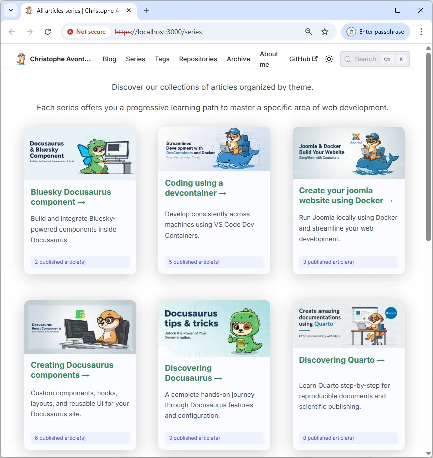
Maintenant, accédez simplement à l'URL /series. Sur mon localhost, c'est http://127.0.0.1:3000/series. Vous devriez obtenir la même page que celle montrée en haut de cet article, sans mise en forme pour l'instant.
Chouette, non ?
2.4 Ajouter une entrée pour la page des séries à votre blog
Éditez votre fichier docusaurus.config.js et, dans la section navbar -> items, ajoutez un lien vers /series :
// [...]const config = { themeConfig: ({ navbar: { items: [ // [...] { href: "/series", label: "My series", }, // [...] ], }, }),};
export default config;Ce code définit un objet de configuration qui structure la barre de navigation d'une application, en spécifiant les éléments du menu comme des liens avec des URLs et des labels. L'objet est ensuite exporté pour être utilisé ailleurs dans le projet.

2.5 Gérer l'URL /series/slug
Ok, ça fonctionne, mais depuis la page /series, si vous cliquez sur une série, vous obtenez cette erreur :
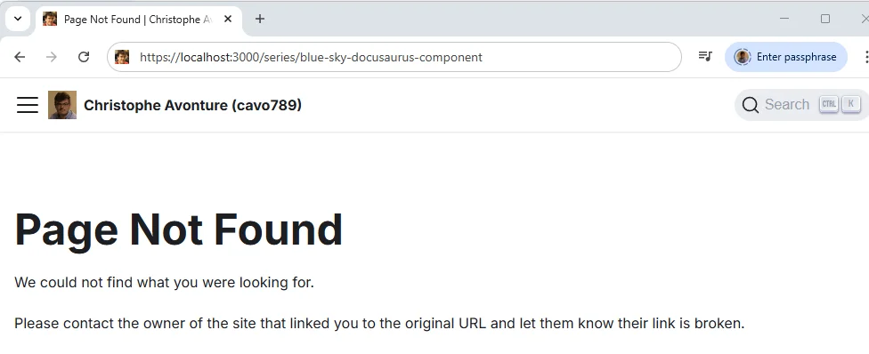
Nous venons donc de créer la page /series. Mais quand votre lecteur clique sur une série pour obtenir la liste des articles, l'URL devient quelque chose comme /series/the-name-of-the-series. Il faut donc dire à Docusaurus comment gérer ces nouvelles URL.
Par défaut, Docusaurus ne sait pas quoi en faire.
Pour ça, nous aurons besoin d'un plugin. Créez le fichier plugins/docusaurus-plugin-series-route/index.cjs avec ce contenu :
/** * Docusaurus Plugin: series-route * * Purpose: * This plugin adds the routes for displaying articles by series slug under the * `/series/<slug>` URL pattern. * * Why: * Docusaurus by default does not support routes like `/series/<slug>`. This plugin * programmatically registers one route per series, each pointing to the * `SeriesArticlesPage` React component, which fetches and renders articles based on * the series slug taken from the URL. * * Why one route per series instead of a single `/series/:slug` (TODO 0092): * Docusaurus's `handleBrokenLinks` resolves links against the list of *registered* * routes, and a parameterized path matches nothing there. With a single `:slug` route * every `<Link href="/series/writing-better-bash-scripts">` was reported as broken, * which is why `onBrokenLinks` had to be set to "ignore" site-wide — and a genuinely * dead link then went out silently with it. Enumerating the real series at build time * makes those links resolvable, so link checking can be switched back on. * * Usage: * - Save this plugin as `plugins/docusaurus-plugin-series-route/index.cjs` * - Add the plugin to `docusaurus.config.js` plugins array. * - Create the React component at the specified path (`src/components/Blog/Series/SeriesArticlesPage.js`). * * This allows URLs like `/series/my-series-name` to display articles for that series. * * See readme.md for more details */
const path = require("path");const { normalizeUrl } = require("@docusaurus/utils");const { listSeriesSlugs } = require("../lib/blog-taxonomy.cjs");
module.exports = function (context) { return { name: "docusaurus-plugin-series-route", // Routes are enumerated from article frontmatter, so a new tag/series would // otherwise only get a route on the next dev-server restart. Watching the corpus // makes `yarn start` pick it up on save, like the parameterized route used to. getPathsToWatch() { return [path.join(context.siteDir, "blog", "**", "index.{md,mdx}")]; }, async contentLoaded({ actions }) { for (const slug of listSeriesSlugs(context.siteDir)) { actions.addRoute({ // Through `baseUrl` — see the same comment in docusaurus-plugin-tag-route: a // hardcoded absolute path registers a route no locale-prefixed link can reach. path: normalizeUrl([context.baseUrl, "series", slug]), component: "@site/src/components/Blog/Series/SeriesArticlesPage", exact: true, }); } }, };};This Docusaurus plugin automatically creates individual routes for each article series in your blog. Instead of using a single parameterized route that Docusaurus can't validate, it builds a dedicated route for each series at build time (like `/series/writing-better-bash-scripts`), pointing them all to the same React component that displays the articles in that series. This approach lets Docusaurus's link checker verify that series links actually exist, rather than having to ignore all broken links site-wide.
Comme vous le voyez dans le code source du plugin, nous avons besoin d'un nouveau composant : src/components/Blog/Series/SeriesArticlesPage.tsx. Créons-le :
import type { CSSProperties, JSX } from "react";import { createSlug } from "@site/src/components/Blog/utils/slug";import { useBlogMetadata } from "@site/src/components/Blog/utils/posts";import { hexToRgba } from "@site/src/components/Blog/utils/color";import { useSeriesLocalizer } from "@site/src/components/Blog/utils/seriesI18n";import { useLocation, matchPath } from "@docusaurus/router";import useDocusaurusContext from "@docusaurus/useDocusaurusContext";import { useBaseUrlUtils } from "@docusaurus/useBaseUrl";import { useSourceLocaleUrls } from "@site/src/components/Blog/utils/localeUrls";import Layout from "@theme/Layout";import Link from "@docusaurus/Link";import Translate, { translate } from "@docusaurus/Translate";import PostCard from "@site/src/components/Blog/PostCard";import SERIES_DATA from "@site/src/data/series.js";import Head from "@docusaurus/Head";import FollowFeed from "@site/src/components/FollowFeed";import styles from "./styles.module.css";
const DEFAULT_IMAGE = "/img/default.webp";
export default function SeriesArticlesPage(): JSX.Element { const location = useLocation(); // Hooks must run before any early return. const posts = useBlogMetadata(); const localizeSeries = useSeriesLocalizer(); // The hook flavour would have to sit here, above the early return, but the banner path is only // known further down — so take the plain function and call it where the value exists. const { withBaseUrl } = useBaseUrlUtils(); const { isDefaultLocale, sourceLabel, sourceLocale, sourceUrl } = useSourceLocaleUrls();
// The pattern MUST carry `baseUrl`: under the `fr` locale the pathname is `/fr/series/<slug>` // and a hardcoded pattern silently matches nothing, rendering the "not found" branch on a // perfectly valid page (TODO 0119). const { siteConfig } = useDocusaurusContext(); const base = siteConfig.baseUrl.replace(/\/$/, ""); const match = matchPath<{ slug: string }>(location.pathname, { path: `${base}/series/:slug`, exact: true, }); const slug = match?.params?.slug;
if (!slug) { return ( <Layout> <div className="container"> <p> <Translate id="blog.seriesPage.noSeriesSpecified">No series specified.</Translate> </p> <Link to="/series"> <Translate id="blog.seriesPage.backToSeries">Go back to all series</Translate> </Link> </div> </Layout> ); }
const seriesPosts = posts.filter((post) => { if (!post.series) return false; return createSlug(post.series) === slug; });
// seriesPosts is filtered on a truthy `series`, so the first entry's `series` // is always a string here; `?? slug` covers the empty-list case (and satisfies // the `string | null` type without a cast). const originalSeriesName = seriesPosts[0]?.series ?? slug;
const seriesData = SERIES_DATA.find((s) => s.name === originalSeriesName); const seriesBannerUrl = withBaseUrl(seriesData?.image ?? DEFAULT_IMAGE);
// `originalSeriesName` is the functional key — it drives the slug, the front matter match and // the RSS feed, and must never be translated. Only these two are shown to the reader, and they // fall back to the English SERIES_DATA when the locale has no row for this series. const localized = localizeSeries(originalSeriesName); const displayName = localized?.label ?? originalSeriesName; const displayDescription = localized?.description ?? seriesData?.description;
const heroStyle: CSSProperties | undefined = seriesData?.color ? ({ "--series-accent-solid": hexToRgba(seriesData.color, 1), "--series-accent-light": hexToRgba(seriesData.color, 0.16), "--series-accent-dark": hexToRgba(seriesData.color, 0.3), "--series-accent-glow-light": hexToRgba(seriesData.color, 0.35), "--series-accent-glow-dark": hexToRgba(seriesData.color, 0.55), } as CSSProperties) : undefined;
const sortedPosts = seriesPosts.sort( (a, b) => new Date(b.date).getTime() - new Date(a.date).getTime() );
return ( <Layout title={translate( { id: "blog.seriesPage.metaTitle", message: "Series articles: {name}", }, { name: displayName } )} > <div className="container margin-top--lg margin-bottom--lg"> <div className={styles.seriesHero} style={heroStyle}> {sortedPosts.length > 0 && ( <img // Same baseUrl rule as PostCard: a series banner path comes from // `src/data/series.js`, so it carries no locale prefix of its own. src={seriesBannerUrl} alt={displayName} loading="lazy" className={styles.seriesBanner} /> )} <h1> <Translate id="blog.seriesPage.title" values={{ name: displayName }}> {"Series articles: {name}"} </Translate> </h1> <span className={styles.seriesTitleAccent} aria-hidden="true" /> {displayDescription && ( <p className={styles.seriesDescription}>{displayDescription}</p> )} {sortedPosts.length > 0 && ( // Plain <a>, not Docusaurus's <Link>: this file is a static asset // written by plugins/markdown-export-plugin's postBuild step, not // a registered route, so <Link> would have nothing to resolve // against. Same reasoning as CopyAsMarkdown's "View raw" link. // // Because it is not a route, nothing prefixes it either: the plugin writes one // bundle per locale into that locale's outDir (`build/fr/llms/…`), so a bare // `/llms/…` sends a French reader to the English bundle. <a href={withBaseUrl(`/llms/${slug}.txt`)} className={styles.markdownLink} target="_blank" rel="noopener noreferrer" > <Translate id="blog.seriesPage.markdownLink"> 📄 View this series as plain Markdown </Translate> </a> )} </div> {sortedPosts.length > 0 && ( <> {/* /series/<slug> is a custom route (docusaurus-plugin-series-route), so nothing injects feed autodiscovery here on its own — see src/components/MarkdownAlternate for the same pattern. */} <Head> <link rel="alternate" type="application/rss+xml" href={withBaseUrl(`/series/${slug}/rss.xml`)} title={translate( { id: "feed.linkTitle", message: "{name} — RSS feed" }, { name: originalSeriesName }, )} /> {/* The same series in the source language: more articles, since only part of the series is translated. Helmet keys <link> on `href`, so this is kept too. */} {!isDefaultLocale && ( <link rel="alternate" type="application/rss+xml" href={sourceUrl(`/series/${slug}/rss.xml`)} hrefLang={sourceLocale} title={translate( { id: "feed.linkTitleSourceSeries", message: "{name} — RSS feed ({language} — the whole series)", }, { name: originalSeriesName, language: sourceLabel }, )} /> )} </Head> <FollowFeed feedUrl={`/series/${slug}/rss.xml`} label={translate( { id: "blog.followFeed.label.series", message: 'the "{name}" series', }, { name: displayName }, )} /> </> )} {sortedPosts.length > 0 ? ( <div className={styles.seriesGrid}> {sortedPosts.map((post) => ( <PostCard key={post.permalink} post={post} /> ))} </div> ) : ( <div className="text--center margin-vert--xl"> <h2> <Translate id="blog.seriesPage.notFound.title">No articles found for this series</Translate> </h2> <p> <Translate id="blog.seriesPage.notFound.message"> Oops, it looks like that series doesn't exist. Please check the name in the URL to make sure it's correct. </Translate> </p> <Link to="/series"> <Translate id="blog.seriesPage.notFound.link">Click here to browse all available series from our homepage.</Translate> </Link> </div> )} </div> </Layout> );}This component renders a page displaying all blog posts from a specific series. It extracts the series name from the URL, looks up matching posts and their metadata, applies localization and styling, and displays them as a grid of cards with RSS feeds and a markdown export option.
Et nous devons charger ce plugin, il faut donc mettre à jour à nouveau le fichier docusaurus.config.js :
// [...]import pluginSeriesRoute from "./plugins/docusaurus-plugin-series-route/index.cjs"
const config = { // [...]
// WE SHOULD IGNORE BROKEN LINKS because Docusaurus’s link checker doesn't // recognize dynamic routes created via plugins; and we're using at least one // i.e. "plugins/docusaurus-plugin-series-route/index.cjs". // If we don't ignore broken links, Docusaurus will always throw an error during build // time. onBrokenLinks: "ignore", // [...] plugins: [ // [...] [pluginSeriesRoute, {}], ], // [...]};
export default config;Ce fichier configure Docusaurus en important un plugin personnalisé qui crée des routes dynamiques, puis exporte une configuration qui ignore les liens cassés (puisque le vérificateur de liens de Docusaurus ne peut pas les reconnaître) et enregistre ce plugin dans le tableau plugins.
Danger
La propriété onBrokenLinks doit être mise à ignore car Docusaurus ne charge pas les plugins de routage pendant le rendu de la version statique du site. Il ne comprendra donc pas les URL /series/xxx et les considérera comme cassées.
Pour la dernière fois, redémarrez votre serveur Docusaurus.
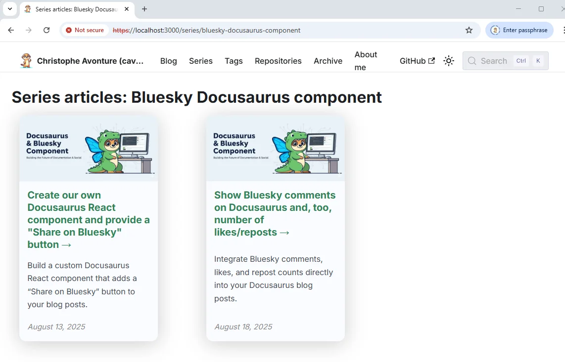
Maintenant, dans votre menu principal, vous devriez avoir votre entrée Series. En cliquant dessus, vous obtenez la liste des séries. En cliquant sur une série, vous obtenez une nouvelle page avec la liste des articles de cette série. Cliquez sur un article pour y accéder.
Partie 3 - Ajouter un fichier /src/data/series.js pour la personnalisation
Le composant fonctionne bien pour l'instant, mais il nous manque deux fonctionnalités importantes :
- La possibilité d'écrire une description pour la série.
- La possibilité d'utiliser une image personnalisée.
Créons un nouveau fichier appelé /src/data/series.js avec un contenu comme celui-ci :
const SERIES_DATA = [ { name: "Bluesky Docusaurus component", description: "Build and integrate Bluesky-powered components inside Docusaurus.", image: "/img/series/bluesky.webp", }, { name: "Coding using a devcontainer", description: "Develop consistently across machines using VS Code Dev Containers.", image: "/img/series/devcontainer.webp", }, { name: "Create your joomla website using Docker", description: "Run Joomla locally using Docker and streamline your web development.", image: "/img/series/joomla.webp", }, { name: "Creating Docusaurus components", description: "Custom components, hooks, layouts, and reusable UI for your Docusaurus site.", image: "/img/series/components.webp", }, // ...];
export default SERIES_DATA;Ce fichier définit un tableau de données contenant des informations sur plusieurs séries de tutoriels ou articles, chacun avec un nom, une description et une image associée. Le tableau est ensuite exporté par défaut pour pouvoir être utilisé dans d'autres fichiers du projet.
Vous devez respecter une règle importante : la valeur que vous indiquez dans la clé name doit correspondre à la valeur de votre series telle qu'indiquée dans votre YAML front matter.
Par exemple, pour cet article, ma clé YAML est series: Creating Docusaurus components, je dois donc la retrouver dans mon /src/data/series.js.
Le composant pourra alors trouver la description et l'image à utiliser.
Maintenant, votre page Series ressemblera à ceci :
Conclusion
C'était clairement compliqué. Beaucoup de fichiers à créer, d'autres à mettre à jour, et quelques éléments de configuration à ajuster, mais le résultat ne valait-il pas le coup ?
Vous avez maintenant un blog où vous pouvez écrire des articles « piliers » avec un contenu si dense que vous pouvez facilement le découper en plusieurs parties et le proposer à vos lecteurs sous forme de série.
Vos lecteurs seront guidés pas à pas, ce qui leur permettra de mieux comprendre les différentes étapes à suivre. Côté SEO, vous gagnerez en visibilité grâce à ces articles « piliers », entre autres, mais aussi parce que vous améliorerez la structure de navigation de vos pages. Les moteurs de recherche apprécient beaucoup ça.
Cet article fait partie de la série Créer des composants Docusaurus :
- Modifier la façon dont Docusaurus génère les balises img
- Surcharger la génération des balises img avec Docusaurus
- Organisez votre contenu Docusaurus avec un composant Series personnalisé
- Ajouter un bouton « retour en haut » dans les articles Docusaurus
- Créer un plugin de recherche/remplacement pour Docusaurus
- Un composant pour afficher des snippets de code dans un blog Docusaurus
- Un composant Docusaurus qui prévient le lecteur que l'article a plus d'un an
- Afficher le changelog de votre article
- Injecter de l'ASCII art dans toutes les pages HTML générées par Docusaurus
- Best Practice - Personnaliser le flux RSS de Docusaurus pour un contenu complet et des images
- Quelques vérifications sur les images de votre site Docusaurus
- Gestion des tags dans Docusaurus
- Automatiser les résumés TL;DR avec Gemini AI
- Le composant ProjectSetup - Une façon standardisée de partager des structures de projet
- Comment signaler un contenu assisté par IA dans un blog Docusaurus
- Donnez vie à vos tutoriels CLI avec un terminal machine à écrire
- Espiègleries de suricate : semer des easter eggs partout sur mon blog
- Tooltips de code assistés par l'IA dans Docusaurus — Explique-moi comme à un enfant de cinq ans
- Ajouter des réactions de lecteurs à votre blog Docusaurus
- Votre blog est illisible pour une IA. Voici la solution.
- Secouez votre téléphone, surprenez le suricate
- Ajouter un bouton « Copy as Markdown » à votre blog Docusaurus
- Ask My Blog : transformer 259 articles en 2 160 questions cherchables
- La troisième porte : une bulle de chat flottante, et la fonctionnalité que personne ne trouvait
- Dessiner une carte de mon propre blog
- Laissez vos lecteurs signaler les problèmes — un widget de feedback multi-types pour Docusaurus
Chargement des commentaires…
Articles liés

Dessiner une carte de mon propre blog
8 octobre 2026

Ajouter un bouton « Copy as Markdown » à votre blog Docusaurus
10 septembre 2026
Secouez votre téléphone, surprenez le suricate
27 août 2026